
early draft of a section from 2nd edition of blueprints
We all would like to think there was an abstract, perfect design that we could find and then never change. But different sizes demand different design approaches, and as our websites grow we have to change the wise choices we made earlier that are now liabilities. This is true of both information spaces and social spaces.

For example, everyone has seen the almost psychic spellchecker most search engines sport, but do you know how it works? It parses the millions and millions of queries and correlates when a query is made, then no click on results is made, then a second query with a large number of similar characters is made, then a click on a result. To do this and end up with a comprehensive dictionary of potential misspellings and corrections, you need millions of searches so you can identify the millions of ways people get things wrong and the millions of ways they get it right. Adding spellcheck to a website may seem easy, but if you don't get high traffic, you can't get the same range of suggestions and you'll have to rely on what is likely to be a less effective approach (a discussion for elsewhere). There are many other types of websites that are changed and shaped depending on how much data they have and how many people are using it. Wikipedia is one.
Wikipedia is only interesting because of the huge numbers of people who use it. Exerts on every topic on earth join in in writing, editing, contributing citations... collectively creating the most complete entries on any topic. Because they have so much traffic, and because most people are nice, if the occasional idiot defaces a page it is repaired in under five minutes. And so goes the marketing speil, and many of the entries do indeed realize this promise. But some on each end of the spectrum of usage show their own set of problems.

The extremely popular entries or extremely controversial entries (often the same) can't be left open to be edited by everyone, no matter what the Wikipedia philosophy is, because the number of people vandalizing it is too high to guarantee a useful entry at any given time. Wikipedia is forced to lock this entries against open editing.


Here we see a typical Wikipedia article, illustrating the power of collaboration. Ciphergoth, mlcome, OliAtlanson, Aastrup and many others are discussing how to make the article more accurate, and complete.

And here we see a page that gets almost no traffic. In fact, it didn't exist until one day I started to wonder where the name (and the food) Jalapeno poppers came from. I searched everywhere, including Wikipedia, but all Icould find was a Chowhound discussion board article that thought they might be related to Chili Reneos. I posted what little she knew on Wikipedia in hopes that the miracles of five-minute-corrections would bring me the answer, and wandered off to ask the question on another discussion board.

People are so used to Wikipedia being extensive, complete and expert no one questioned this entry. Over the next ten months, a couple people did add to the entry, one restoring the tilde to jalapeno, another contributing a photo, and someone adding suspiciously marketing-esque information about John Neutizling's invention of the Chile Relleno (unless he's Mayan, I really really doubt it). That has been removed since this screenshot, but in the stub world updates are slow, and vandalism - especially subtle vandalism--remains up and the truth is arrived at with fewer miracles if it arrives at all.
Moreover, in the ten months since its creation, it is now the 4th result (5th if you could video best bets) in Google. 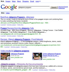
The LATimes tried to leverage the power of wikis with their wikitorial. On June 17th 2005 they launched it, and on June 19th they took it down. Users were posting obscene photos and comments at a pace that no one could manage. LATimes had the large numbers needed to create interesting content, but hadn't learned the lessons of Wikipedia's controversial entries. After all, if Wikipedia with its vibrant and committed community couldn't keep George Bush under control, how could a brand new newspaper section? It still hasn't returned, and maybe it represents a problem that can't be solved.
When you look at examples on the web to learn from, make sure you are dealing with similar problems of scale.
see also earlier size matters post
Several years back, John Zapolski urged all the members of my design team to read Atul Gawnde's essay "Whose body is it anyway?", replacing the word doctor with designer and patient with client. His point was that, like doctors, we had a body of expertise on design, but like patients clients had a body of expertise on being themselves. And that design decisions should be, like health decisions, a collaborative process. The article is a terrific one and can be read in Complications: A Surgeon's Notes on an Imperfect Science. Amazingly, almost all the articles can be read with an eye to the design process, and lead me to reading his second book, Better: A Surgeon's Notes on Performance
which was even more applicable to my design processes.
I've just begun a third book, How Doctors Think and as I read the introduction, I can already see the similarities. If someone had told me practicing medicine and designing product was in any way the same, I think I woudl have laughed at them. But medicine is more art than we think, and design more science. In both there is a tension between these two forces, and a need to resolve this via practice and experience.
That's one place I think design could learn from medicine. Young doctors are overseen by more experienced ones during the early phase of their practice. But young designers are turned out of school expecting they have been given all the tools they need to be a great designer and the title alone demands all must gave way to their ownership of design decisions. But a senior product manager or engineer may have been instincts than they do without a day in art school from years of watching users and businesses do their mad dance together. Without the guidance of a senior practitioner, they may insist on dreadful design solutions that appear sensible but for experience's warning bell. Unlike doctors, no body will die from these poorly made choices (most of the time) but a fragile business might.
Design understanding should be understood to be a experience-based skill rather than taught, and it is often collectively held. Unlike mad photoshop skillz or writing java it doesn't come from a class (obviously getting really good at these things comes also from experience beyond the class, but competent can be straightforwardly taught.) Very often young designers ask me for career advice. I almost always send them to large groups who have senior designers to learn from. The in-house folks I send to consultancies, the consultants I send to companies like yahoo or ebay, because you learn different things at each. But I never say, join a start-up. Unfortunately, almost all startups who cannot afford to have a young turk as their sole resource are often stuck with them due to financial constraints. If they are lucky, they'll get fast learning curious designer who will get into every corner of the business and learn and correct on his own. In a worst case scenario they get a willful freshly titled designer who wrongfully applies whatever he was taught, and wastes time-to-market fighting with everyone.
One of the things I've been thinking about and watching for is how Social Spaces change depending on the size of the community. For example, LinkedIn's news has the comment field at the top (it adds a second one at the bottom once there are three comments). This is fine when you have a small community leaving very few comments. However, if you had a slashdot sized community, this would encourage idiots to post before they read what other's said.
Too often we treat all practices as if the fit all communities, but the fact is size matters. For instance, Joshua's favorite example of the top diggers page, recently removed. What motivated folks at the beginning became a gamed liability once they got big. Much as we are reluctant to change UI's and remove features, there is a reasonable strategy for it....
A nice reminder of the wisdom of "You are not the user" at a product manager's blog: Eating Dog Food?
The real issue is that this is just another symptom of a big problem we have in our industry, but especially here in the valley. We tend to believe that our customers and users are much more like ourselves than they really are.
and even better, a reminder that there ar ea number of people you shouldn't consider your user either
Why Silicon Valley just won't shut up about FriendFeed
Has it ever occurred to Arrington that he is, in the argot of product managers, an "edge case"? Entrepreneurs desperate for coverage, and aware that he never reads email, are trying a new way to reach him -- and Arrington, in his compulsive neophilia, actually tries out the new medium, for a while. He then quickly tires of it, and throws a tantrum. Catering to such a person's whims is no way to run a company.
To that list I add Scoble and your CEO. And no, Steve Jobs is an exception, not the rule.
As of late, I've been extremely focused on how we motivate behavior via our design choices; that theme is reflected in most of the talks I've been giving. Social spaces are particularly critical because of their complexity, subtle clues in interface make a big difference.
Often panels can be a bunch of folks sitting in the spotlight congratulating themselves for begin smart-- I prefer it when it's a chance for a series of lighting talks on a theme, then hopefully some discussion. Joshua's short talk from SXSW is a good guide to behavior in a compact form. I hope my panel form IASummit complements it.
Bernardo A. Huberman has been, so far, the most impressive speaking in a very impressive series. and, lucky you, they just just posted the video of his talk.
The web mediates interactions among distant people on a scale that was never possible in the physical world. From vast social networks, to grass-root amateur creativity and the creation of encyclopedic knowledge, a collective intelligence is at work in ways that differ from traditional communities in style, intensity and effectiveness of interaction. I will present the results of several studies of social dynamics in the web, as well as mechanisms we have designed to access this collective intelligence while improving users experiences with digital content.
On TED's website, Gladwell tells the story of how Prego discovered to their great profit that not all taste buds are alike.
This is not only entertaining, it's a critical reminder to all designers that there is not one UR-design, but that sometimes you have to provide choices. It's obviously an offshoot of his research from the fascinating and important The Ketchup Conundrum on the same theme.
Of course, in that piece he points to the fact that there *is* an ur-ketchup. No one wants extra-chunky or zesty ketchup, despite endless efforts from the food industry to break Heintz's hold. It's strange there is one true ketchup that you succeed or fail depending on how well you adhere to the design of it, just as it's strange there is only coke and sometimes Pepsi, and pretty much no one else successful in the Cola space. Not quite the level of lock-in to ketchup, but close.
I saw a taste test of Mayonnaise on America's test kitchen in which they concluded that, unlike other tests of other products, mayonnaise had to taste like what you grew up with, and it tastes different on the west coast, east coast and midwest. So there are regional ur-mayonnaises, based on familiarity.
This struck me as particularly relevant as we discussed threaded and nonthreaded discussion software at Linkedin, which led us to ponder other "religious wars" such as Mac vs. PC and VI vs. EMACS.
LukeW and I have often discussed conservation of effort; which means a certain amount of effort is always made in software usage, and you can take it on yourself on the design side, or push it off on the user. For example, how many times is personalization actually a way for a team to avoid having to make hard design choices?
Simple as possible, and no simpler. Sometimes you need an extra-zesty interface as well as classic, sometimes you don't.
And dont' forget to check out Jim
Design
watch the alpha geeks
- new tech moves through hackers, then entrepreneurs then platform players
examples include screen scraping and the peddle powered internet presaging data platforms and interest in alternative fuels
On Facebook (they have a new report coming out)
facebook is growing 1.14% a day
aps are growing 2% a day
87% of usage goes to 2% of aps
top 50 developers by usage looks like a more traditional long tail, but all 5K and the tail is way long
compares it to chris anderson's research, including book sales.but facebooks long tail is essentially useless right now.
the power law is skewed, that may change, but thats the bad news.
many applications competing for the same users. dating aps have the best uptake, then messaging and chat, just for fun as a category isn't strong.
the most successful category with active users is sports then gaming, chat, fashion, just for fun)
most active categories (what are people building) just for fun, then messaging, then gaming, then video (multiple categories, so may not be fully accurate)
aps with over 100,00 users messaging, dating, gaming, video, just for fun, (sports weaker here)
top 40- top friends, funwall, superwall, superpoke, video, x me, ilike, movies, graffiti -- top aps seem to be topping out, growth slowing.
a web 2.0 refresher
the more users, the more value
building a collective database
* building on top of open source, yahoo pays people to extend
* learning from open source, wikipedia uses volunteers
* p2p sharing users build song swapping tools as a byproduct of their own self interest
* google works this way, and to some extent facebook too
key concept: harnessing collective intelligence. ajax doesn't matter, what matters is value grows wiht userbase.
a network-effect-driven data lock-in, with accelerating returns. red-shift companies
Yahoo started with user generated content, and picked and chose best. google figured out how to automatically extract meaning from activity. They coudl automate what yahoo was doing.
page rank as true start of web 2.0
wesabe uses it too, with fan scores, recommendations, and data information being gathered and used for advice.
facebook is picking up data but you don't have much control over it, there is not much intelligence in the data.
for example, a list of facebook invites
* geni.com knows sean is my brother
* my company directory knows I work at oreilly
* google knows I worked with Danese
* amazon knows who's written books for me
- why should I confirm? can't facebook learn to use databases?
How ridiculous is this? my phone company knows everyone I ever called, but my phone only knows the last ten. Phone companies suffer from churn-- data could create lock in.
"are you my friend" anyone with email, phone, IM already knows who my friends are (Yahoo, are you listening???)
xobni is extracting data such as phone numbers and email, click to call, statistics on how often you communicate, let you know when you haven't talked to someone in a while.
The Internet Operating system
the subsystems will not be devices, they will be data subsystems. facebook describes itself as a platform, it's really a subsystem platform, not a platform yet. if you study history, a platform beats an application every time. lotus 123 to excel... wordperfect gets beat by MS word.
two types of platform
* one ring to rule them all
* small pieces loosely joined
facebook can't do it all. hopes they will help open it up to a small pieces model
=> thoughts on the social graph read it!
questions you should be asking
* am I doing everything i can to build applications that learn form my users?
* Does my applications get better with more users, or just more busy and crowded
** consider filtering, smart filtering
* if ""data is the intel inside":http://radar.oreilly.com/archives/2007/02/data_is_the_int.html" of web 2.0, what adata do I own?
* what user facing services can I build against it?
* does my platform give me and my users control, or take it away form us?
** you have to create more value than you capture
Random thoughts about what I want form the social grpah
* I want social networks to reflect my real social network
* I want it to help me manage those contacts (how to reach them, updated status)
* I want it to manage my groups of people
** I need to put java people together, or facebook people, if I know them or not.
** people I know, people I don't know, people I regret knowing
* I want it to recognize asymmetry in relationships
** how can I reach out to superstars in a field I don't yet know
** I don't want to just manage my friends. In fact, the closer they are, the less I need to manage.
* I want fine grained control over what I see and what I ignore
** some people I just want flickr feeds, other ones I want everything. I want to see this persons blogs, but not their tweets.
* I want to discover interesting people
is Tim normal? Probably not, but good ideas here.
geni.com .. mothers maiden name no longer a good security question ;)
I can't recall if he had a point, except smart understanding of relationships
facebook doesn't fit my relationships -- steve case: i sold him a company, what am I going to say, we hooked up? might be accurate.. yes, that was a quote.
FOWA, should look at different tie describers
what do people want to say about themselves? What do I want to say about them? What if I could adjust my view of the people. How do I want to see them? could I rearrange modules to shape how I want to be updated?
jaiku has done great things, and just got acquired by google. takes idea of smart presence to mobile. your phone knows where you are. your phone should tell you if a friend is in berlin and you are going to wake them up. Or if a friend ins town, you cna ping them. I do this with twitter, but obviously not as effective. But do I want my movements tracked?
I'm and inventor. I because interested in long term trends because an invention has to make sense in the world in which is finished, not the world in which ist is started." ray kurzwell
think far along the curve, think about new platforms, think about future of applications, think about taking the platform forward so we can say, wasn't that platform quaint?
QUESTIONS
Q: criteria in companies distribution channel?
A: one of my fundamental beliefs about web 2.0 - it's distribution, creating interfaces with your customers. The best use all channels, web facebook, etc. They want as much contact as possible. The need to understand each of those channels, and there may not be much overlap-- ilike says only 4% overlap between web and facebook uses, they tend to choose. thinking of twitter, everyone has a favored interface the uses is the asset, and the services you can offer to them, and you can figure out how to offer that.
Q: If Facebook will dominate, won't they fight to keep their uses to themselves? Even if everyone wants it?
A: I'm ont sure, there are a couple answers. If you become truly domainate, no need ot share- facebook isnt there. Google is a good example. they own a lot of data they don't share BUT they also share a lot as well. They spider the same sites as yahoo and ms. you can share and still dominate. if large graphs cooperate, say geni and facebook cooperate both sites become more valuable. There is value in openness, if you focus on building services for users, then you choose ... it ultimately depends on the services and applications you build. Right now there is way more for facebook to gain by being open, as they try to crack open these deep mines of data. For now and for many years to come, all the trends say openness is good for you.
Dave McClure is useing fun movies ot intro folks. this was at the end of Tim's talks
Yesterday I asked on Linked in (and on Facebook, more on that later)
What do you consider the greatest challenges in designing for social media/software/networks?I have gotten many terrific answers, and I'll share a couple now.
When you are designing social media you are not building and designing a product in the typical sense of that word. You are really designing an infrastructure upon which social interaction, and eventually a community, can build. The affordances needed to "direct" and "control" the development of a community are very different from and much more subtle than typical single-user systems that we (as designers, developers) know. I usually compare it metaphorically to a soap bubble: you can gently try to push it in a certain direction, but if if you push too hard, it'll burst. User-centered design takes on a whole new meaning when you are building social media and communities......
There are many MANY more terrific answers, and since the poll is open for another six days, I recommend you read them and add your 2cents. After it closes, I'll do a write up of what I've learned, and create some follow up questions to answer some of these challenges.The greatest challenge is marketing, because marketing determines who your audience will be more than the quality of your product design.
Design-wise, the answer is similar: understanding who your audience will be, as chosen (hopefully) in close collaboration with marketing. If the marketing people don't exist or aren't powerful, then the features and the site design will alone be relied on to determine the audience -- and this will result in a fractured, aimless audience with no sustainability and no strategy except a hope to get lucky with some sort of coincidental generation of audience cohesiveness and thus community.Clarification: I'm not trying to discount the importance of features or product design. I just happen to think that, especially among Christina's group of friends and contacts, we're more likely to fail to understand the importance of marketing than we are likely to fail to deliver powerful user experiences. Other answer-ers here are thinking along the same lines when they stress the importance of brand, voice, and acquiring users: all of these qualities are the things that marketing experts can really help with in a profound way.
To whatever extent that a UI designer can do this, that UI designer is performing a marketing function.-- Christopher FaheyTwo things:
1. Not doing one. I find the biggest issue these days is that companies continue to shy away from social networks as something someone else does. The loss of top down marketing control and the perceived liability of open-ended conversations still keeps many companies well away
2. Not looking at what networks already are working and carving out a space in them for yourself. I think a big mistake for a lot of companies is the idea they have to start complex processes like this by always building their own first. I think it would be better to start with a thread or user group or sanctioned community employee team to participate on other well-participated meta-forums first. If the desire is strong enough to create a unique social network that is more targeted to the select group, then the idea will have some momentum from the target community itself to move along.-- Tod RathboneReleasing control to your community. On the two social sites I've worked on, both aimed at narrow audiences (one tech-oriented, the other party-oriented -- assuming those are separate audiences), the site owners in both cases wanted to avoid "The MySpace Syndrome" wherein nearly every page becomes a messy conflagration of plug-ins, run-on sentences, endless scrolling and possible lawsuits. Facebook has been somewhat successful in manhandling its audience into a single interface they can't easily manipulate. But growth seems to depend on freedom of expression, and when you have thousands or millions of users, control goes out the window. Finding the balance between "My Vision" as a client and "Your Vision" as a user is painful, but unavoidable.
-- Lance Arthur
I think the biggest challenge is having a really good reason to build one in the first place. back when streaming media was new, everyone and their brother was saying 'we need streaming media on our site!' More recently it's been "Ajax! Web 2.0! We need some of that!" No you flippin' don't. That's like saying 'we need more concrete to make this new building excellent!' Social networking applications are becoming part of the infrastructure of the web and technology. They are a commodity, a tool. And they are being applied indiscriminately, which is making them worthless. Unless there is a really good reason for supporting some kind of 'community,' then social networks and community applications just increase noise and diminish the interestingness and goodness of 'real' social networks. So the biggest challenge? Doing the really good thinking up front, before you decide you need one, to figure out who you are trying to help, why, what they need, the experience you want to support, and the best ways to support this experience. Designing social media or networks should only be undertaken AFTER you've done all that hard work. and I think it's the biggest challenge because i think so few people are doing it.
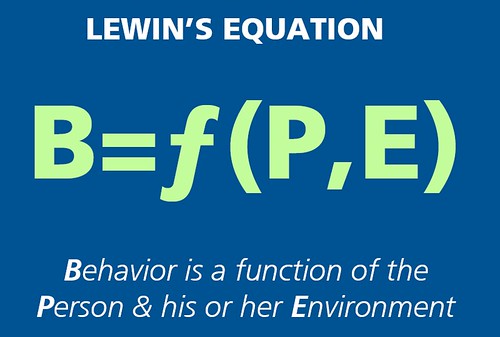
When I saw this slide on Josh Porter's terrific preso on Psychology Of Social Design the clouds parted and the angels sang.
There is a desired behavior that we need to create, we have no control over the person but, via interaction design, information architecture and interface design we control the environment.
Perfect, and succinct. I need to make a T-Shirt.
entire presentation:
a particularly smart slideshow.
I was delighted to see a poster I worked on when I was at MIG referenced in it... made me feel all tingly.
Rosenfeld Media recently did an analysis of user experience mentions in prominent Business Magazines. What they discovered is quite fascinating.
- The Harvard Business Review dramatically differs from its peers in its information focus. Knowledge management (26.7%) and information management (61.7%) combined to account for 88.4% of its results, while the average for all of our business publications is 28.2% (8.5% + 19.7%). Of course, HBR is the most academic publication on our list. If this is the explanation, does that suggest that the research and academic side of the business community is more focused on information management issues? If so, why?
- The Economist is quite focused—at the expense of all other UX topics—on branding: 96.7% of its results, versus a 42.4% average among all analysts. Of all the terms on our list, branding has been in use perhaps the longest. Does The Economist see newer topics as flighty and not worth deeper coverage?
- Conversely, Business Week seems to have the most balanced coverage, with six terms accounting for at least 5% of the results each (branding, content management, industrial design, information management, knowledge management, and user experience).
 I am an unapologetic foodie. Left with any kind of free time in my days, I fill it with wandering around grocery stores staring at ingredients, reading food essays and cookbooks, and cooking. The end of the brutal day when everything went wrong, and you want to crack a beer? I want to turn baby artichokes. So it’s not surprising I’m reading The Reach of a Chef: Professional Cooks in the Age of Celebrity
 when I should be reading Wikinomics
or Designing Interactions
.
But as I closed the book on the last page this morning, I couldn’t help but feel the plight he described sounded familiar. Chefs, having struggled for years to perfect their craft, find themselves stuck with two choices. They must either become businessmen in order to open more restaurants, or become master craftsmen so they can charge higher and higher prices for their dishes. In the book this is epitomized by Thomas Keller, opening Per Se and Bouchon in Las Vegas, with plans for more, and Masa charging 350 a person for dinner as a start. Meanwhile Keller sighs over not being able to cook anymore. Does this sound familiar, anyone?
How many times have you heard a design manager complain abut not being able to design anymore? How many times have you heard a senior designer puzzle over going into management. How many large companies now offer “senior practitioner” routes for their best talent, allowing them to have the earning power of managers rather than lose them?
Other chapters, on Grant Achatz’s Alinea (written about here earlier) and Melissa Kelly’s Primo show chef’s pushing their craft toward innovation, seeking to engage their audience in new and more compelling ways. Cross your eyes slightly and you can see the struggle between design innovators and user-centered designers played on on a new field. The book speaks to the challenges chefs face as they grow more successful; how the struggle to define themselves, reinvent themselves, and —hardest of all— make a decent living.
Life repeats itself over and over, it’s called convergent evolution. And in the craft-professions —design, engineering and now cooking—we see the same patterns and the same solutions. Which leads me to the next question: when are we going to see the design channel on TV? Top designer? Hell’s Studio? I’ve got my application ready…
delightful slideshow on design
Monday I listened ot a pretty terrific forum, a radio program on my local PBS station. Because their site behaves in a way I can best describe as erratic, here are the relevant links:
The show discusses the lure of "the dark side" with Philip Zimbardo. What makes good people do bad things? Where is the line between good and evil, and where does this line become blurred? Can we curb this seduction to commit immoral deeds?Philip Zimbardo , professor emeritus of psychology at Stanford University, creator of the Stanford Prison Experiment, and the author of "The Lucifer Effect: Understanding How Good People Turn Evil"
![]() Download (MP3)(Windows: right-click and choose "Save Target As." Mac: hold Ctrl, click link, and choose "Save As.")
Download (MP3)(Windows: right-click and choose "Save Target As." Mac: hold Ctrl, click link, and choose "Save As.")
I've long been fascinated by the Stanford Prison Studies, and the effect they had on research, but more so on the learnings they gathered so very quickly and so very deeply. In this talk, one thing I couldn't help but fixate upon was the details-- his choice of military-style outfits for the guards, including reflective sunglasses, or the hospital-gown style uniforms for the prisoners.
Because I spend most of my time considering which features affect community behavior, I wondered what is the online equivalent? What are those aspects of the fixtures of our design that create or dissuade evil (and how could it have affected the situation that led to Kathy Sierra's life threats) Is anonymity on the web something we want to discourage? How can we continue on without flagging (which obviously PublicSquare has.) I've been told that people feel more kindly to me and respond more gently when my avatar includes my baby. How can photos change our communications? Does a icon carry the same weight as a photo, does a photo carry the same weight as a photo of a face?
Good and evil are not something we as designers think of all that often. In fact, fairly often we hand wave and point to Leni Riefenstahl as our icon of beauty in the face of evil (beauty as the face of evil?). But we are not just recorders of life who can choose to do so with or without style, we are the architects of life, just as much as architects of buildings or urban planners.
I think every design choice in PublicSquare is built with conscious or unconscious implications on user behavior. You are responsible for your actions. Your bio carries every comment, every story you write. Your photo hangs out next to your words, as does your reputation. The reputation on each comment reflects passer-by's reactions. People don't approve when you make a snarky comment, or even when spelling errors are publicly mocked. The community decides what's acceptable and what's not, if you give them the tools to do so.
I wonder what tools create abuses of power. The theory in Zimbardo's book is most people have the capacity of evil within them, they just need the right situation to bring it out.
We can't hand wave if there is even a slim chance he is right.
If we design community spaces, we must design with community mores, be it a small community or the community of man.
My pal Jonathan Boutelle calls this a "mullet" when a blog lists less info about its posts as they get older, but still lists many many posts. Valleywag has the same configuration. I love this name.
Conference Program | ASIS&T Information Architecture Summit 2007 suggests that this year, like every preceeding year, the summit will be my favorite conference. If you are on the fence, get off it and register.
No since Budd Uglee have I see such a "design" website.
Theous Logo Designers - Unlimited Award Winning Logos.
Rouxbe claims to be "The Recipe to Better Cooking" but is it?
The concept is simple: technique is better communicated by video than text. Recipes only workif you know what you are doing.
It is beautiful, no doubt, with a dean & delucca-like clean and airy design. In many ways it is a shining example of desing best practices - recipes are broekn out step by step, so you can watch each part once or twice before tyring to coopy. And the food videos are gorgeous, shot in that soft-porn style that has made food-peddlers from saveur to rachel ray sucesses.
But of course they have their weaknesses, disguised by elegant user expereince and a lightweight airy desing that owes as much to Getty Images as it does to Dean and Delucca.
First off, I don't want to cook from my laptop any more than I have to. I have a small enough machine and a big enough kitchen (barely!) my laptop can come onto the counter. But this is bad news:
A simple solution might be just to unpack the videos into printable recipes with screenshots. But this raises the real problem of Rouxbe. They are too pretty.
Those video recipes are gorgeous. They will take too long and cost too much to light, shoot and cut (not to mention the need for a 'food stylist'.) The addition of making illustrated text versions will further drive up cost. This is an unhealthy proposition for a start up.
It also hurts their ability to gather user-generated content. They set the bar too high-- how am I going to feel posting my "how ot prepare fava beans" shot on my digital camera with its video feature? Boom, they've just locked themselves out of both a source of free content and a way to deeply engage their audience.
Design is not enough. But for now... look at that sexy halibut, scantily glad in frisee. Oooh, baby!
During the B&A redesign contest, we struggled mightily with the question "What makes a publication scream 'magazine' rather than 'blog'"?
The First Post certainly knows the answer.
VP design in Palo Alto, CA 94306 $187,000 |
|
VP product in Palo Alto, CA 94306 $154,000 |
design in Mountain View, CA $92,000 |
|
engineer in Mountain View, CA $95,000 |
|
design in San Jose, CA $90,000 |
|
engineer in San Jose, CA $93,000 |
|
design in Palo Alto, CA $92,000 |
|
engineer in Palo Alto, CA $95,000 |
Christopher Allen rocked the house tonight with many vital insights on group size. But don't beleive me, do
MORE...
Goofing around with the new Google trends (very nifty!)

Makes me want to start mapping events against these trends-- information design, which is much older a practice seems to come out of nowhere, and rather later than I would have guessed... and I wonder what IxD and IAI did for the terms, if anything.
Now before you get all upity, and start puffing out your chest in pride, try adding "usability" to the equation.

You may have come a long way baby, but Jakob's kids have come farther.
What the heck is this, and why do the lawyers think it is common enough to need to be represented iconicly?
Looking at new site The Conversations Network and redesigned The Long Now Foundation, I realize something I've been noticing steadily growing: the technical constraints of blogs tools have changed how *all* web pages look.
Neither of these sites needs to look like a blog. And yet, they have all the traditional earmarks: the banner like art element, the long narrow floating body, the main content body and the suplementary links on the right, and almost no navigation.
Has the ability to design a site been reduced to deciding how big your fonts will be? After the css zen garden, why is everything so the same?
If you have been living under a rock, like me, you may have missed Jess's model for design maturity (pdf) .
If you ever were thinking of abandoning your title in favor of living design, now is a good time, a better time than ever. Check out his blog post as well.
RSA Journal - Better by Design
John Zapolski, a San Francisco-based principal of the Management Innovation Group, believes there is 'increasing importance in using design as a framework for organising decisions that people make", citing, alongside the work of his own company, that of innovation consulting group IDEO. He is keen to differentiate designers from design, implying that the people who use these methods may not be called designers.
I worked with Sasha at Y!, and was impressed with how well this system cured many waterfall ills. You should try it at home!
When VC's start thinking about design-- well, penetration has happened, baby.
Northwest VC: Following the value trail...
"Value is all about the brand and product design. Bose has a great brand and these headphones are pretty cool and comfortable so people are paying up for them."
You can hear part of the talk I took notes on-- the ideas are very much the same.
Listen to this commentaryBusiness schools will be launching their graduates into the real world over the next few weeks. Fed Chairman Alan Greenspan speaks at Wharton's commencement this Sunday. Pepsico's president will do the honors at Columbia Business School next Wednesday. General Electric's CEO Jeff Immelt shares his thoughts with the graduating class at the Harvard Business School in June. These stars are all at the top of their game. But commentator Dan Pink says an MBA won't necessarily get you there"
from Online Extra: Commentary: Apple's Blueprint for Genius
"Designed in Cupertino."The words are printed in such small type on the back of Apple's (AAPL ) tiny new iPod Shuffle MP3 player that you have to squint to read them. But they speak volumes about why Apple is standing so far out from the crowd these days. At a time when rivals are outsourcing as much design as possible to cut costs, Apple remains at its core a product company -- one that would never give up control of how those products are created.
At first I recoiled: I can't say american design is inherently superior. But that's not the point... keeping design close to home is.
Even more telling is this quote
"I've been thinking hard about the Apple product-development process since I left," says design guru Donald Norman, co-founder the design consultants Nielsen Norman Group, who left Apple in 1997. "If you follow my [guidelines], it will guarantee good design. But Steve Jobs doesn't want good design. He wants great design, and my method will never give you that. That takes a rare leader, who can bring both the cohesion and commitment and style.
It's not usability that makes great design but a complete approach to the product that spans approaches as well as components. from business strategy to physical design, from software to plastics, the gestault of th product is the secret-- and it's a secret most companies simply aren't willing to emulate. Outsourcing, waterfall development, overfunding a single approach -- anything that piecemeals the design process weakens it.
Adam Gopnik rants against a new signage system in TOO MUCH INFORMATION
"Worse than merely unfamiliar, though, the signs are infuriating -- first, because they are there for the convenience of cars, and thus violate the first Law of Civilization, which states that nothing must ever be done for the convenience of cars (the mark of a city worth living in is that there are never enough places to park); and, second, because they eclipse, as decor, the jaunty, jazz-era syncopation of the classic New York street-corner sign pair, each sign gesturing toward its own street, but with the two set at slightly different levels, so that they have a happy, semaphoric panache. "
The city's comissioner of transportation argues for the signs by talking usability, but I think Gopik's rebuttal is sound on both a use and a aesthetic platform. It's a fine reminder that a system is more than its parts, more than a single homogenous solution that fits all, it must embrace the soul of a place and the nature of its people.
Reading MSNBC - Does Your iPod Play Favorites?
But just about everyone who has an iPod has wondered how random the iPod shuffle function really is. From the day I loaded up my first Pod, it was as if the little devil liked to play favorites.
I have to ask-- do you really want true randomness? Because I don't. I want my shuffle to learn. I want it to notice when I fast forward in the first ten seconds of a song, and when I fast forward toward the end, or through the rest of the album. I want it to read the tempo and genre,a nd make decent mixes for me. I want it to stop putting chapter five of Art of War between Bireli Langrene and Abba.
The fetishization of true randomness is such a engineering thing to do. True serendipity comes from designing a user experience not calculating an abstract one, and a great algorithm comes from studying humans, not studying math.
In Concept Cars Don Norman writes
Want to design properly? Take concept cars seriously as design prototypes. Explore those constraints. Playfulness is a wonderful design stance that can produce out-of-the box breakthroughs. But there is playful and silly. Ford seems to have confused the two. Too bad -- there are excellent ideas hidden away inside the SYNUS armor-plated exterior.
No Don, no.
The point of the concept car is to design properly but not to design for use, and the two are not synonymous. The point of the concept car is to create a shift in cognition in the viewer, to help him or her imagine something that was not possible before. We can all imagine a useful ergonomic car (and some of us spend huge amounts of time doing so) but it's not so easy to picture the role of wifi in a car. And because a mental status quo it is almost impossible to break mental models with timid steps.
A certain foolishness, a certain grandness is needed in a concept car. It's physicalized science fiction. It's made to make you dream of going to the moon, not made to carry you there. When pragmatic car designers who prototype the real cars see the concept cars, the spark of innovation in their mind is fueled, and they can press against the many well know constraints of car design to create a surprise. Do you remember the first time you saw a Bug on the road, or a PT cruiser? The design concept that gave birth to that initial moment of pleasurable surprise was born first in an unbuildable concept car, when its very unbuildablness gave the designer the freedom to dream. Only later would it be dialed back, the most useful ideas harvested and put to work in a real car.

from The Origin of Things
Concept cars are also made to a certain degree to help the consumer get excited by cars again-- something that's hard to do with normal SUV's and midsize cars, no matter how many mountain roads the commercials show you. Concept cars are thusly comic book cars, ridiculously endowed with extreme qualities to entice and arouse interest, and sometimes repulse. The thrill of the impossibleness makes you dream of being a hero, capable of great feats due to the wonders of technology.

from The Origin of Things
It's hard enough to to get an industry to look forward, it's hard enough to say "lay down your rulers, we're gonna dream now" but to try to make the concept cars really work in today's world would lengthen the time it takes to create a vision of the future, make it less practical as an exercise and castrate the results.
If you make the concept car practical, all you are doing is making everyday design slightly more edgy, and simply creating another design team like the others. The concept car must be an unbuildable dream, because dreaming is what makes innovation possible.
Of course, it's pleasantly ironic to remember that making cars more suitable for humans was once driven by a concept car. Freed of the constraints of making concept cars all about sex and science, Marc Newson designed the 021C in 1999 that was all about having a good trunk, making it easy to get in and out of the car, and making far more readable dials and usable switches. Sometimes the wacky idea is to make things usable. But that should make us protect the concept car's inherent unshipableness even more fiercely. Only in a dream, sometimes, can we dream of better products. And yesterday's foolishness is today's best practice.
 from Marc Newson's site |  |
Do check out The Origin of Things. It's always good to remember where stuff comes from.
From Steve Jobs and Jeff Bezos meet "Ginger"
"I think it sucks!" said Jobs.His vehemence made Tim pause. "Why?" he asked, a bit stiffly.
"It just does."
"In what sense?" said Tim, getting his feet back under him. "Give me a clue."
"Its shape is not innovative, it's not elegant, it doesn't feel anthropomorphic," said Jobs, ticking off three of his design mantras.
"You have this incredibly innovative machine but it looks very traditional." The last word delivered like a stab. Doug Field and Scott Waters would have felt the wound; they admired Apple's design sense. Dean's intuition not to bring Doug had been right. "There are design firms out there that could come up with things we've never thought of," Jobs continued, "things that would make you shit in your pants."There wasn't much to say to that, so after a pause Tim began again: "Well, let's keep going, because we don't have much time today to-" "We do have time," said Doerr curtly, changing his own ground rules. "We want to get Steve's and Jeff's ideas."
"The problem at this point is lead time in our schedule," said Tim.
Jobs snapped his head from Doerr on one side to Dean on the other, as if he'd been slapped. "That's backwards," he said, his voice rising.
"Screw the lead times."
I keep returning to this article. I love Job's stellar ADD and vivid vocabulary, both loosely disguising a superlative design and business sense. I am not an Apple person, nor an apple user (except my recently acquired ipod), but I am becoming a Jobs fan. He knows who he is.
Redesigning American Business shows why outsourcing shouldn't scare designers....
"Designers are teaching CEOs and managers how to innovate. IDEO, ZIBA Design, and other players run workshops to help business people better understand and meet their customers' desires. Companies are creating "chief design officer" slots, and designers are helping corporations build their own innovation centers. The hot design firms in the U.S. today call themselves "design innovators," not "product designers""
From MSNBC - Women snuggle up with 'Boyfriend's Arm'
"A new product on the Japanese market has been designed for the single girl in need of some manly comfort while she sleeps."
Actually I suspect the real audience is girlfriend/wives of travelling men, who need the status quo to nod off. Single gals need a extention to the bed where they can place visitors so they can return their spread-eagle-diagonal-take-up the-entire-bed-through-sheer-force-of-cold-feet.
Happy friday!
According to Michael Porter, there are essentially two ways to compete: cost and differentiation. A Dry Cleaning Story explains how one small company choose the trickier course of differentiation and suceeded.
"A local dry cleaning company has taken the leg up on competition, and I've happily given them all my business. Not only that - they convinced me to pay more money than I was paying at the previous cleaner I had used for 3 years."
Not small multiples, but rather multiple small... Bullet Madness is a collection of teensy bullets, arrows, icons and such not. Cute enough to make a japanese preteen girl squeel. Well, if she was an interface designer....


Like most folks, I get envelopes full of coupons all the time. So far, the only ones I save are the ones for Chicago Pizza, and I've been reconsidering that since I went on the South Beach diet (after all, why torture myself? I could eat the coupon before I could eat pizza these days...)
But getting an envelope from Target these days is a lot like getting mail from the AIGA. These coupons look like IDEO's idea cards, like a AIGA fundraiser, like a tarot deck predicting the future of my nose... these coupon-art-cards came three days ago, and I can't quite recycle them yet. I have them spread out on the dining room table right now, because I like how they look.
They may actually be around when I run out of detergent. Which would be a win for Target, and a win for Tide. And won via aesthetics, and won by a designer smart enough to question the ink-on-your sweaty-fingers thin-newspaper-glossy coupon. God bless 'em, whoever it was.
I'm doing a lot of defining these days, between widgetopia and a project I'm working. This defintion of "icon" is worth a honorable mention.
"Ultimately from Greek eikon (likeness, image, portrait), an icon (or ikon) is an image, a representation, a simile. Accordingly, 192 iconicity in a semiotic sense refers to signs where the motivation is due to some kind of physical resemblance or similarity between the signified and signifier (see section ); 193 a Christian icon is a picture of a sacred or sanctified personage, traditional to the Eastern Church, which can be seen as hand-made (painted) or non-manmade (archeiropoietos). 194 Semiotically incorrect, but nevertheless widely used, is the denomination of the symbols on the GUI desktop and in WWW documents as ''icons''. In this paper, I call the graphic representations of hyperlinks Graphical Link Markers (GLMs). "
BW Online | May 17, 2004 | The Power Of Design
After just seven weeks with IDEO, Kaiser realized its long-range growth plan didn't require building lots of expensive new facilities. What it needed was to overhaul the patient experience. Kaiser learned from IDEO that seeking medical care is much like shopping -- it is a social experience shared with others. So it needed to offer more comfortable waiting rooms and a lobby with clear instructions on where to go; larger exam rooms, with space for three or more people and curtains for privacy, to make patients comfortable; and special corridors for medical staffers to meet and increase their efficiency. "IDEO showed us that we are designing human experiences, not buildings,"
An excelelnt article. The magazine version is worth buying, as the photos and charts are rather nice. I had to go to a couple stores to try to buy it-- it's selling out across the silicon valley.
A recent article on document design in the WSJ shakily raised the question:
Is a poorly designed memo at fault for not warning the president the nature of the terrorist threat.
In many ways it's a retread of the butterfly ballot controversy, and the Challenger controversy, but I think it's a controversy worth raising again and again until careless attention to design stops killing people.
Here is the article (PDF) (html). Here is the redesign of the memo.
Here's what wasn't printed from my interview (lightly edited for coherence):
Q: I'd like to talk about the PDB and the redesign - especially what wasn't working in the original
A: I can't blame the president for having a hard time with the memo: it's a mess. Everything is wrong with it: bad writing, bad design and no sense of hierarchy. Presidents of large companies can only give a few minutes to most issues brought before them; it must be far worse for the president of the united states. Bush has to be able to judge in a few seconds how much of his precious time needs to be devoted to an issue in a memo: this one wasn't helping him.
People scan newspapers for a number of reasons: too much daily information, difficult reading conditions such as subways and buses, etc. Journalist like yourself write using the inverse pyramid. This allows the reader to immediately understand what the article will cover and if it is relevant to their lives. It's the same with writing for executives; they are so deluged with information they have to scan as a survival trait.
Imagine if that first sentence was "Data from reliable internal and external sources indicate Bin Ladin planning a large scale attack on an US target." from there you can move on to bullets
This way the president can glance over the memo to understand the threat and then dig in to richer information that can help him decide how to act.
Adding color and graphs would improve both scanability and impact. Imagine if every memo had bargraphs displaying a scale of how severe the threat was, how urgent the issue was and how trustworthy the data sources were. Bush could then compare that memo to those on corn production and diplomat dinner schedules and know where to place his attention.
In a strange way it's like designing a comparison shopping site like Yahoo! Shopping-- you know when users are searching for a camera, they want to be able to look over a number of stores who are selling the camera and quickly see if it is a brand they know, what is the user rating, how much is the price... the president may need to know how severe is the issue, how much time does he have to respond, how trustworthy is the information.
And he has less free time than an average shopper.
(I'm not a presidential adviser, so hard for me to say what he needs to know, but let's use those factors as strawmen)
Q: "what is information architecture?"
A: A profession devoted to making the complex clear, via information design and content organization. It requires an understanding of human nature when faced with mountains of data.
Some good definitions here
http://www.aifia.org/pg/about_aifia.php
1. The structural design of shared information environments.
2. The art and science of organizing and labeling web sites, intranets,
online communities and software to support usability and findability.
3. An emerging community of practice focused on bringing principles of
design and architecture to the digital landscape.
Q: What is the growth of the info architecture field since you've been involved
A: When I first started, there were very few IAs out there. But the growth of data has resulted in information overload, and trouble means opportunity. There are hundreds of dedicated practicing IA's, and thousands of people who make IA a part of their work. Data is useless, knowledge is invaluable, someone has got to make one into the other.
Q: Have you ever heard of/seen a company that tries to apply usability principles to internal communications.
Yahoo! does. During a major Yahoo! property redesign, every single day the product manager sent out html email updates. Each item was a bullet point, and each item was color coded green, yellow or red depending on how much danger it was of slipping.
The Senior VP could take a look and in a second he knew where he needed to spend his time straightening matters out, and where he could relax. It was a very successful project, and those simple daily memos made everything run a bit more smoothly. I bet Bush would have enjoyed a similar design. After all, shouldn't a red flag be red?
Q: Do you know what the readership is like for "Boxes and Arrows"? Any sense of how many readers you've got, and whether it's grown during the two years it's been around?
A: In our first year, we had 1001117 page reqs, in 03 we had 2337704, and this year's numbers suggest we'll grown by another half. (aka half again each year.) our mailing list went form 2000 in year one to 6000 to year 2.
Q: What are big topics in IA circles right now?
A: IA is going in two directions right now. Many folks who are "hands on" IA's are becoming master craftsmen of taxonomy design and navigation systems. Others are going in a slightly tangential direction-- working on complete user experience strategies that encompass multichannel design based on business priorities. Both are thrilling: the hands-on IA's are embracing things like topicmaps and emergent classification tools like Wikis, while the big-picture IA's are becoming involved in organizational innovation and user experience strategy. Overall its an exciting field, with a lot of innovation and experimentation.
Q: What's going to be the challenge for the next few years?
A: The challenge in the next few years is two-fold; one is how do we push forward to the next generation of knowledge management. By that I mean how do we harness the vast amount of information that is out there-- every day physicians prescribe the wrong medicines because as humans they can't keep up with the massive amount of new knowledge flooding the field... sometimes this limitation results in a less than effective treatment, sometimes it actually result in death.
The information space is growing so rapidly its becoming harder and yet more crucial we keep it human-manageable. I think this is one of the reasons we're seeing search get so much attention-- its one potential solution to the problem.
The second challenge is exactly what you spoke of earlier... how are we making sure what we've learned is getting out there. That's one of the reasons I founded Boxes and Arrows-- it's critical that as advances are made, they are shared. That way we are standing on the shoulders of those who have gone before us, instead of reinventing the wheel....
Also see: every breath death defying: IA in the WSJ
Correction on the WSJ article: I am no longer President of AIfIA, that role is now Peter Morville's. I was AIfIA's first year president.
I'm catching up on blogs.
I suddenly wondered what my world view would be if I read nothing but slashdot and design is kinky.
 I was just thinking that the netflix queue is a great design problem for any design class.
Queue management is fairly complex, especially in a two-person household like mine. For example, I went out of town. Suddenly philippe needed to get all "his" movies to the top of the queue. However, once I get back, we want to sprinkle a combination of his, mine and ours. We also go through moods-- comedies, classics, french. We also watch old series sometimes, like the avenger, and unlike other movies, it is *not* okay if the second disk comes before the first.
Really, once the queue grows to 200+ proportions, the problems are very different. You don't actually care if a movie is 57 or 62 in the queue-- what matters is "right now" and "someday" for a given film. How could this be handled?
Plus, as you can see here, the page gets very long. How can someone cognitively hold all that data in heir head well enough to manage it's organization?
radio vox populi: live from the commons is notable both for its crisp infographic, tasty design, as well as the curious nature of the experiment it's running (aren't all web pages experiments, really...)
anyone enjoying it?
I was able to register www.widgetopia.net. I feel cool about the .net, since so far it's me, manu and josh all doing widgetopia. and maybe more folks will join us. widgetopia's power will be, I think, in volume over time.
I also tripped over this useful collection while catching up on CHIWEB reading.
widgety!
from Life StyleMaven. Bring Your Target Market to Life
"A Mood board is an innovative and fun tool that translates market research data into a visual representation, providing a unified and inspirational kick-start for creative teams."
For a breif time, you can compare the new Yahoo! Autos to the old .
So Zap sends me this wonderful Rich Gold talk The Coast Guard and its Borders and tells me to read it. And I do. And I find this gem (as well as many others)
"I had gone to a college with both an art school and a design school. And the artists and designers always sat at separate tables and didn't like each other much. These guys had sold out according to these guys and these guys were kind of flaky and didn't really want to make a living according to those guys.
And the way I think about it, the difference between the art and the design is that an artist paints a painting, and he goes, "Oh, it's beautiful. It's me. It expresses myself. There I am. There's my vision." A designer paints a painting and in the end, turns it around and asks: "Do you like it? No? I'll change it." "
Zap actually sent me the second part of the quote, but I wanted to include the first part, but there exists this art/design cultural uneasiness in schools, and later we pay for it no matter what side were on. As artists we are taught arrogance and starvation mentality, as designers we are taught to be pliant to the power of the buck. And we constantly suspect the other side might be having a better time of it, but we don't dare cross because we are holding on to our dream/sense what-have-you.
As designers we ought to be strong but not arrogant, and be willing to do the right thing isince we are here to help our clients, and "help" and "obey" are not synonyms; and as artists we need to stop being bellybutton gazing sycophants and say something some one can hear.
From an interview with Wim Gilles in Origin of Things, reviewed previously (line breaks mine, to aid reading):
"How did you Design then, at the time?
Do you know the term heuristics? In science you pose a hypothesis, and it is true as long as you cannot prove that it isn't (this is Karl Popper's theory.) Science is therefore a process of verification. That is a bit of traditional scientific thinking, to draw a conclusion on the basis of establishing a few facts, and to deduce from all the facts that there appears to be a general rule. We call that a law.
Heuristics is based on a known piece of information. If you're a carpenter, it is known (by passed down information) that you don't hold a nail by its point, but rather with the point downwards. That has never been proved scientifically. You just do it like that. You'll discover if it doesn't work.
That is heuristics, an ancient Greek way of doing things that has been denied by science for centuries. You just do something. It's a matter of trial and error. These is therefore a heuristics school and I belong to that school."
Can a book be deeply flawed and still be worth having? The Origin of Things delights and disappoints with every page. The book consists of a collection of design objects across the years, along with the sketches and related items used to achieve their final design, and the images are fascinating. The lowly paperclip is photographed as lovingly as the Frank Lloyd Wright vase, giving the paperclip the warhol-icon treatment and revealing its inherent beauty.
The text, however, fails the magnificent objects. It's often incomplete, obtuse, or dry. The result is a tease that either makes you hunger for more, or mystifies, leaving you alone to decifer the drawings and results. Sometimes reading a dry but more complete text, one sense a thrilling story behind the design process-- such as with Wim Gilles scooterette project, in which he fought to do a personal project to build a lightweight folding scooter/moped that got to final prototype then was killed preproduction-- but the story doesn't keep up with the photographs. Not bad, but unsatisfying.
However, I've really enjoyed the book, no matter how disappointed I've been with an incomplete story, because it is so neat to look at beautiful, well crafted objects and their creation artifacts: the prototype kettle made of two pans soldered together, the x-rays that informed a silverware set, the raw and elegant drawings that became Lloyd Wright's vases.
Decide for yourself.
From Best Practices and Case Studies: Be Very Afraid
"This story reminds me of a warning I received when I was young -- your parents probably said something like this to you, too (after you did something stupid with friends) -- If Johnny jumped off a cliff, does that mean you should too?
That idea is not too different from that of best practices and the case studies of other companiesâ successes. In fact, something might have worked well for one of your competitors or another company. But does that mean you should do the same, and will you get the same results? Following in the footsteps of other companies is called mimicry, and while it might be flattering, it is often very dangerous. "
It's a good article, tailor-made for forwarding to those who want to play it safe by copying.
TC 510 Course Website David Farkas has an amazing collection of web-based articles supplementing his course that would make fine reading over the holidays-- the breadth and diversity of the reading would help round out any IA or ID thinking.
Well, you guys found the little project i've started I see. Widgetopia is still too small a collection to be useful, but in time it will change. I was collecting widgets for myself, but then decided "why not do it in public and let others share in the findings?"
from The Guts of a New Machine (NYT, free refgistration required)
''The Dells of the world don't spend money'' on design innovation, he (steve jobs) said. ''They don't think about these things.'' As he described it, the iPod did not begin with a specific technological breakthrough, but with a sense, in early 2001, that Apple could give this market something better than any rival could. So the starting point wasn't a chip or a design; the starting point was the question, What's the user experience?
Design innovation. What's the user experience?
That's where *I* want to go today.
There are two sites I've been spending a lot of time at: Web Design Practices and UI Patterns and Techniques. One observes they way things are done on the web and pulls out the common design choices; they other collects instances of the best way to design. You could say one is common practices and best practices.
There is a certain amount of overlap, but not as much as one might expect. This is partially because the practices site reverse-engineers, and thus must be primarily concerned with the visible; while the patterns site grows out of designers' knowledge, and concerns itself with the invisible as well.
I can't help but ponder the two: descriptive and prescriptive. And wonder what they mean to a designer: if a common practice turned out to be a bad practice, Nielson aside, what does that mean? Could you as a designer do something crappy just because everyone else did it? If a pattern is a great practice but nobody does it, what does that mean? Could you win the battles with your larger team to do something unusual (see earlier post on copying...) Would you want to flout convention?
I venture it means what it always means: design it as you best see fit.
When my husband wants to cook something he's never done before, he has an odd practice. Rather than choosing a recipe to work from, he tries to find a dozen, reads them all then makes his own up based on the themes he's found (a practice made easier by the web.) I see these new sites as cookbooks, to be read and learned from and improvised out of rather than followed. After all, we're designers, not recipe followers.
Patterns for Personal Web Sites could nearly be "a pattern language for blogging"... or even "best practices for blogs". Check it out!
I was reading Starting a Business: Advice from the Trenches: A List Apart
and along with the usual-- get an accountant, do you really need an office, etc-- came across this slightly unexpected bit of advice; get a partner. "A partner will keep you on your toes. When you want to buy that $2,000 scanner, he or she should question why. If you want to design a promotional piece, it should be a group effort to get the best results. If you start to slack off, he or she will be there to remind you of business priorities. No one can do everything, and two complementary skill sets create an asset that cannot be reproduced when flying solo."
I've long thought about partnerships in design processes... xtreme programming advocates pair programming for speed, quality and to avoid the bus factor. Cooper adapts this in their design approach, pairing an interaction designer with a design communicator on all projects. AIfIA, in the beginning, tried to make sure all project leaders had co-leaders, as volunteering can be onerous (though it turns out sometimes a short burst from a determined individual can be just as valuable. Actually, when you're a volunteer organization, anytime anyone does anything it's valuable).
But lately I've been adding to this contemplation of the value of partners the consideration of creative conflict. Creative Conflict is what my former creative director at Egreetings used to call it when two folks were going at it like cats and dogs over a design choice. Unlike many folks who shun conflict, he welcomed it and encouraged it. He explained it to me like this: Creative Conflict is when two viewpoints on how to design --slightly to very out-of-sync-- come together in a passionate but constructive argument and enhance product quality. (paraphrased, sorry rossi!)
Lately I have come across the concept of Creative Abrasion which sounds a lot like Creative Conflict to me.
"Each of us is hard-wired and highly proficient in some modes of thinking and relatively uncomfortable with others. Yet, if we are to spark innovation, we need the intellectual disagreement that raises options." -- Dorothy Leonard, When Sparks Fly.
Ms. Leonard champions designing teams with members from different backgrounds to create conflict for the purpose of enabling innovation.
In a talk in which he embraces this concept, John Seeley Brown says "Disciplines are not very good at interacting with each other. Just walk into any type of campus. So the catch to me is: how do you create a space of pluralism that somehow manages to foster and honor a kind of creative abrasion. So you can get ideas that really rub against each other productively as opposed to destructively." and talks about it in terms of physical space that allows disciplines to interact and argue safely.
And now I'm wondering now if the real value of a partner is someone to argue with (which means your partner must be someone you *can* argue with).
So I think the question next to ask yourself is who are your design partners... who do you argue with, who cares about making good design as you do, who can hold the knowledge of the design along with you, and who makes your design better?
Off hand I'd think any designer would need a business partner to fight to balance business and design, a user advocate partner so the designer can fight for elegance over mass appeal (and vice-versa) a technology partner to fight to push the borders of what's possible... and all these battles if done respectfully, eloquently, thoughtful and with the best interest of the product at heart should be better than mere design by committee.
So finding a partner requires finding someone
and a bigger question is, if you have only one partner (such as in the article that kicked off this thoughtwander), who can provide you the creative abrasion you need, while still being a good partner for creation of not only design but of a business?
Writing on the NYT redesign, Design Observer: Apocalypse Now, Page A1
"Enhancing legibility is invoked as a goal (as well as adding a little dramatic heft to the poor "spindly" "A" head) but the clear aim, above all, is consistency. Clients understand (and love) consistency, and the Cheltenham family drawn by Matthew Carter is well suited to this purpose."
If there is one red herring in design of stuff, I suspect it is consistency. As human observers we recoil from inconsistency, yet as human users we seem to ignore it.
This is an observation gleaned from web tests so I may be stretching it to include print, but in the many user research studies I've seen, while users get a lift in ease-of-use, happiness, confidence, etc. from UI object consistency, they are almost utterly unaffected by design consistency.
In fact if one is trying to use inconsistency to message a change (of location or of state for example) one has to nearly hit the user over the head with it, using vibrant colors and huge font messaging.
I've seen users change sites willy-nilly without realizing they had left the parent site until prompted "where are you" and even then only a percentage noted they had changed sites, usually with a glance at the upper left hand corner. This often has disasterous effects if they expect functionality to follow them from spot to spot.
How valuable is consistency when it comes to graphic design, I wonder? Perhaps it's simply best to choose the most effective design for the moment, and let god sort them out....
I'm collecting diagrams of UCD processes, including this fine specimen from Nick of an interactive design process. Nick also suggested this sexy egg model...
Got some?
(and yes, I've searched...)
Digital Web Magazine - IAnything Goes: Soft Skills for Information Architecture Though it's targeting IA's, this article is really for anyone doing design. Our job is highly political, in a way engineering can often avoid, because of our frequent role as a service and because design is so much more tangible than other disciplines. Jeff gives a bunch of great advice including
All very true... we often get people saying "move that two pixels to the right" or "label that web" (labels being the more tangible side of IA) without regard to the body of thinking that goes into those choices. And if we as designers don't know how to coach people through review processes, the product is likely to suffer. The soft skills aren't just necessary for us in our careers, they are necessary for us in the act of design.
I'll be talking on this more at UIE 8, but check out jeff's artcile for now...
These Tools are great for any kind of designer... there is nothing particularly IA about them. Really useful stuff includes document templates, process map posters and other tools to help you in your practice.
check it out!
Beyond the Whiteboard makes me sad Rettig's wall ppt is no longer online.
But walls afford thinking well. And it's always good to buy the biggest whiteboard they offer, or perhaps whiteboard paint.
I'm a heavy Netflix user. In my opinion, Netflix is why you buy a DVD player, not the other way around. I visited Blockbuster recently, to get a big pile of movies in preparation for tuesday's dental surgery, and I noticed Blockbuster has rolled out a new "Movie freedom pass." It allows you to keep two movies as long as you want, and see as many as you want, two at a time, for a flat fee.
My husband read the offer as we stood at the counter checking out, and snorted "same as Netflix except you have to go to the store and you get crappier films." The endlessly maligned Blockbuster clerk did not respond, merely continued to ring me up. Sometime I think the clerks' apathy provide a challenge to my husband's gallic nature, as he seems to save his most insulting comments about american culture for our arrival at the counter.
So: back to Netflix.com. They've redesigned their site. Because I visit Netflix so often, and typically from clicking an email as often as navigating there, I had the good fortune to have old Netflix and new Netflix open in two windows and was able to capture at a page of each for comparison. And here is my rambling observations...
Below is the redesign explanation page. Most sites undergoing a major redesign now respect this best practice. A few years back, complete redesigns & rearchitectures were sprung on users regularly with hardly a word of explanation. Now there is usually a tour or guidepage explaining what sort of mischief the designers have been getting into and how to adjust to the new design. Even when a design is a great improvement, users of the previous design will often have problems as they relearn the interface.
Unfortunately the vast majority of the users will not turn to the explanation page, except perhaps out of curiosity or if they can't locate a favored feature and want to see if it's still there. Tours tend to get the traffic of a good banner ad... abysmal. Still, it's good to offer help to those who seek it.

In my case I'm thwarted by the move of search (#6) from the left (common not only to the old netflix but to many other of my regularly visited sites such as amazon) to the right. I'm sure someone had a deep and passionate argument about how having the search box on the right was more ergonomic and intuitive, but damn if I don't keep looking for it on the left every time.
(There was a poster at this year's ia summit with typical location of things like shopping cart and search-- anyone have a link?)
Below we have the old netflix queue page and the new one. This is a page I spend a lot of time on, moving movies up and down the queue as my mood swings from serious to playful and my needs from blockbuster-stupid to intellectually challenging. I doubt I'm unusual in this pastime. Netflix's few drawbacks is you can't match film to mood easily.


There are two big changes in this page. One is the aqua-ization of the design. Everything is shiny 3-D macraphics. Why? Page was loading too fast? That fountain pen really enriches my renting experience! Those round tabs makes me feel so futuristic, like I'm in minority report!
I will admit that I have a personal aesthetic preference for the flat interface, and I really don't get what a 3-d tab brings to the experience. But then, OSX leaves me vaguely seasick, and when my XP machine arrived, I spent a hunk of time removing the fisher-price interface and returning to the simple "windows classic". This is my caveat... I like flat. Still, I do suspect this design will look dated pretty fast.
Moving beyond the veneer, let's consider use. This page is a highly utilitarian one. Why add visuals that don't help? The fountain pen neither helps in wayfinding nor explains how to use the page, nor sets the tone for the task. It bespeaks a designer's struggle digging through clip-art seeking an image that represents managing a queue of movies-- maybe the solution was no image?
Is an image necessary on this page at all? Setting the tone of the service's brand seems far more appropriate on the home page, perhaps lightly across the browse pages. But once you get to a page the regular committed user accesses again and again, why not make it lightweight and swift, with no unnecessary elements?
One thing the image does do is tie the tabs into the page. Often tabs are tossed on top of an interface like a hat, and have no visual connection with the page they modify. This undermines their power-- the ability to show state and provide both location and alternatives. The new tabs are far better tied to the pages they modify than the old buttonettes.
Are tabs the right metaphor for Netflix? On the web, you see two uses for tabs. the old software metaphor, which is different views of the same thing, and the new/old folder metaphor, top-level groupings of items. Amazon uses tabs in this way, as do most.
Netflix is using tabs to indicate the three different tasks a user might accomplish on their site, an atypical use for tabs. Tabs are probably the wrong widget, then. But a little rebel within whispers "I bet they tested great in usability."
Another big change you'll notice is the removal of the left-hand navigation. I'm going to assume they looked at the number of clicks this received, and decided that it was not serving any purpose beyond noise. On the other-hand, its removal basically renders this page a dead end. You've tweaked your queue, you are satisfied the right films are lined up to arrive... now what? What does the user want to do next?
My answer is usually
1. Find more movies on netflix
2. Go to IMDB and read up on a movie, or find suggestions for another.
3. Leave to do something else.
You can no longer easily do any of these on this page. Why not offer movie recommendations here? Why not do a deal with IMDB? Why not take overture text-link ads to take advantage of an exit point?
I think Amazon is the master of the "no dead-ends" philosophy. Every click provides you with a thousand other tempting offers, until you enter the check out tunnel. Netflix has got your money, the best thing they can do is make sure you view them as an indispensable part of your existence. Part of that means making sure you have a rich queue of movies so you never sit at home with no red envelope, wondering what you are paying for.
Noel spots some good advice: wash meat.

The book I'm foisting on my team these days is Paula Scher's Make It Bigger. Make It Bigger is immediately appealing with its odd shape, powerful use of type and wooden cover. Cracking it open, you discover Ms. Scher designed much of the imagery from the 70's-80's that you might recall, from the dubious distinction of Boston's "spaceship" cover, to the endlessly copied "Bring on the Noise, Bring on the funk" poster, to the controversial and eventually canonized Swatch-swiss poster parody. Flipping through the book it is clear the power one designer can have over how the world looks.
But more interesting to me, and the reason I keep making my designers read it, is her approaches to dealing with clients and her concept of "selling down." (poor screen shot here of one of the many wonderful diagrams she users to explain how sign-off processes work--btw, the screenshots amazon chooses to show are just appalling-- here is a book full of gorgeous colorful design and they choose a few text heavy pages? What up?). Having started her career making a design, having the assistant art director suggest changes, the art director suggest to changes, the creative directory suggest changes, the product manager suggest changes, the VP of sales make changes.. she realized she had to make changes to how she presented her designs.
The title itself -- Make It Bigger-- refers to Paula's endless battle to help clients be able to see the design clearly, and accept it without the layers of hierarchy pissing on it (my words, not hers). By end running the hierarchy and then selling down rather than up, she is able to avoid watered-down design arriving for final approval.
All of us have heard those words-- Make It Bigger, Make It Red, Put It On Top. But only a few have learned how to deal with it. In these days of designer disillusionment and rising struggle to make our work count again, Paul's book comes at just the right time. The work quickly dismisses the idea that design is irrelevant while the text and diagrams give young designers the tools they need to navigate political waters.
I've spending a bit more time online again, remembering the pleasures of using the computer for messing around-- even surfing-- and I've noticed a need for a couple features, one simple, one not-so.
I'm addicted to reading The Julie/Julia Project. But, like my experience with a couple other excellent serials (Bloggus Ceasari and Dive Into Mark for instance), I encounter two great frustrations.
1. Where to begin? Digging one's way to the first post of a serial is ridiculously hard. If you're doing a good job with a serial, you will get late-coming fans, as the publicity gets out. Why not make it easy for others to get caught up with a nice "start here" or "first post" button (and yes, I'm repeating myself... and ceasari did indeed respond)
2. How to bookmark? I suddenly appreciate I.E.'s nomenclature "favorites" because I now need true bookmarks--- a way to note this is the place in the serial where I left off reading, so I can pick it up again. And this bookmark, unlike Netscape bookmarks, needs to be movable and eventually disposable.
One for the lazyweb? They would both be nice MT additions...
The Onion | Bowling-Alley Owner Wants TV Ad To Look 'More Matrix-y'
Is this your client?
""Is there any way we can work in those falling green letters or something?" Dieber said. "And I'd love to throw in some of those levitating effects. There could be a shot of me in the snack bar, and I jump into the air and just stay there while the camera spins all around me. That'd grab people's attention.""
"TR: What's wrong with product design nowadays?
BROWN: Well, one big problem is feature creep. Companies feel pressured to add features, because they want to put a check mark in every check box in the product review magazines. Home stereos are a perfect example. How many people use one-tenth of the features on their stereo? And, in fact, the most expensive home stereos actually have the fewest features, because those users understand that they actually get in the way of the experience. And so I think what we try and do as designers is use real hard evidence of people in the world to show our clients what things are appropriate and what things aren't appropriate, and help them have the bravery that they need to be able to resist the temptation. "
I like the word "bravery" in that sentence. Features are a measurable way to see "improvement" in a product. Yet for many products, more features is the worst thing that can happen to it. Search should always be simple. Having a hundred features makes it slow and complicated... why do you think so few people use advanced search, despite the fact that it would probably get them better results? Because a single box will get them good-enough results, and is less painful to use.
Sometimes innovation is removing features, as much as thinking new ones up.
Om which Mr. Nahzah says "Das kann ich doch nicht riechen!" and we understand what people mean by a "scent of a website"
I read. A lot. Its what I do. Ive always read tons of books since I was a kid. And When Im puzzled by something, or want to understand something I begin by reading. Returning to management recently, I decided to read what they were reading (peek at your managers bookshelf sometime. Reading their books will help you dip your toe into their mind).
Two books leapt into my field of interest: First Break All the Rules and The Art of Innovation. The first states a simple pretext. In your early childhood too many nerons are firing, and pretty soon those settle into a pattern. This pattern defines your strengths and weaknesses. Its a mistake to try to overcome weaknesses and be well balanced. Better to play to your strengths, increase them, and find a partner for your weaknesses, or avoid jobs that require your weaknesses to be strengths. This suggests designers are born or at least, they become designers very early on.
The Art of Innovation shows how bring creativity into your processes. Implicit in this is the idea that with the right methodologies, creativity can belong to anyone. And while I doubt Ideo would never suggest that anyone can design (they are consultants after all) the message is clearfollow their methods and you two can design great products.
This argument is a lot like the are writers made or born and are artists made or born and the x,y,z argument its always about training versus raw talent. And usually when you are engaged in these arguments, you can come up with examples of each they guy who never had a lick of training in his life who came up with a brilliant idea, and the gal who has two PHDs and makes brilliant work.
Throughout my career Ive met a lot of designers, both with the title and without. Ive also met a few folks that probably shouldnt be called suchpeople with brains suited better to engineering or marketing who never did get their head around design. But in the end I think the answer is training can cover for a lack of talent, raw talent can cover for a lack of training but if you want to be great, you have to have both. This is probably not shocking news. What Ive found surprising is how little of design is talent, but how crucial that tiny bit is.
What makes a librarian an information architect, or an engineer an interaction designer or a artist a visual designer? I think it is an instinct for users. And I select the term users with some care... I really mean people who use the things we make. The great designers are always with the users, seeing them in their minds, know who are the key users and how to meet their needs, and always struggling to delight them with the design.
Training just adds a boost up for these folks. Personas are a crutch for peoplelike many engineerswho cant get their head around who the users are. In the hands of a designer, personas take a good design to great. Classification methodologies help instinctive classifiers articulate many things they are probably already doing but also extend and refine their systems to be still more satisfying for the end user.
So whats the point of this thought-wander? I guess if you want to be great, you get to make some choices. Do you struggle to make good design? Or does it come seamlessly? Does it energize you or exhaust you? When you watch users in a lab, are you thrilled at seeing them struggle or do you curse them as morons? Did you rush to Amazon when About Face 2.0 came out, or did you shrug and pass? If your passion and instincts arent with the act of designing you may wish to look elsewhere for employment. Or maybe you are happy to be a workman. Then you must force yourself to read the books, take the seminars and study and analyze the industry leaders to keep yourself solid enough to hold on to your job. And if you are among the lucky for whom each design you make is better than the last, watching user testing is like a day at Disneyland, your surround yourself with books and great design for the sheer pleasure of it well then your path is set. Learn still more. Study the things you dont know are relevant, but catch your eye. And study the things you know you should know, fill in the gaps in your knowledge.
And what if you cant tell? Well, why worry? If you love it, do it. If you care, work hard to refine your craft. And if you dont care, it doesnt matter if you are talented or not
Well, if I was wondering, I feel I now have proof form not only doens't have to follow function, it doesn't feel required to have anything to do with function: Shoe of the Day ::Style with Substance: Heeled Flip flops.
Take that you usuability fans. OW!
from Jeffrey Veen
"SUAC v. Acronym for "Shut Up and Color". How Marketing and Engineering departments often think (or wish) design should be done."
ugh. yeah. damn.
The Webby Awards: 2003 Nominees
In "Print and Zines"
" AlterNet http://www.alternet.org
Boxes and Arrows http://www.boxesandarrows.com
Metropolis Magazine http://www.metropolismag.com
Shift Online http://www.shift.com
The Onion http://www.theonion.com"
Us and the Onion? Well, it would have been fun to win, but hey-- exciting to be nominated!!!!
Anyhow, if you think we are swell, share in the people's choice awards.
Happy Birthday Boxes and Arrows. Our baby is one year old! Mama is so proud!
Need to know at a glance if a film features beehives, Backne or killer bunnies? Check out Beck's Incredible Film fest: The Icons
I'm beginning to theorize that designers and usability researchers can start to quickly evaluate designs with their gut, once they have seen enough usability tests. Watching test after test builds up a body of experence that can result in pattern matching of interface and behavior. This results in situations where a designer (or researcher) looking at a design and feeling uneasy-- they might not know why it won't or will work, but they "know."
In fact I think the gut is more accurate than a rule.
How to Think With Your Gut lends credence to this theory.
from the inbox, Thomas asks: "I've been meaning to ask but have held my peace until ten minutes ago. What was the idea (or "IA") behind your checker-board layout (home)? It's disorienting. As far as personal sites go, I suppose its creative license. Still..."
You know, I did it for two reasons.
1. I could. I was reading a mark newhouse article and suddenly I got the idea of how to use some of his code in a radically different way. (well, not so radical, but in a way I hadn't seen before). This was the simplest expression of it.
2. After sketching it out in illustrator, I liked the design. I'd never seen anything like it. And personal sites should be places for expiramentation. I'm flying my freak-flag.
It proved easy to build, easy to maintain. I've never had a decent homepage-- this one is actually better than some of the dogs that have graced.com before. I have a new version of it in my head that will be less disorienting, more usable and probably just better except I have no time to flesh it out and build it.
So if I ever get a lazy rainy saturday, I'll have a new homepage. Until now, enjoy the tilt-o-wheel!
After seeing the California Quarter Design - Poll, all I can say is "Is there a designer in the house?"
After reading Consumer WebWatch: How Consumers and Experts Rate Credibility on the Web, it seems if you you want to be trusted, get design and IA right.
Today I recieved a couple queries from a reader, one I could answer moderately easily ("IS IT ILLEGAL TO COPY SOFTWARE AND HOW I KNOW WHICH SOFTWARE WILL WORK ON MY COMPUTER?") and one that I thought I'd let you folks take a stab at as well...
"WHY GRAPHIC USER INTERFACE IS SO POPULAR?"
I'd say the answer to the GUI (graphic user interface) popularity is twofold
1. GUI's are easier to learn. It can use a combination of both images based on symbols we might already know --such as an pencil for draw-- as well as text to express meaning.
2. GUI's are easier to relearn. The human memory is finite. Command line interfaces require you memeorize hundreds of unique commands, which, unless you use them daily, you forget. But GUI combines text with images, and allows for nice touches like tooltips to supliment the fallable human memory.
What's the alternative to GUI? Command-line interfaces, where users must learn and memorize a set of commeands. Take Vi, a command line editing tool. I used to know it fairly well, and could edit html in it quickly. Now I barely remember the commands, but I do recall doign things like ctl-j to out two lines on the same line, or wq to save a file and quit editing it. It took me a long time to learn to use it in a limited fashion, I became very swift with it for a short time, and now I can barely recall it enough to use it (possibly not enough to use it).
Now that I think about it, it's also possible that typing might be a piece. To use a command-line interface well, you must be a fairly swift and accurate typist. You can get away with being a so-so typist wiht a GUI. The mouse makes up for a lot.
Also images are pleasurable to look at. a GUI gives you words *and* pictures and humans like rich sensory experiences.
This is my five minute version-- what do you all think?
Boxes and Arrows: Putting a Face on B2B Websites is a good article for a number of reasons, one of which is the way it takes on emerging technology use.
It also reminds me of how hard it is to be a consultant and design for an unknown domain. Even though "web" is your bread and butter, it's the client who has most of what you need to know to design well locked in their head. And considering they don't like to pay you money to catch up, how do you design well? An inhouse designer/IA for domain unique products is one solution (works for yahoo!), developing a relationship with a company over time is another solution for clients and for the consultant, specializing in a field is another solution (sapient built their business with health-care sites, I've heard). And there are many more I'm sure-- mixing in-house and out-of-house teams, paying for a "discovery period" or doing discovery for the proposal (someone has to pay for the catch up...)
makes me think.
"I'm ready for my close-up, Mr. De Mille!"
shudder.
Bruce sends me Typography of the Bauhaus. It's the second time in 24 hours Bauhaus has come up-- maybe ti's time to crack open From Bauhaus to Our Houseagain.
Reading about 'Intelligent' design personalization at bbc.co.uk i wonder a bit about this tool. Firstly, I'm a baseball follower, but have no interest in any other sport. So basically i may click the sports area quite a bit for a few months, then not at all for eseveral more. does the box stay dark blue? Is it smart enough to fade, then go dark agian during spring training? Or what if I'm following one news story, but generally I'm apathetic about the news? This sort of customization might seem to make sense at first blush, but humans are not fixed in time -- different things are important at different moments. Once the design can understand humans as changable creatures, I think they'll have it.
History of Art for the Intelligence Community may be more a joke than anything-- what if the CIA-types used classic art for reporting purposes-- but it's interesting to think outside the status bar. I'd liek to see a powerpoint like this, in which company data was all indicated via masterworks....
Ceesar sent me a makeover of a newly designed 2 million euro website : ThinkTank. | Diseño Centrado en el Ciudadano. (in spanish)
my rambling is over at Boxes and Arrows: Leaving the Autoroute
I really loved reading Web Design Special "For the Love of Design" . As someone who spent almost all of yesterday getting some long overdue upgrades done to B&A, it's nice to hear from others plowing the field of design for the love of it.
I suspect most typographers are cukoo. Behind the Typeface doesn't prove me wrong. It's really great-- entertaining and informative-- but also reveals just how nuts you have to be to love type this much.
God bless the crazies.
I love fonts deeply. But like my wine experiences, I have no memory for names and thus I tend to a sensualist's pleasure rather than a collector's passion. (i can never exclaim, "oh rather! this is just like the 1981 copppola-bondoni -- insouciant, but structured." And perhaps that is for the best.)
Public Lettering tickles me right where I live. This collection of signage throughout London is a delight if you love fonts, architecture, photography, signage or travel. I've been wanting to do the same sort of thing for el camino avenue... the street is lined with amazing leftover fifties structures with classic signage. This inspires me to try to make it reality.
In Dan's Brown's latest Special Deliverable, Where the Wireframes Are, he discussed one of my favorite sticking points: wireframes as turf war for design and IA (Hey, we tuff, we got a gang sign.)
He writes "we hired a new creative director, and together he and I formalized the user experience group in our office. As part of that process, and based on our own bad experiences, he told me that I needed to find a way to take design out of information architecture."
Anyhow, Nick asks about IA and design. This question comes up a lot. I thought that another one of my bad diagrams will help add clarity rather than muddy...
Important disclaimers: this diagram does not list everything either job does. It's all very random, as this diagram was done in all of 20 minutes. Anyone who wants to do a better more accurate one is invited to do so. Stuff on the ends is not in strict order, imagery selction is not more designy than type, metadata harvesting is not more IA than controlled vocab creation. Whew.
it's not as simple as IA is or is not design (graphic design I mean, IA is an act of design of course). The question is what is the relationship of IA and design.. and how can we make that relationship more productive.
Both IA's and graphic designers do stuff theat the other has very little interest in (inviduals excepted) and both do stuff that are natural outcropping of their work.. they just happen to be natural outcroppings of someone else's work as well. Dan's article showed there are ways to do your job, do it well and to its natural conclution and still not get in anyone's face.
I was reading through the Design Interact: Ofoto Case Study, and thought, it's a good looking google. Will there be a new trend in minimalist homepages? Obviously it only works if your business model is simple, but it's a nice change from the "link to everything" portal-copycats.
"SBFAQ - "Should Be Frequently Asked Questions." Not only am I providing the right answers, but more importantly, I'm also supplying the right questions."
rather technical, but enlightening anyhoo...
Digital Web is looking for some talented hands to help with a redesign. It's a volunteer effort (like ALA and B&A) so there is no money, but it would be fun and high profile.
MORE...Making the Invisible Visible came in the mail today and it's beautiful. beautiful.
more when I've read it. but oooh.
I just finished reading this,a nd what I found very interesting is each of these anecdotes was a story of innovation prompted by close observation fo human need. Wiht all teh talk right now of user-centered design smothering innovation I think that this article illustrates that true user-centered design actually promotes innovation.
How to Design the Perfect Product
emphasis mine:
"After reviewing industry trends and witnessing the difficulties that warehouse employees had when using rolling ladders to get parts, Crown developed an entirely different product. "
"Sam Farber, already a successful entrepreneur, sensed an opportunity in the housewares industry after watching his wife, an arthritis sufferer, struggle with existing kitchen tools. Farber's insight introduced utensils that weren't just comfortable to use, but that also set a new aesthetic standard. "
"To stay in the upper right, you have to keep injecting useful, usable, and desirable features. "
and so on.
The other thing I like aobut this article is how it incorporates beauty and use to define a great product, and points out techn0ology alone is not the answer:
"Now let's look at the Rotato Potato Peeler, which falls into the lower-right quadrant. It is a technically driven peeler, the latest incarnation of the frightening 19th-century mechanical peelers with exposed blades.
Cagan: As seen on TV!
Vogel: Companies often try to improve on the generic product simply by adding new technology. Add more gadgets, and make it spin, electrify it, or hand-power it. The Rotato supposedly reduces the amount of labor -- but it also takes off at least an eighth of the vegetable.
Cagan: Plus, the Rotato is cumbersome to use. And it's ugly. You don't really get very much lifestyle impact.
Vogel: But the American ethic says, If you add more technology, it's always better. If you add a power train or a turbo boost, you've automatically improved it. "
Today Amazon introduced the soon-to-be standard dancing tab with hairy feet. Yes, another exciting innovation that will spread across websites like wildfire. 

 I should have smelled trouble when the gold box showed up. I think I remember the gold box from digging through my publisher's clearing house packet. I've finally learned to stop clicking it. All it ever offers me is blenders. Oh, Amazon, I thought you knew me better than that.
 The final insult is the message center. I thought, "hey they've been managing my friends. Perhaps they have decided to create a special email for Amazonia, the community that has sprung up around people who like the same stuff." But no, it's just spam! and does this mean they don't still send me spam in my regular email box? Nope, it means I get spam everywhere. It's like getting a big brown box from Amazon, opening it all excited-like, and discovering it's full of direct mail. bah.
Much like my homepage, Audi Redesigned uses information modules that rearrange themselves upon browser sizing. James asks if this will make a difference to usability. I wonder.
Personally I think this is a difficult but effective way to use screen real estate. Why difficult? It makes designing into a game of tetris...
You've officailly been ripped off. What a thrill!
ENVIRONMENTAL TECHNOLOGY
Actually, from all the greek, I assume this is just a trial design? hmm?
I was reading Users Decide First; Move Second
"In our studies, we observed that once users realized there was more information available to them, they stopped and re-evaluated the screen. Users seemed disoriented by this disruption in activity and they lost confidence that they were clicking in the right places. The users now questioned a choice that seemed to be a good one earlier.
Some dropdown and fly out implementations required our users to use awkward movements to make simple choices. For example, on a recent version of the Verizon site, the user was looking to find out more about the Verizon Foundation. "
This is 100% true in my experience-- I've seen this in enough tests. In fact, often people are so ready to click they click on the header, and then notice the flyout and have to hit back to see what they missed. What UIE doesn't cover is the ergonomic problems with these GUI objects. Test after test I've seen people slip. They slip on long drop downs, they slip on flyouts, and they misclick or their mouse slips off the menu and the whole dang thing folds up under them before they can click. Slipage is common and annoying. And slippage causes resentment toward the site that chose the GUI object and a desire to not use it again. For a news site like MSNBC that wants peopel to come to read it every day, that would be a very bad thing.
MORE...I saw Lebbeus Wood talk last night, and it was very interesting. He's an architect of many peculiar things, including uninhabitable spaces. He believes that an architect should not wait for clients to design, but that an architect is a social agent with an obligation to try to answer hard questions. So he makes things like scars for buildings wounded by war.
He said one thing that got me a it het up (well several, but this is relevent to the things I've been thinking about lately). He said "Design is about predcition." i.e. we create designs because we are predicting how space will be used, and what will exist.
Which knocked me on the head so I realized that there are two kinds of design
Design as planning
Design as articulation
Design as articulation is what we think of when we hear design most of the time. You know, line-color-font to communicate and evoke. la.
Design as planning is what we mean when "non-designers" (and designers, sure) design something. Software design, interaction design and so on. Strategy for the act of building.
I've been thinking my nascent Venn diagram and thinkingit is half the picture. I realize it is... the planning half, with InfoD wandering into the articulation half. I'm working on a new diagram. Will post as soon as it's vaguely acceptible.
This is probably old school for folks who did design in college (I did fine art, so I have a different vocabulary, where I have one....) so I'd love to hear from folks.
Excerpt from a letter to Don Norman:
"One of your partner's heuristics is aesthetic and minimalist design. What a hard one to talk about!
The key I think is beauty vs. fashion. Fashion is flashy. Beauty is simply well designed. What is well designed?
A well designed product meets the needs of use while bringing a sense of satisfaction through use. Line is articulated, but not pushy, shapes are ergonomic (Herman Miller Aeron chairs, or his Red Line), colors appropriate and natural. Pleasure is experienced at first contact in the showroom, and increases rather than decreases through daily companionship. (the canon s100 is such a tool)
The well-designed product is rarely the most striking on the shelf; it should never be judged against the alternatives upon first blush but always slept on (and with, if possible-- I mean this in a non-sexual but again, in a companionable way).
The well designed product's interface is understandable, but not utterly revealed; as one uses the well designed object it continues to reveal its fitness to the task. You discover advanced features as you need them; you do not wade through them to get to what you need everyday.
The well designed product knows its place in the world and fits with other products; flip through an Ikea catalog to see some possibilities (Ikea products are often well designed by not always well executed.) The canon s100 slides in the front pocket of a pair of jeans; the rolling suitcase slides under the seat in front of you; the Aeron seats comfortably the 300 pound and the 125 pound board member. The palm fits the palm.
Personally I do not consider the m-series palm beautiful-- I don't think they know what they are doing. The flip on the bottom is as full of false purpose as fins on a thunderbird. I consider the palm 5 the most beautiful. Slim and sharp as a little black book (and reminiscent of the prowess that comes with one), it slides in a dozen different pockets. It was the first rechargeable palm (thus conscious of the environment it has responsibility to) and it was designed to be ambidextrous; it's a charmer.
I also don't think that the imac's truly beautiful; merely inventive. The shape of a user's body when interacting with them tells most of the story. How can the product be beautiful when it makes the user ugly?
Jakob Nielsen's Designing Web Usability is a stunningly designed book; revealed by the audience it garnered him. But the mistake would be to assume it was well designed because it was -- well designed. Homepage Usability is a pretty shell and as such, a failure. Too heavy to read comfortably, too flashy for its subject; it's a whitepaper in a promdress.
The content and design of Designing Web Usability were in perfect unity. Beauty resulted."
All the fuss over findability resulting from Peter's article and the many insightful comments led me to think about this new concept until I saw this diagram in a dream. 
Structural Design Components
Unfortunately my skills fall mostly in two of the three circles, so this draft is pretty rough looking. This one is a bit fancier. I'll be browsing Information Graphics for inspiration later...
The key concepts should be apparent, though. An IA strives toward the goal of findability, an interaction designer toward the goal of usability and the information designer toward understandability.
Obviously there are overlapping points. I had originally thought to put something in them, but then realized many items could go there. Between IA and InD, browse structures, between IfD and IA you get navigation design, between InD and IfD you get interface (GUI) design and so on. Most websites (and most software) fall neatly in the middle.
This is definitely a draft, so I'd love to get feedback from folks. Cheers!
OJR article: WSJ's $28 Million Renovation
"So why completely overhaul a Web site that works? And what on earth or online accounted for the $28 million price tag being bandied about?"
What do you folks think? Improvement? Nice but not 28mil nice? Or worth every penny?
A Conversation with Don Norman
Talking about DOET:
"In the first draft I said, "It's the designers who're wrong. Stupid designers. How could somebody be so incompetent? How could someone design such a lousy product." ... There are no "dumb decisions." Everybody has a problem to solve. What makes for bad design is trying to solve problems in isolation, so that one particular force, like time or market or compatibility or usabilility, dominates."
On his working at Apple
"I work in a group we call the "user experience architects office" because we want to emphasize the experience of working with a particular technology, how the experience feels. We call ourselves architects because that's what we do. We worry about high-level structure and functionality and we don't do the detail design, which gets done later. "
On the PC
"When one machine does everything, it in some sense does nothing especially well, although its complexity increases. My Swiss Army knife is an example: It is very valuable because it does so many things, but it does none of the single things as well as a specialized knife or a screwdriver or a scissors."
Ever since I've been reading Sorting Things Out , I look at classification schemes differently.
When I saw this: Webmonkey | design I realized that it was as much a statement of how Webmonkey currently sees design as it is an organizational system.
Design is subdivided into "Site Building" "Graphics" and "Fonts"
Site building holds articles that range from usability to cheap web hosting.
hmmm.
Another christina sent me this article: Reduced to a look and a feel
"It alarms me when I hear that many interactive agencies make the distinction between a "designer" and an "information architect" (IA). Apparently the IA determines the structure, functionality and content of a site and then the designer applies the "look and feel". Needless to say, in the methodology mentioned above, the box entitled "information architecture stage" appears just before the "design stage" box."
Well, yes, that would annoy one.
'Consequences of Thought' continues our "it's friday" series.
I know I've noted tis before, but since we're talking large font versions..
The Sacramento Bee -- toolbar is another example of a tool for changing fonts.
a confusing, mysterious tiny tool. But we're moving in the right direction.
My biggest question is how can be let people with poor eyesite be aware of the large font version without overwhelming normally sighted folks? it's nice design challenge.
![]()
Peter Morville's new Social Network Analysis is a pretty sweet essay on the social network Peter used to learn about social networks. And check out those cool diagrams!
Meanwhile Jesse continues his recon. I'm even more uneasy about this entry, but I want to see how it all plays out before jumping to any conclutions about the essay. Facinating to watch it unroll.
The real mystery is how these people write a book and all these essays. And they've got spouses. It's all I can do to work, write the book and keep my husband feeling like a husband and not a couch-warmer dinner-maker.
Anyhow, my sentence of the week is "Design has consequences"
I can't think of a sentence that is more acknowledged as true and most often acted as if it were false in our industry.
Not at this moment, anyhow.
I'm still sorting out how to handle the newsletter. But today's glean is below...
MORE...Optimize Your Home Page for New Visitors asks us again "Who is the homepage for?"
and James catches amazon in an interface boo-boo.
Nick Finck was laid off today. I've long admired his work on digital-web.com and I think anyone hiring him would be very happy.
a cartoon about graphic designers, found on the always swell giantant.com/antenna.
From Trust: it's about good experience over time, David Walker writes:
"The Cheskin/Studio Archetype study's most important conclusion was that trust deepens or retreats based on experience. "Trustworthiness is about experience over time," concluded the report.
Specifically, the eCommerce Trust Study claimed that trust sprang from:
Thoughts? How much does good design affect trust? How much does bad design affect trust?
Weird-- I had planned to do a different design for my front page everyday in February, as a way of stretching my new design muscles (still a 98 pound weakling!) then I got slammed with work. But I see someone else has got the time...
More css layouts on Web Nouvaeu.
Seven Habits of Successful Pattern Writers
is a lovely article on te fine art of pattern writing. I am increasignly infatuated with pattern languges. It reminds me of abstract use case writing.
brightlycoloredfood has a new good looking design to go with a ton of fresh and interesting content. Yum Yum.
If you want a design like this for your own site, wander by freelancer David Bloxom's joint...
Usability News - 4.1 2002 -- A Comparison of Popular Online Fonts: Which Size and Type is Best?
facinating for many reasons. For me, it's the difference in perception and reality.
Attack of the killer conventions is just a breif muse on the emerging standards in webdesign, and the pattern movement. nothing revolutionary, but nicely said.
note: link repaired
One of several gems from Dennis Boyle , senior designer at Ideo.
Boyle says speech recognition won't become ubiquitous: "It's possible, but it may not be socially acceptable or private enough. If you're in a meeting, for instance, you might not be able to say what you want freely. On a plane, your neighbor won't want you to be talking to your computer."
Can is not should... an often forgotten maxim.
 Oh those delightful and decadent Swiss. Swiss Graphic Design is eye-candy on a high level. You become better at design just flipping through the pages, and I doubt you will flip through more than ten before you drop the book to pick up a pencil.
Last night while my friend Tracy and I were walking to the local brewery, she asked me what I thought the difference between intuition and instinct was. I blurted out a half-baked idea, we went back and forth and came up with:
Instinctive: built into the body, from our animal brain
Intuitive: understood by the brain's subconscious, informed by past experience.
They look the same when you see them in play: a sudden and swift apparently thought-free action. Yet intuitive action is not thought free, it is based on experience.
I bring this up because "Intuitive" is a an objective of many pieces of software and websites. And it's important to realize the best way to achieve intuitable interfaces is to pull from design principles and previous design standards. Because these are what your users have in their experience.
Something I've done in the past is replacing a competitive review with a best-practices review, in which one looks at other bits of software/websites the projected userbase is familiar with to harvest patterns and best solutions.
So let's say I was designing a bookstore for accountants. I might look at Amazon, but I might also look at excel and quicken.
And because the universe is every obliging, I found this article, INTUITIVE EQUALS FAMILIAR, in my inbox this a.m. from a list I'm on.
So this brings me to another cool thing we talked about-- the unlearnable interface. Have you ever used a program where you kept making the same damn mistake over and over again? Take a closer look. You'll probably discover that the designer of the program has gone contrary to principles or standards...
I'm thinking about the nature of standards a lot lately. So this is a full-on blather about them...
A couple weeks back, my biz partner, Gabe, was sitting at his desk, surrounded by books: Microsoft Windows User Experience , a similar guide to OS X (which I can't seem to locate on Amazon), the sun interface standards one, and Elements of Style.
Gabe said "They are all essentially the same book--- they all explain the standards, and how to adhere to them to be more effective."
Today, browsing Digital Web Archives, I came across The Destination Matters More Than the Journey, in which Dean Allen points out that Elements of Style -- not just Elements of Typographic Style -- is very useful to typographers. Which caused me to re-open Strunk & White's masterpiece.
The Elements of Style is still the best seven bucks you'll spend if you want to be better at pretty much any creative act. Not just writing (though it is the book to read if you want to be a better writer. And everyone needs to be a better writer.)
The book does more than give rules of proper English; it provides principles of the art/craft of writing. And these principles are so succinct, so well crafted in themselves, so universal that they apply beyond the art/craft of writing to the act of creativity, no matter what the medium.
There is a big difference between a rule -- say, "use blue underlined text for links" -- and a principle -- "group like items together to provide context and relevance." The rules are hard and fast and unquestionable-- you either live with them or break them. Principles are subtle, hard to learn and hard to unlearn. Rules lend an air of efficient professionalism to your work, a veneer of unassailable propriety. Principles improve your work immeasurably, and move the judgment of your work from "correct" or "incorrect" to "true, real, meaningful, dismaying, disturbing" ;i.e. following a principle can take your work away from being judged for its execution and get it judged for its intention.
Part of the power of the Strunk and White book is the relationship of the Strunk to the White. The first half is written by a English teacher, and has succinct excellent clear cut rules for writing proper English. The second half was written by his pupil, E.B. White, a writer of fiction, and pays attention to the more subtle act of creating compelling writing. Thus the first half is strict rules, the second principles.
From the first section "Place a comma before a conjunction introducing an independent clause" which is followed by an explanation and examples.
"Two-part sentences of which the second member is introduced by as (in the sense of 'because') for, or, nor, or while (in the sense of "and at the same time") likewise require a comma before the conjunction."
From the second section "Do not affect a breezy manner" Which is followed by
"The volume of writing is enormous, these days, and much of it has a sort of windiness about it, almost as though the author were in a state of euphoria. 'Spontaneous me.' sang Whitman, and, in his innocence, let loose the hordes of uninspired scribbers who would one day confuse spontaneity with genius."
The division is not always perfectly neat-- Struck gives fine principles such as "Omit needless words" and White lays down the rules-- "Do not dress words up by adding ly to them, as though putting a hat on a horse." But overall it is Strunk's job to make the rules, White's to teach you the principles.
Rereading Strunk & White reminds me that while learning the rules is useful, internalizing the principals is vital. Yesterday Gabe and I were talking again, this time about an interface for a project, a weblication. He was stuck with a problem of displaying hierarchal toolsets. He was digging through the Window's book for a standard to adopt, and was dissatisfied with all the current conventions. The solutions the book presented were ones we'd seen fail in user testing.
I suggested he figure out a way to visually associate each toolset with the item it was modifying. It seemed more sensible to me to simply stick to the more ancient standards of design principles, if recent software standards were lacking. We brainstormed back and forth, and came up with a satisfying design.
So standards, rules, principles... was our solution breaking conventions? true to principals? What are rules, if they don't make for better designs? useful? hindrances? Even as I write this I begin to think about the power of rules, and all the gradations between rule and principle... when is a rule a rule? a principal a principal? How do standards fit in? What about style?
It's a lot for a Sunday...
Erin's insightful take on the somewhat unfortunate Information Architecture versus Graphic Design is worth looking at, if you missed it-- as I did-- in the holiday shuffle.
Again, designers are mistaken for stylists ( Adam Greenfield's quickly catching on term for style-above-substance designers).
When the us and them is replaced with the us and us, life will be quite better.
How else can you explain alphabet 26?
A case Study in Design Interact shows Salon's carefully developed process, and the effective design that has emerged from it .
well, their title tag says it all, don't it.
Mongrel or Hybrid: The Role of Design in the Internet Age
"Mr. Glaze: Yes, graphic designers, who have a sense that "I do something very mysterious and complex that you can't do, and you couldn't possibly understand what I do, and therefore you need to orbit around me." That has always existed in the design community. I think from my standpoint, I won't tolerate it within my organization. I don't hire people that have that point of view.
Quite frankly the environment for designers now, for graphic designers, is such that they can't afford to take that position anymore and be successful at it. You won't see firms with that sort of the cult-of-personality approach to design in this economy, I don't think. It's required to be too collaborative, and no designer-graphic, information, anything else-has a grasp of all the issues required to execute successfully.
Now I would say, just in addition to that: a good graphic designer, in my opinion, understands information design and always has, even in the print world. Much of doing good print is understanding how information flows, how people move through it."
The Bottom Line in Web Design: Know Your Customer
"Web site designers at e-commerce companies may be feeling repressed these days because growing customer demand for site usability is limiting designers' freedom to employ the beloved bell-and-whistle."
and if that doesn't start a conversation, I don't know what would.
This was the experience design family tree. Who's on the tree now? Has it been pruned, grafted on to...?
a small inspiring story on Mule Design Studio
In Information Design A Graphic Designers Salvation
Roger Whitheouse suggest bored designers tired of of creating CD covers and magainze layouts consider Information Design to provide the kinds of challenges they are missing. the price? Your mom will have no idea what you do. where have I heard that before???
A new v-2.org launched sometime yesterday, still full of content yuminess but with a new shiny exterior. I'm refraining from commenting until I get used to the new creature, since I --like so many folks-- have that first "change bad" feeling before settling into a comfortable relationship with a new design. But I'd love to hear what you all think.
As you all know, I love a good fight-- er-- debate. I'm lucky to see a lively one at ye old website over that classic topic, do designers know how to design?
If you've been a long time resident of a mailing list, you see some arguments crop up over and over again. A classic on usability lists is people trying to apply Jakob's top ten rules to some poor schmuck's homepage.
A classic unique to web development lists is "Why can't I force the user to upgade their setup." It's usually in reaction to a burning desire to use CSS2, or some cool javascript, or they've got a moron breathing down their neck wanting the design to be "just how it is in photoshop" or maybe the developer is just sick if figuring out out how write degradable code. One developer pointed at a recent article on scottandrew.com which further pushes that agenda: if you want people to upgrade, force them! I responded on the list thusly (and it applies to the usability nazis too).
"This is art
http://www.subakt.fr/ortografi/
when you make art, you can do as you please. A gallery can ask the patrons to come in through a vent rather than a door, if they think it improves the artistic experience. An art site can take over your browser: they need you to PAY ATTENTION.
This is a personal site
If you have a personal site, you can do as you please, as long as you please yourself. It's the equivalent of wearing no pants while you watch TV with the window open. If you are okay with it, why not. Your neighbors may be dismayed, but they know how to draw the shades.
This is a personal/professional site
Now we get into a gray area: it's rather like putting on a blue suit for a job interview. John Rhodes is representing himself as a usability expert, and he may love mauve, but he suppresses an urge to make all his links mauve in order to show he is about savvy about usability practices. He keeps his pants on.
This is also a personal/professional site
Nathan is a designer first, a user-centered advocate second. He's also fairly established in the field. He can break a few of "the rules" as he is also expressing his artistic flare. He may need to be a flashy to stand out in the crowd. He may have to wear a tie with a hula dancer on it with his blue suit to let people know he may do something unexpected.
This is a site that wants your money.
they get out of the way of the product. They do not express themselves. They do not force you to upgrade or buy a better monitor. They know people do not upgrade when you ask them to, people type in barnesandnoble.com in their search engine. Their site works on netscape 2.0; the doors are always open. They are not arrogant, but they are rightfully proud of giving everyone who comes to their site a solid experience.
This is a site that wants your business.
They know businessmen have big pipes. they also know businessmen aren't always sure how to resize their browser (looks good on 800x600 as it does at 1024. Heck, you can use it at 640...)
Know your audience.
Know your business.
Know your technology.
Build."
User-centered design does not stop at information architecture. it doesn't stop at interaction design. it doesn't stop at graphic design. User-centered design is code-deep.
The Fresh Styles for Web Designers Book Review has links to many of the sites for those designers in need of inspriation. Not a second too soon, I see. Who invented this style? Why is it everywhere?
My site may be craptacular, but it's original. that is until I launch the new version!

thanks to the n-gen for the design!
erin points out that the proceedings and artifacts are up from the AIGA Experience Design Conference, and I'm sure i'd tell you all about how interesting or simulating they are if i weren't about to go fall asleep on the couch with design agent on my chest. (I always feel like i'm napping productively if i'm under a book.)
 Check out this new book from Curt Cloninger, Fresh Styles. An expansion of his terrific article Eyecandy from the Underground, the book showscases several distinctive home-grown web styles. It then goes through them one by one, deconstructs each, looks at comercial applications of each, then adds a few tips on how to "get that look."
I've long enjoyed his writing at ALISTAPART.com, especially the infamous "Usability Experts are From Mars, Graphic Designers are From Venus." He's articulate and lively, funny and straightforward-- kind of a steve krug if he was a designer. Fresh Styles is a great wake-up call for any designer whining for print, or anyone trying to design who can't quite break through a creative block... and its fun for kids like me who just like to dream of better design.
tasty stuff.
Check out this new book from Curt Cloninger, Fresh Styles. An expansion of his terrific article Eyecandy from the Underground, the book showscases several distinctive home-grown web styles. It then goes through them one by one, deconstructs each, looks at comercial applications of each, then adds a few tips on how to "get that look."
I've long enjoyed his writing at ALISTAPART.com, especially the infamous "Usability Experts are From Mars, Graphic Designers are From Venus." He's articulate and lively, funny and straightforward-- kind of a steve krug if he was a designer. Fresh Styles is a great wake-up call for any designer whining for print, or anyone trying to design who can't quite break through a creative block... and its fun for kids like me who just like to dream of better design.
tasty stuff.
The myth of optimal web design
"Perfection in design is not possible. No matter how much is known about a given business, user group or technology, you can not simultaneously satisfy all possible objectives."
How should design be effected by recent events? (yes THOSE events)
via giantant.com
If you haven't seen the Adobe.com piece on Jimmy Chen, don't you want to?? Follow up with the Digital Web interview...
Everybody loves free fonts. Except foundries, I suppose.
http://www.freewarefonts.com/index.html
http://www.51fonts.com/index1.htm
http://www.geocities.com/fishdicks_2000/index.html
http://www.freepcfonts.com/index.html
Just found the Design for ... Home Page while researching a project.
"To gain the competitive advantage we must
Design for Value (choice).
From the perspective that each person must design so that those to follow in the process can do their best, we must also:
Design for Conceptualizability
Design for Evaluability
Design for Marketability
Design for Designability
Design for Prototypeability
Design for Testability
Design for Producibility
Design for Deployability
Design for Operability
Design for Supportability
Design for Evolvability
Design for Retireability
Design for Manageability "
"The DMI Journal is devoted to articles and case studies exploring how design in products, communication, and environments is an essential resource, a component of every organization that can be effectively managed to make important contributions to the bottom line and to long-term success."
design machine! (via antenna) Finally push button design!
Nick Finck sure can design.
New at V-2, beauty now for the people has Adam despairing the state of design on the web, finding it flaccid and dull. He believes the latest "market softening" (setback/downturn/recession/etc) is to blame:
"Seen in this light, the sense of ennui that has suffused the web design community since the dot.com bubble burst has a certain self-fulfilling inevitability. When all around you, shops are closing or laying off staff; when every site you see seems like a barely-iterated rehash of somebody's year-old innovation; when designers left and right are slated by their erstwhile peers as "trendwhore" or "rock star" - well, this is not a prescription for the widespread emergence of novelty, is it?"
but he is ever an optimist, and points out a few innovators to get our juices flowing once again... check it out!
"Our language for analyzing, responding, describing, judging and
communicating is verbal. Visual thinking is always translated into verbal
language in order to be widely understood"
thanks to the insidious Vander Wal!
While looking for tom's site, I tripped over this interesting url of a photographer. I don't know about you, but I like pictures of boats.
rocking my planet. I clicked installation and there were visual explanations. lovely.
thanks to mook who was helping me collect gray sites.
good example of a style manual
An IA list was asked for examples of non-traditional navigation. Here are some of the replies.
http://www.emplive.com/digitalcollection/index.asp
Ivan Hoffman's Articles for Web Site Designers and Site Owners is an invaluable resource for anyone publishign or designing online. thanks steve!
 Soak Wash Rinse Spin: Tolleson Design is stunning. I just open it and I start to drool. Each line has purpose, meaning and elegance. This is "big d" design, and IA's and designs can learn equally from it. You may never ask if it's possible to be beautiful and usable again...
I read the news today, oh boy! I've got bad mefi withdrawal, so I went trolling and as a result, the news&commentary section is back, full of news that ranges from relevant to not-quite-so-very. Eh!
To combat withdrawal, I decided to try out plastic, which turned out to be AGS (another gray site). Dang, pretty soon the entire web will be grayscale.
my collection of gray sites includes (in order of gray-ness)
http://www.peterme.com (recently gone gray)
http://a.wholelottanothing.org/
http://www.carboniq.com(of course)
http://www.biggerhand.com (though lightened up with photos)
http://www.heyotwell.com/heyblog/
http://www.davezilla.com/and http://www.designiskinky.net/ are semigrays
http://www.dithered.com/index.html
http://www.blackbeltjones.com/index.html is nearly white
add another, or explain to me why gray is the epitome of elegance.
Rather nice sitemap-design.
a typeface foundrie that reminds me how tasty serifs can be
Inspiration for the worst designers:
I feel pretty good when I realize this elegant site
was preceded by this
Lovely and richly illustrated article. I bought the book yesterday; quite excited to receive it!
common mistakes made by new web designers
On BiggerHand Mike calls attention to a passage in the CIQ interview on digital web that refers to designer's boredom with IA matters, and suggests that any designer worth his salt cares rather deeply about them and that digital web is teaching self-hatred.
At Seybold a creative director came up to me after one of the panels wondrering why he couldn't teach himself IA, or suggest his designers learn IA, and skip hiring one. I had to admit that if he had good designers, and the site was not overly complex, he could easily do exactly as he proposed-- and if he considered IA to be sitemaps and wireframes. However, if he needed to consider metadata-theasuri-controlled vocabularies, if he needed to plot out multiple use scenrios, if he had multiple user groups whose needs had to be plotted out, prioritized and met, he might wish to expand a team to someone whose was a specialist in this area. Kind of like he might hire an illustrator to do some illustrations for a design. Or he might say, my kids can do it.
We often forget in these theorectical discussions that teams are made of people. It's entirely possible a CD might say, hey my lead IA Joe can design quite respectably, and this data input form requires no brilliant innovation, just excellent information design which Joe can provide. Or a CD might say, hey, my lead designer Carla is an outstanding informtion designer as well as getting the brand down pat... I've going to send Joe over to do some card sorts while Carla makes this messy form usable.
Design and IA have an overlap-- they aren't identical by any means, but they share some turf. That turf can be a cause for turf-wars, or it can be a place where a savvy CD can get a lot from his team.
These are my thoughts, from having the pleasure of having worked with Mike as well as other excellent designers in the past. I'd like to hear your thoughts on our ongoing struggle/collaboration with graphic design.
Corporate Design Foundation (via xblog.com)
"Corporate Design Foundation is a nonprofit educational and research organization founded on the belief that individual and organizational interests can best be served through the effective use of design disciplines: product design, communication design and architecture. This site contains resources for business leaders, faculty, students and others interested in the integration of design and business."
"U&lc Online is ITCs international journal of graphic design and digital media. U&lc Online needs no subscription; its part of the ITC web site, itcfonts.com. To read U&lc Online, just bookmark this page and check it out every month."
"My erstwhile students found themselves doing more and more static, formulaic stuff and being less and less happy. If Jacob Nielsen had his way they'd be doing nothing that resembled design and a lot of clients are listening to what Nielsen has to say. Is mundane and pedestrian work under the flag of "usability" the future of the web?"
One guy proving design, usability and --gasp-- programming talents can live in the same person.
check out his True Design Company paper.
but don't stop there. there is a ton of good stuff on his site.
Wandering the web I came accross an old essay, Web Woes
"My erstwhile students found themselves doing more and more static, formulaic stuff and being less and less happy. If Jacob Nielsen had his way they'd be doing nothing that resembled design and a lot of clients are listening to what Nielsen has to say. Is mundane and pedestrian work under the flag of "usability" the future of the web?"
I thought this essay was going be another "bash-Jakob Nieson" "flash-intros allow us to express ourselves as artists" piece. But no. It starts out bemoaning the conformity of websites, and points out designers have found themselves marginalized. "Graphic designers often find themselves in the role of visual dishwashers for the Information Architect chefs" He goes on to challenge designers to rediscover and reinvent the medium.
And in the end, Gunnar asks some great questions about the future of design online. I highly recommend people read this article, and see if they can come up with answers to some of his questions:
"If one can't fall back on the joy of the object because the point is anothers experience, what does that do to our joy in the process? Does all of this require a new kind of designer? How do we make sure that doesn't mean a designer in name only? Does doing meta design--designing what will happen when a database meets a unique request generating a different (and unpredictable) "object" 250,000 times a day--require a different mind than that of a graphic designer?"
If you're not a designer, it doesn't hurt to put yourself in their shoes. In these changing market conditions and with technological change never slowing those shoes may soon be yours.
Design Crimes (via iaslash) -- "Everybody wants to be a web designer. Design Crimes was established in order to showcase the worst attempts."
Everybody needs stock photos at some time in their career. On a list I'm on,
they are exchanging their favorite resources, which I share with you beloved
readers.
public-domain images (free with restrictions)
iStockPhoto (free)
Links (scroll down to free stock photos)
Hemera (reasonably priced CD).
London based company: image 100 (royalty free)
Interesting article in Design Matters What's in a name? (and I'm not just saying that because I partipated)
"Are there two information architectures? One influenced by presentation and one influenced by structure? Is the presentation-based IA better served by the name "information design?" Does the medium really matter? Is print IA/ID different from web-based IA/ID in meaningful ways?"
from Accept responsibility to make your online project work
"Business managers can make online projects by accepting the responsibility for their design - or court disaster by letting technologists shape them."
This is an intriguing look at what happens to a project from conception to reality. The trouble comes when the project is handed over to implementers. "...they hire people and firms who have built software and systems. 'Those people and firms have their own interests', Thomas points out, 'and those interests won't necessarily align with the aims of your outfit. The outsiders want to bolster their list of stated achievements - their CVs, their corporate brag sheets. The individual developers want to work with bleeding-edge technology. The more pragmatic firms want to re-apply previous solutions.'"
As Sartre said, "hell is other people"
 Guess what the recommended cure is? Something remarkably similar to an aspect of IA-- interaction design. The article recommends that managers "define in precise detail what users of the system can do - a tough, confronting task which takes place before a single line of code is written, and which requires managers with at least a small measure of technical savvy and a great deal of determination."
The article's key failing is not recognizing that business folks are no more trained to design a humane system than engineers. There are three part of success... what is technologically feasible, what is business necessary and what is user desirable/acceptable. Pay too much attention to one of elements, and the project's likelihood of failing shoots through the roof.
Typographic Voices (via xblog.com)
"Perhaps because of the emphasis on images in design, more and more
designers are returning to typography as a means to make their work stand
out.
Hypermedia Design Patterns Repository
"HPR is an initiative of ACM-SIGWEB in collaboration with the University of Italian Switzerland.
Its goal is to allow a larger community to reuse design experience gathered by other designers of hypermedia and Web applications and systems, by providing useful Design Patterns."
Visualizing Information (Examples)
"We live in a datastorm, amid dense flurries of information. Hence the great challenge of contemporary information design: to create displays capable of presenting highly complicated data in precise, functional, relatively easy-to-use, and aesthetically pleasing forms."
Noel's looking for Open Here: The Art of Instructional Design, by Paul Mijksenaar.
I think that's the best looking useless splash page I've seen in a long time.
matt jones analyzes the sapient redesign
Digiweb magazine this month is all about the importance of simplicity in design
Color Systems at the color museum (via christung.com)
Sapient's got a lovely new redesign for their site
Usability Analysis of Useit.com
This report is an analysis of factors affecting usability for the UseIt.com, a web usability site authored by Jakob Nielsen, renowned web usability curmudgeon.
from 1964's First Things First Manifesto
"Many of us have grown increasingly uncomfortable with this view of design. Designers who devote their efforts primarily to advertising, marketing and brand development are supporting, and implicitly endorsing, a mental environment so saturated with commercial messages that it is changing the very way citizen consumers speak, think, feel, respond and interact. To some extent we are all helping draft a reductive and immeasurably harmful code of public discourse."
That a set of individuals-- any individuals-- owned up to being partially to blame for creating a world in which we are "citizen-consumers" makes me tingle with excitement... responsibility! Ownership! Willingess to clean up after your own mess!
but I am sad to read the addendum, created when the manifesto-- worthy manifesto-- was signed by recent designers...
"22 visual communicators signed the original call for our skills to be put to worthwhile use."
"Put our skills to worthwhile use"? What are you waiting for? Put your own goddamn skills to worthwhile use. Control your fate. Make a difference, don't make a difference, make your own trouble... too good for advertising? Make advertising better. Too good for product design? Make the products better.
Make the world better one toothbrush at a time.
(no, I am not kidding)
in other news
I can't remember the last time the news moved me to tears. A blog has never moved me to tears. But Mike's recent blog entry on a news article-- a news article I might have read and just shrugged at, helpless again at the horror of the world-- Mike allowed me to feel the horror of the news and cry. Maybe that is the job of art sometimes, to make us feel again.
dot-dot-dot, graphic design - visual culture magazine
Gray's Anatomy online!! Now that is fodder for art and design....
Gray, Henry. 1918. Anatomy of the Human Body
2001.DESIGNERSITE.CHKLST.
tee hee
Kerning: The importance of space between letter pairs (via xblog.com)
http://www.coolhomepages.com/cda/kerning/
Starved for eyecandy? Lots of pretty links at designiskinky
A friend forwards Catalyst Resources, a "user experience" consultancy. I couldn't help but be struck by their "problems viewing this site" link, which launched a javscript pop-up window that said:
This is is optimized for 4.0 browsers and above on a PC. You need to have Macromedia's Flash 4 player installed in order to correctly navigate the site.
No 4.0 browser or flash? You can just go away now, thanks.
Now that's user centered!
Another new UX consultancy draftsix, however, is as low-fi as it comes, and I'm sure they load lickty split... though some of the copy sounds oddly familar...
I should watch it; last time I insulted a small consultancy I ended up working there...
Anyhow, UX companies are springing up left and right, and Carbon IQ is about to be 1 1/2-- still kicking!
I can only consider this proponderance of UX companies a very good sign. If they are getting work in this thin market, it suggests that companies are putting more emphasis on customer satisfaction. Perhaps yesterday's rant will soon be a thing of the past.
I have a strange passion for intentionally horizontally scrolling sites. However, I feel something is missing on this one. oh, I know. a scrollbar.
http://www.commando.se/
The Best Designs :: the ultimate DESIGNER'S resource (via xblog.com)
"The Best Designs was created as a resource for designers to view the best
designs on the net, to read articles written by other designers, and to be
guided to the most helpful web design resources on the Internet."
http://www.thebestdesigns.com/
Go to shynola for objects of mirth, beauty and pathos...
(click the heart... these guys aren't regular useit.com readers...)
these guys work in a wired-up suburban house in norf lahndahn as a
cooperative/collective and produce some of the most breathtaking videos,
imagery and worlds currently out there... including the lastest radioheadvideo
(beware... spawns realplayer stream...)
A meta-gleaning... Hugh Pearman is a pretty respected design critic here in
the UK, who writes for The Sunday Times of London, Design Week etc. He
'gets' the web more than most 'mainstream' design media types (and some
net-media types...) and so most of his writing is posted on his site, which
is fully-searchable...
great new xplanation
Congrats nadav, for getting second place in the 5K contest!
This is a truly lovely work.
http://www.the5k.org/description.asp/entry_id=604
and Betsy sends me more type sites! Woo hoo!
"So, here are a couple of sites I didn't see mentioned in your paean to
typography.
http://www.itcfonts.com/itc/ulc/
Not my favorite site design, but lots of nuts-and-bolts type info with a
focus on type designers
http://www.letterror.com/index.html
Nice site from the Netherlands
http://www.gmund.com/gmund_neu/start.php
A really beautiful site for a paper company that breaks a lot of Web design
rules for typefaces and manages to get away with it."
OPENING THANG
Still busy, though I am occasionally sneaking off to add a blog entry here and there. I finally solved the a-list mystery, thanks to Anil. Check out the blog for the story.
Now I need something new to obsess about. I'm thinking it might be typography...
I love type. I think I feel about type the way hetmen feel about women. I don't understand it, am incredibly drawn to it, fascinated by it, can stare at lovely type for hours.... I download font after font only to choke when the time comes to use them, and I end up choosing Tahoma over and over again (no, I can't explain my weird Tahoma fetish) for print and Verdana online. I suppose it's time to look for a typography class.
Some recent type-sites I've been exploring
and netstar's freshfont
Lines & Splines http://www.linesandsplines.com/
And Chad writes:
"before I fall asleep, here is the beautiful weblog I promised:
and here are two great examinations of typography:
http://www.textism.com/writing/
http://www.textism.com/textfaces/ "
DESIGN MATTERS
tired of the 216 and need more colors? get more crayons
the return of psychedelia (via metafilter.com)
Hobo Signs (via giantant.com/antenna/)
The iconic language of the hobo
IA MATTERS
RE: Cory Doctorow. (via tomalak.org)
"The idea is that you have a folder on your desktop, you put some things in it you like, and it will fill up with things that you'll probably like. It figures out what you'll probably like by finding peers in the network who have taste similar to you and telling you what they think is good." dude!
BLOG OF THE DAY
In that "html chic" category of cool designs + lots of humorous little insights accompanying the links.
USABILITY MATTERS
Statistical Research: Pop-ups more noticeable and more annoying
"Internet users are far more likely to notice pop-up ads than banners,
but they are even more likely to be annoyed by the pop-up ads."
Business 2.0: Better Data Brings Better Sales. (via tomalak.org)
Jakob Nielsen. B-to-B sites often try to get away with approximate pricing, because of the assumption that the two companies will meet in person to negotiate. Even so, users still like detailed price information that discloses how much each feature or option will cost.
MARKETING MATTERS
Darwin Magazine: Do You Really Need a Customer Czar? (via tomalak.org)
"Some top execs can't imagine life without a CCO; skeptics contend that for many organizations, creating another seat at the boardroom table could very well be a recipe for disaster. Does your company need a CCO? Or is this a management fad you'll want to take a pass on?"
TECH MATTERS
prepackaged css layouts. via kirk (morecrayons.com)
BlueRobot's Layout Reservoir has some elegant examples of CSS layouts:
Glish.com has some cool layouts too:
As does the Noodle Incident:
Noodle is dropdead gorgeous, btw...
NEWS & COMMENTARY
Some of dot-com jobless having fun
"Valerie Hoecke, at age 28 already a weary veteran of the dot-com world, is now focusing her time and energy on something new: rock climbing." Go Val!
Spam vengeance feels oddly satisfying; a simple click costs spam software companies from a few pennies to a few dollars.
read article
CommerceNet: Most ecommerce firms outsource work
"Almost three-quarters of ecommerce-enabled companies are currently
outsourcing, or planning to outsource, parts of their work."
APROPOS OF NOTHING
thank god for geocities.
AND FINALLY
Adam of V-2 writes:
"Excellent, and I mean AMAZING, article in James Gleick's "Best American Science Writing 2000." It's not available online (believe me, I looked), but it's worth picking up the book for. (Anyway, the book also has a piece by *The Onion*, so you know you can't go wrong.)
The article in question is called "When Doctors Makes Mistakes," by Atul Gawande, and while it sounds like a FOX TV special, it is a compassionate and surprisingly deep inquiry into task and failure analysis where "failure" is literally a matter of life and death.
Gawande deals with "latent errors" built into systems which assume human infallibility, cascades of trivial errors in complex systems leading to systemic failure, critical-incident analysis, and the search for the elusive sixth sigma of quality.
It's not IA precisely, but just exactly 'cause it comes at IA-centric issues perpendicularly, it sheds some innaresting light on our concerns. It's fascinating to see, for example, how long it took relatively trivial human-factors insights to be accepted even in truly mission-critical areas like anesthesiology. And anesthesiology adopted these insights far ahead of the rest of the medical/surgical profession!
Anyway, I think it's worth a shout-out to your readers...
Plus, as you know, v-2.org has been nominated for a Chrysler Design Award, further information regarding which may be found at
http://www.chryslerdesignawards.com
I am of course near-mute with gratitude and amazement."
Congrats Adam!
OPENING THANG
Well, I don't know about you, but it has been a crazy week for me. Very busy at IQHQ. Which, in these tumultuous times is not something I'm going to complain about. I snuck in a couple of hours to get greymatter running for gleanings, and I think you'll like the results.
{{you are already here, so link removed}}
Also in a strange mood around 1 am I suddenly changed the look of the front page. If I could decide I liked it, I might propagate it through the site. But I'm puzzled-- I just broke my own process
DESIGN MATTERS
Interesting article about back-biting on ALA
Happily misspent some time downloading fonts from the lovely büro destruct . Be sure to check out the book pages.
A recent post on chi web set off a great exchange of sites with innovative
navigation (and unfortunately some rather snide commentary. everyone is so cranky
these days)
USABILITY MATTERS
Noel deconstructs an online bank on the CLog
and Peter attacks Style
NEWS
My sister (stylewithsubstance.com) sent me this article proclaiming the web is the best thing since sliced bread for small business.
Three e-business myths debunked
Dylan Tweney: Open secrets. (via tomalak.org)
These technical and market forces combine on the Internet to create an environment where information of the most private nature can quickly be disseminated worldwide, in seconds. In other words, "Information wants to be public."
and even if it doesn't want to be...
3 Charged With Giving Lucent Secrets to China
(Registration required.)
ebay is following Yahoo's lead in banning all hate-related memorabilia
Ebay to Ban All Hate-Related Items
"The online auction site extends its policy as it makes an aggressive
push into international markets."
read article
Razorfish Founders Quit Top Management Positions
"Mr. Maheu, who once oversaw North American operations and corporate development at Razorfish, called Mr. Dachis and Mr. Kanarick "industry pioneers and visionaries" and said the company's goal was to "return to profitable operations and positive cash flow while successfully serving the expectations of our clients, shareholders and employees."
read article
my commentary
http://www.eleganthack.com/blog/archives/00000038.html
Why I'll never use Blogger (via webword.com)
"For those unfamiliar with security, the FTP protocol transmits usernames and passwords in clear text modes which, means anyone on the Blogger network can easily sniff out a username and password to log into your webserver, plain and simple. I'm not saying anyone at Blogger would do so, at least I would hope not, but who's to say that someone won't compromise Blogger's network in the future? Are you willing to take that chance?"
read article
I've heard similar things about greymatter....
APROPOS OF NOTHING
I've decided I don't care if this is an urban legend or not.
"Oh my !!! Nice Kitty!!"
Put simply, Snowball is no ordinary cat, she measures 69 inches from nose to tail and weighs in at 87 lbs.
MORE...
From: Gleanings
To: thinkers
Subject: Gleanings: a buzzing bee....
OPENING THANG
been busy. very busy.
recent projects:
keeping http://www.carboniq.com/log entertaining (along with clever noel)
getting http://www.carboniq.com/events/cocktailhour/april live
making http://www.tracystroder.com for a friend's upcoming art show
Oh, and that billable work thing....
but I haven't forgotten you, dear gleanees. here is a nibble to keep you
going until I can emerge again...
IA MATTERS
Don Norman points to this as a potential innovation in navigation. Worth playing with, for sure.
http://www.primavera2001.org
~~~
Researching web sites - paul nattress
Describes a technique on researching your competitors web sites to help you design your own.
researching_web_sites_pn
~~~
Scents and sensibility (via giantant.com/antenna/)
IF WEBSITES are built without bricks or mortar, why does navigating around them so often feel like bashing your head against a wall?
and the original xerox parc scent study
~~~
big hairy pile of cog-psi papers, (via peterme.com). yum-o.
DESIGN MATTERS
Have you had your superbad today?
~~~
reboot
.threeoh.
USABILITY MATTERS
Internet World: Is Usability Really Worth Anything? (via tomalak.org)
Jakob Nielsen. Is usability really that bad for business? Basically, all
usability does is generate more sales, more traffic, and more loyal users. If
you lose money on every order you ship or every page view you serve, then
increasing the volume will indeed result in a flood of red ink.
~~~
IBM developerWorks: The usability world according to Tog.
"Effective interfaces are visually apparent and forgiving, instilling in their users a sense of control. Users quickly see the breadth of their options, grasp how to achieve their goals, and do their work."
"Effective interfaces do not concern the user with the inner workings of the system. Work is carefully and continuously saved, with full option for the user to undo any activity at any time."
"Effective applications and services perform a maximum of work, while requiring a minimum of information from users."
read article
~~~
New AskTog!
Is the Internet Really Collapsing?
"Fear is in the air. A lot of us have lost a lot of money in the past year. It seems like the downward spiral will never end, but it will, and then things are going to get a whole lot better. "
read article
NEWS & COMMENTARY
The Web Grows Up
A dip in Net surfing last December raises the question of whether the Web, like other media, is showing signs of seasonality.
read article
~~~
Napster Tones Down the Downloads
The number of songs traded on the service dips by more than a third during its first month of blocking copyrighted music, a report says.
http://www.thestandard.com/article/1,1902,24127,00.html?nl=met
I think it's true-- despite attempts at misspelling, I couldn't find a single live soul coughing song (I've bought all the albums, and I need more!!!)
APROPOS OF NOTHING
H4x0r Economist
(via captaincursor.com)
read article
~~~
Okay you have to be a web geek *and* a car geek *and* read a little french:
click several times on the car.
read article
From: Gleanings
To: flashaholics
Subject: Gleanings: I lied
OPENING THANG
Okay, I wasn't going to glean today, but it was link-mania yesterday: the universe was conspiring to share interesting stuff with me, and how could I not share back with you-all?
IA & DESIGN MATTERS
Human Factors International Articles
ones I'm excited to read include: Managing Your Defense Against GUI's from Hell, Pull Down Menus: Out of Sight, Out of Mind, Key Tips for User-Centered GUI Design and Icons: Much Ado about Something
~~~
Like to critique other people's work?
~~~
Information Architecture, an electronic web guide
"How many times have you gone to a web site looking for specific information and you weren't able to find it? Organizing informational content on a web site can be a very difficult and complicated endeavor, and most web developers lack the skills necessary to perform such tasks. Luckily, a new discipline is emerging in the web world that is tackling this very problem.It's called Information Architecture. "
~~~
How Architects Think
"The purpose of the experiment was to study the role and potential of mental
imagery in the architectural design process."
LEARNING MATTERS
Good site for learning the basics of web design and webmastering. Simple and friendly.
~~~
Barnes&Nobel University"It's FREE - join today! Enter an online classroom now and learn everything you wish they'd taught in school. Live instructors and students are online now! "
USABILITY MATTERS
The Non-Verbal Web
"In preparation for a class I'm teaching this quarter on Interface Design, I re-read Norman's The Design of Everyday Things (aka POET), which I am using as one of three pillars of the class.
I was struck (again) by the concept of perceived affordance. My communications background causes me to think of this as "the non-verbal language of objects" -- it's how I perceive the object's mode of interaction. Whether my perception matches the design reality will determine my satisfaction. "
~~~
Helping and Hindering User Involvement - A Tale of Everday Design
"This case study provides a detailed account of the obstacles and facilitators to user involvement that were identified during the design of a computer application. The factors that affected user involvement included contracting design services, selecting users, motivating users, facilitating and mediating meetings and offering points of focus for user contributions. "
~~~
Bad Human Factors Designs
"A scrapbook of illustrated examples of things that are hard to use because they do not follow human factors principles. "
my favorite
NEWS
Greenfield Online: Consumers don't want Net-enabled cars
"Consumers are far less interested in having email or music downloading
facilities in their cars than they are in having built-in systems to
deter thieves and sensors to alert them to hazards on the road."
~~~
IDG.net: Unproductive email like "being killed by friendly fire"
"While lawmakers and company bosses are increasingly concerned about
the levels of spam email, a new study says that unproductive internal
emails take up 30 percent of employees' time spent reading email."
~~~
Netcraft: Domain name registration slumps
"New data from Netcraft shows that there has been a dramatic reduction
in new domain name registrations."
~~~
SBC: DSL users just love their high-speed Net
Internet users with high-speed DSL connections at home say their DSL
link is an important household technology and would rather sacrifice
other media before they gave up their DSL.
~~~
MSNBC: Gadgets offering 'convergence' show whole can be less than sum of
parts. (via tomalak.org)
It is an old story that keeps getting retold. Bewitched by the promise of "convergence" -- the blending of communications, entertainment and computing -- and galvanized by the Internet, engineers and marketers are dreaming up a new class of high-tech Swiss Army knives.
~~~
Guru: Engineers Won't Design Next-Gen Systems
"It's not you guys" who will build equipment and systems that are easy to use, said Norman, of the Nielsen Norman consultancy. "You're the wrong people." Instead, future systems will be designed "by psychologists and social scientists working in combination with engineers and technologists," he said he predicted.
APROPOS OF NOTHING
why are we glad flash exists? today's apropos of nothing should prove the joy of the medium:
Kung-fu, stick figure style. it was just like the tavern scene in "crouching tiger, lousy title" except everyone is a stick figure.
this arrived with the subject heading"The latest demonstration of the power of the Internet..."
http://user.tninet.se/~prv247p/hatt/hatten.swf
and in that same category of "because we can, we will"
http://member.iquest.net/~derecho/pika.swf
I cannot recommend these two short flash works too highly. my jaw dropped onto the floor (esp.. the second) turn up the sound and enjoy.
~~~
kate points at the very goofy swedish fjallfil
she says "Have you run across www.fjallfil.com in your travels? It seemed timely in light of a recent chi-web discussion about drag-n-drop interfaces (but since I'm fairly new to the list I felt a wee bit shy about submitting such a very silly site). enjoy. "
no one should ever have anything against silly! (oh, and you can click over to English at the bottom)
From: Gleanings
To: Clickers
Subject: Gleanings: fair to partly bloggy.
OPENING THANG
A quiet weekend, and the few things I had to do got cancelled. What a pleasure. As well as long walks, a movie and a trip to the flea market, I wrote like crazy in the blog.
http://www.eleganthack.com/blog/index.html
As an experiment, this Gleanings is made up 97% of blogs. (it would have 100%, but I get interesting mail...)
DESIGN & IA MATTERS
Funny and engaging article on using flash well (xblog.com)
"My name is Squid Vicious and I'm a Flash-aholic."
http://www.zdnet.com/devhead/stories/articles/0,4413,2665825,00.html
A step-by-step guide to making icons (giantant.com/antenna/)
http://www.iconfactory.com/howto_home.aspfrom http://www.iconfactory.com/
Mini interview is with Bryan Boyer
http://www.kottke.org/
Usability rant on Jabber, from Matt Haughey (theobvious.com)
http://a.wholelottanothing.org/archived.blah/3/01/2001/#494
Some Thoughts on Design for Mobile/Wireless Devices (peterme.com)
http://www.peterme.com/
A List Apart (zeldman.com)
"Three web designers discuss trendiness and innovation in design, and list 15 sites that made a difference in the year 2000."
http://www.alistapart.com/stories/declination/
TECH MATTERS
Building the (New) Webmonkey Toolbar (captaincursor.com)
"So after years of procrastinating I finally wrote the documentation to the dropdown Webmonkey toolbar. Enjoy."
http://hotwired.lycos.com/webmonkey/01/12/index1a.html
EMS (zeldman.com)
"A discussion at Little Green Footballs explains again why stylesheets that use ems, with the best intentions in the world, often produce web pages that are illegible for many readers."
http://www.littlegreenfootballs.com/weblog/weblog.php?y=1&x=archives/00000214.htm
APROPOS OF NOTHING
Mike, apparently living off a diet of cotton candy, has been in a happy place all week. Start on Monday the 16th, stop when you hit the naked lady.
http://www.biggerhand.com/
of maybe he just read this (camworld.com)
http://members.aol.com/maxxdaddy/mw3/weird.txt
this is where I leave blogs for my mail...
From the fucked company newsletter:
"I'll now be donating a large percentage of Fuckedcompany's unsold
inventory to non-profit organizations. That's non-profit BY CHOICE -- the
organization must have only charitable intentions."
http://www.fuckedcompany.com/
From George:
1040 for dot-com employees:
http://www.thoughtpolice.com/bayboyz/1040DotCom.gif
And thinking of the darkside of online dating... Be afraid, be very afraid.
http://www.psychoexgirlfriend.com/voicemails.html
From: Gleanings
To: Lazyboys
Subject: Gleanings: It's friday, it's friday
OPENING THANG
It's Friday, which means gleanings is less relevant than ever! Because you would all rather watch quicktime movies and read modern humorist than learn about usability on a Friday, right? Well, I dig you, fellow babies! "Apropos of nothing" is chock full of meaningless goodies. Just scroll past these silly "work links" Oh-- after you watch jath, of course!
Part two of "how I met my husband" (TODAY ONLY!)
How to go from moron to babe: one word. motorcycle.
http://www.jath.com
DESIGN MATTERS
my latest favorite blog
http://www.emdezine.com/designwritings/index.shtml
Machine Beauty : Elegance and the Heart of Technology
http://www.amazon.com/exec/obidos/ASIN/046504316X/eleganthack
a visual language. sugar coated pictograms
http://www.khm.de/~timot/PageElephant.html
this site is a mess, but a pretty one. it will take over your screen, and launch about 50 windows and you need every plug-in known to man... still game?
http://www.typographic56.co.uk/
USABILITY MATTERS
The Church of Usability
"Who are these special individuals, the prophets of effective Web user-interface design? We sought out and interviewed six of these inspired souls, scribed their words, and made them Web." (Did I link to this already?)
http://builder.cnet.com/webbuilding/0-3881-8-5069140-1.html?tag=st.bl.3881-8-5069140-2.txt.3881-8-5069140-1
NEWS AND COMMENTARY
Engines Idling Roughly
"Less than half of all Web pages are indexed by search engines, but 6 out of 10 Web surfers spend one hour or more using them each week. "
http://www.thestandard.com/research/metrics/display/0,2799,22065,00.html
The Ethics of Opt-In
If you're considering an electronic direct-marketing campaign as an effective and inexpensive way to target potential customers, there are a few things you should know.
http://ecommerce.internet.com/solutions/ebusiness/article/0,1467,7651_716141,00.html
The Success of Online Advertising Lies Outside the Box
"The failure of banner ads to attract clicks has turned into an overdeveloped and unreasoned caterwaul against the entire online advertising revenue model. It is important to remember that advertising on the Internet is still a relatively new business model that should -- and will -- evolve. "
http://www.newmedia.com/nm-ie.asp?articleID=2569
APROPOS OF NOTHING
Noel look askance, I laughed till I wept, you be the judge..
just do NOT skip into.
http://www.cadaverinc.com/
cool 404
http://noahgrey.com/404.shtml
for the survivor fans (or nonfans who need a giggle too)
http://www.modernhumorist.com/mh/0103/reject/
or would you prefer humor about the journalism frenzy over dead dotcoms?
http://www.modernhumorist.com/mh/0103/cliche/
now this is just cool: be sure to go slowly and start with the single penny. jumping to the end just ruins the effect.
http://www.kokogiak.com/megapenny/default.asp(thanks matt!)
The Onion's Guide to Human Interaction
http://www.theonion.com/onion3301/cybercorner.html
Apple Employee Fired For Thinking Different
http://www.theonion.com/onion3507/thinking_different.html
A FINAL NOTE
btw, the dreamhost support team was fabulous and took care of all my technical difficulties. I still say dreamhost.com is number one.
Christina,
I was surprised to see this on your weblog today:. . . . . . . . . . . . . . . . . . . . . . . . . . . . . .
2. "It's the content, stupid" Duh on an epic level. Why do people come to a website? Because there is something there for them. Most often that something is that mysterious thing called content. ...
The most beautiful hand-crafted raku ceramic cup in the world is useless if it leaks. ...
. . . . . . . . . . . . . . . . . . . . . . . . . . . . . .
I thought people were cluing in to the idea that people don't visit a site just for its content. If they did, we wouldn't need graphic designers, illustrators, interaction designers, and writers - who all give a site its particular look and editorial slant. Given all the choices, why do I read your weblog, but not eightface.com? Yours looks good. It has a personality. Even if every usability blog had the same content, presentation matters. I believe, though I don't expect everyone else to believe it, that presentation actually matters more than what you say.
Your poor leaky raku cup certainly does has a purpose; why else do you keep it? (Why else would people keep making raku cups? Raku isn't really suited for use as liquid containers.) Its purpose may not be to deliver coffee to your mouth, but it brings you pleasure in other ways, right? If you want coffee, you pick another cup. If you want beauty, nostalgia, warmth of feeling, you pick up the beautiful one.
So content isn't king, as we used to say in the 90s. It's one member of a committee, maybe: depending on the committee's purpose, it might be the chair or it might be the one they keep asking to go fetch donuts.
Best,
ken=====
. . . . . . . . . . . . . . . . . . . . . . . . . . . . .
ken mohnkern http://www.geocities.com/kem/
"do what you're doing."
Logos: The Development of Visual Symbols Through the story of one very smart designer creating a logo for one very particular client, the author manages to cover how to handle client relations, how to keep creative juices flowing, how to move through a structured design process, and what a logo needs to do to be successful-- all without losing the narrative flow of the core story.


Tibor changed the way I think about design. Tibor Kalman: Perverse Optimist is beautiful, playful and revolutionary. From his work with Talking Heads to his magazine "colors" his designs were insightful and relentlessly original.... If you are on a budget consider Design and Undesign, a thinner and cheaper Tibor for those seeking a "lite" survey of his work. Salon Article on his life and SFMOMA Exhibit


Stop Stealing Sheep & Find Out How Type Works a great and visually lush explanation of the importance of type. If you've ever felt that times and arial are enough as font choices, read this.
If you hunger for more knowledge on type, The Elements of Typographic Style will be next on your list.
From: Gleanings
To: Sleep is for the Smart
Subject: Gleanings: refreshed and refreshing
Hey kids...
after a grueling working week I'm back. I'll never use the phrase "sleep is for the weak" again... sleep good.
Idle information....3% of my visitors have no JavaScript. They either turn it off or don't have JavaScript enabled browser. Wonder which it is.
I also have a higher than industry standard number of Mac and Netscape users
I get 28% Netscape and 20% Mac... compared to the web-wide numbers of 13.5% for Netscape and 3.5% Mac. Just goes to show you, nothing is more valuable than designing for *your* users. Anyone have an old Mac to donate so I can browser test?
(BTW I use http://www.TheCounter.com/ for my stats rather than digging through my logs)
okay, enough about me.. here are your URL's.....
USABILITY MATTERS
do not forget the alt tags!!!!!!! or it may cost you.
Still more reasons to remember alt tags, including being found by search engines.
evil bureaucracies?
Useit.Com: Regulatory Usability.
Regulatory requirements often reduce the usability of Web content and end up
damaging the exact goals they were trying to promote. Regulatory agencies
usually base their rules and regulations on design criteria that are
appropriate for paper-based documents but which don't work in the online
medium.
more Jakob
CIO WebBusiness: From February 1, 1999; Jakob Nielsen on Dinosaurs
DESIGN MATTERS
Death of the Websafe Color Palette?
good old webmonkey discoverers there are really only 22 websafe colors. hope you like green.
OTHER MATTERS
interview with author of cluetrain manifesto
NEWS
Business Week: So Who Wants to Surf the Tube Anyway?
Q&A with Lutz Erbring, professor at the Free University of Berlin. The
technology is there to combine the devices. But nothing that we've [seen]
suggests that people want to mix those activities. When they're watching TV,
they want to relax. They don't want to do any research.
NY Times: Trademarks Winning Domain Fights.
At the heart of Icann's domain name arbitration system is the Uniform Dispute
Resolution Policy, a set of rules that provide the litmus tests for
determining if a domain name holder is acting in bad faith or is out to hijack
a trademarked name.
Industry Standard: Yahoo "Ads" It Up.
Anheuser Busch might know that millions of dollars spent on ads that feature
talking frogs will lead to hundreds of millions in beer sales. But the
intuitive logic of advertising seems like a stretch to Wall Street, especially
with investors leery of Internet stocks.
APROPOS OF NOTHING
Splendid Maya Palace Is Found Hidden in Jungle
Dieting Lowers IQ of British Girls
One in four schoolgirls are damaging their IQs by dieting and depriving themselves of iron. British researchers found a highly significant difference in IQ between schoolgirls with the lowest levels of iron in their blood and those girls with adequate iron levels.
From: Gleanings
To: labor day demons
Subject: gleanings: laboring on labor day
IA MATTERS
collection of readings on ethnography and experience design
Slashdot: Copyrights on Web Interfaces
EYECANDY
Cool Web Design http://www.cwd.dk offers inspiration to web designers by featuring "best of" websites in many common categories.
NEWS
hey! Linking against the law? I think we are going to see a lot more of this...
from Tomalak:
Washington Post: 'Opting In': A Privacy Paradox.
It's one of the more puzzling conundrums of online life. While companies that
capitalize on the Internet's powerful potential to invade privacy are
denounced as villains of the information age, millions of people type out
highly personal data and send it off to Web sites they've barely heard of...
PC World: Is Eudora Snooping on You?
That's the situation we currently find with the Eudora 4.3 e-mail client. And
while the company that makes the program, Qualcomm, says no "personal
information" is being sent to their servers, data is being sent from the
program to a Qualcomm server, and most users probably don't know it.
and.. I never thought anyone would have anything nice to say about reflect.com, but...
NewMedia: Inside Edge.
This is a true quantum shift, for although it's one thing to just-in-time
design and manufacture a computer through Dell, it's quite another when a
company such as P&G mounts the wave. They've recognized that new product and
service lines...
The Race to Be Wired
By Dale Buss
In a century-long rivalry's latest chapter, Ford and GM each want to
claim the mantle of world's most Net-savvy automaker.
APROPOS OF NOTHING
fun variation on the old meyer-briggs test
From: Gleanings
To: the old hood
Subject: Gleanings: Brought to You from the Glamourous Excelsior
I moved over the weekend, thus the period of silence. I'm now a resident of the sleepy excelsior district.
IA MATTERS
Making Tips Work
EYECANDY
I never thought I'd say this, but "cool splash page man"
APROPOS OF NOTHING
What happens when you keep getting instant messages from strangers? Well, you hook it up to an artificial intelligence, of course.
the news storythe webpage
NEWS
from tracy: maybe this will get europe more online.
Internet Access with Nopay
the message seeks a medium (from tomalak)
NewMedia: Ideas As Objects.
Scott McCloud. Yet, even though my profession (cartooning) grew out of paper and ink, I'm not a print loyalist. I'm prepared to switch as soon as print's strengths are improved upon by other technologies, and that threshold is approaching fast.
Useit.Com: From February 1995; The Future of Hypertext
Wired News: How Barbie.com Got All Dolled Up.
Their job began about 10 months ago. Every two weeks, the diverse group of
computer-savvy girls from Los Angeles, New Jersey, and San Francisco received
screenshots through email from Cheskin Research, Mattel's partner in the
project.
FEEDBACK
a friend writes:
> I feel it is my professional obligation to mention that my friend
> the IA put an apple tart recipe in her IA newsletter and forgot
> to mention in the ingredients list that there are apples in it.
it's true. takes 8 or so apples.
From: Gleanings
To: glean-team
Subject: Gleanings:less real but more fun
APROPOS OF NOTHING
I am in love with this site. With its well thought out icons, strange
photodisk testimonials and clever personalization and stickiness ploys it is more successful as a fake site than many real e.coms.
Goodwill. Globally.
more on fake websites
NY Times: Wacky, Fake Web Sites Grab Attention.
The trend is meant to capitalize on the growing use of and fascination with
the Internet as well as to take advantage of the capabilities of the Web to
produce content at a low cost that appears to be genuine. In other words, on
the World Wide Web, it can always be April Fool's Day.
this has to be seen to be believed.
super postal worker.
EYECANDY
(flashcandy)
http://www.graffiti.org/figm/index2.htm
http://www.lorenhaynes.com/
I quite like the design and navigation of this webshop.
http://www.entercomm.com/
NEWS
domain squatters are starting to lose...
Yahoo! Wins 40 Domain Names (AP)
http://www.msnbc.com/news/446029.asp
from Tomalak
Salon: Don't call us.
In five years writing about the Net, I've seen a lot of ridiculous endeavors -- like publicists who fax over press releases and then request that, if you don't plan to write about "Making Merry with Shari's Berries!" you fax back an explanation of why you passed on that hot story tip.
from webmonkey
Friday, 18 August 2000
Levi's and Phillips have banded together to create the first commercially available line of e-clothing! They're starting out with jackets that come with built-in MP3 players and cellphones, and cost between $600 and $900 (so reasonable!). Some people are concerned about the possible health risks of having so much technology constantly radiating your body, but I just want to know what the coats look like. I mean, unless they're really cute, you probably won't wear them enough to worry about anything but the wrath of the fashion police, right?
Read all about it at Wired News
and more
Industry Standard: Hello, And Welcome to Our Redesign!
Q&A with Alex Weil, designer at Charlex. What I tried to do was raise the
quality of the Web site to match the brand and culture it created through
the phone. The first thing we did was add its well-known slogan to the top of
the Web site. "Hello, and welcome to Moviefone!" can also be downloaded as an
audio file.
Adweek: From July 3, 2000; Sneak Previews
From: Gleanings
To: they might be gleanings
Subject: Gleanings: now with less content!
EYECANDY
limn.com has been a nightmare for users.. this is half apology, but mostly
something very different.
turn on your speakers: their background music is by they might be giants.
APROPOS OF NOTHING
NEWS
Cellphone are for people communicating with people, not Proctor and gamble or the NBA...
from tomaak:
SJ Mercury: Forget the hype, e-books still hard on the eyes.
E-book technology is just not ready. It's too hard to read on the screen.
Think of this as the opposite of what's going on with the music industry and
Napster: With Napster, the public is clamoring for file-sharing technology but
the big companies are trying to ignore it.
In their dreams
Sony claims to be an Internet company. It isnt yet
Found a new resource: author of the Yale style manual.
All the cool kids are doing it: personas
the sh*tty internet logo of the week museum
which reminds me of the swoosh collector
a website where you can design your own shoes: interesting web-ap
a story for all designers: what about the websites that we never born
apropos of nothing
what if Lincoln had used PowerPoint?
IA MATTERS
creating trust in cyberspace
iacandy
a bunch of truly beautiful odd new visualizations.. information design and IA are one.
plumbdesign thesaurus/
and the story behind it
www.thinkmap.com
more
http://inxight.com/
more
smartmoney
from
http://www.smartmoney.com/intro/tools/
more
http://www.artandculture.com
hey, anyone going to any of these?
BRAND
The Evolution of Brand Strategy
The Changing Roles of Identity and Navigation Design
Uncanny
The Art & Design of Shawn Wolfe
Published by Houston
Best known as the man behind Beatkit, the ubiquitous "brand
without a product," Wolfe was deconstructing consumerism and
brand fetishism since before he knew that's what he was doing.
See the cover image at:
http://www.emigre.com/CBUN.html
NEWS
Did you think that you can stop worrying about downloads?
Fast Company: Why the Long Wait?
Latency, says Reed, directly affects the quality of users' experience on the
Net. Although ISPs aren't blind to this issue, too few of them agree that
latency is the defining metric of their networks' performance.
Napster cannot be killed.
Industry Standard: It's Not Dead Yet.
Kevin Werbach. Rather than delaying a resolution of the major issues
surrounding online music distribution, the Napster injunction has accelerated
it. The injunction raised the stakes and also brought Napster tremendous
mainstream publicity.
yeah, these guys are the victims. sure.
Wired News: States: Labels Fixed CD Prices.
Thirty states filed suit Tuesday against the five biggest record companies and
two music retailing giants, accusing them of conspiring to fix CDs prices --
an act that the states say cost consumers millions of dollars.
the war between design and usability
USABILITY VS DESIGN
DESIGN MATTERS
A little while ago I asked what designers have against capitalization. Mike
of biggerhand.com has been kind enough to let me share his response to me
with you.
me: "What "do* designers have against capitalization?"
mike: "they get used like exclamation marks: Too Often And For Emphasis!!!!!
(usually the emphasis is that the copy sucks, but we'll build around
it with exclamation marks, or "bangs" in marketinguese, and caps.)
in the event of cap & bang bloat i usually strip them all out and get
the client to put them back in. they generally put back about 25% of
what I took out.
In one particularly dire situation I talked marketing down by telling
them that caps added significant overhead in k-count. We then came to
the compromise that we would capitalize the first word of every
sentence and the CEO's name. To give them a "warm fuzzy" I agreed to
capitalize the first word in every paragraph too.
I like making people happy! (<--bang)"
NEWS BITES
from tomalak
Business 2.0: Five Questions With Mike Mulligan, CEO of MapQuest.
And while they've got a brand that people know, it's a brand that's not
relevant online. It's like Brillo. Everybody recognizes the brand Brillo,
butit doesn't do you any good online. And everybody recognizes the brand Rand
McNally, but it doesn't do them any good online.
and for more on Rand Mcnally's struggle to play catch-up (also one of gleanings favorite
topics)
Business 2.0: World to Privacy Sites: Now or Never.
Looming legislation threatens to make many of their current functions
obsolete, and recent high-profile embarrassments have forced many of the
sites
to reconsider their entire raison d'être.
Business 2.0: The Perfect PR App.
The other day, I received a routine press release. It wasn't time sensitive.
It wasn't interesting. There was absolutely no way I or anyone else here
would've written about the contents of the release. Yet, it came in a FedEx
envelope sent via the highest, and most expensive, priority.
Computerworld: States formally object to proposed settlement between Toysmart and the FTC.
The objection was submitted by Massachusetts Attorney General Tom Reilly,
who said in the filing that the effort to sell the customer data "is a breach of
Toysmart's promise and constitutes deception pursuant to the Consumer
Protection Act of Massachusetts"...
Was pointed to this article by the CHI-WEB list: Text and Margin Width Influences which helps sort out the #1 question that comes from liquid design: are those long lines of text interfering with people's ability to read?
Okay, this has nothing to do with IA, I just want to be able to find this site when i feel like it, and I'm betting you will too (see the honkworm entry) 5k was a content to build engaging websites that would be 5k or under... and engaging they were. sometimes designers need constraints... (take that sapient, you slow loading dhtml monster)
Today's surfing reveals this: Frequently Asked Questions About Fonts - Table of Contents
what a great collection of knowledge and information on fonts, from converting formats to greeking to the history of type...
Well, everybody is doing it, so I may as well too.. time to get on the weblog bandwagon and put my thoughts down on the web for all and sundry's approval/dismay. www.blogger.com is a truly amazing site... I can't resist.
Eleganthack is supposed to be devoted to Information architecture (as opposed to devoted to my resume, as it is right now)
So, to start the dialog...
A while back there was an article on a study that showed men and women navigate cities differently. Men tended to use maps to form a cognitive model of a space, then expresses directions in this way "go south 1 mile,
then turn west for 2 miles..." Women however used landmarks for wayfinding "turn left at the red house, then right at the Denny's.."
I never saw the original study, and I'd be curious to read it..
That said, I wonder how this can apply to wayfinding in information spaces. How, as web designers, can we create landmarks to assist navigation? How can we make our structures transparent so they can be used to navigate? Should
be design differently based on our understanding of our audience's preferred navigation method?
A friend and I were discussing this over lunch, and we thought that breadcrumbs actually help both styles of wayfinding...
Entertainment>Humor>Bitterness>Things_That_Suck_
(yahoo, natch)
this both conveys a hierarchy and provides language that is vivid enough to act as a landmark.
Thoughts? Are there any studies/papers on this topic?

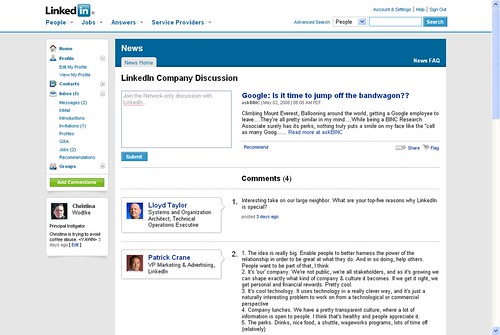

