
I'm sorry if you are trying to leave a comment on this blog. This may be the final straw. I think I may finally move to Wordpress. it breaks my heart, since I helped with early versions of Movabletype. But it just gets stinkier and stinkier every single release.
When are they going to start usability testing ballots, already?
I don't know why, but my dad does love stupid interfaces. Perhaps it is the human in the machine, revealing itself...
In Lotus Notes email, if you have an email message open and click on the "delete" button, you get this error message: "Cannot remove NotesDocument [sic] when instantiated [sic] by NotesUIDocument [sic]." I just LOVE that one! It really reads like parody. (And doesn't explain why there IS a delete button if it won't work in that view.) I suppose it shows I have a geek sense of humor, but I find it very funny.
"When one buys a print on Flickr/Yahoo, the order form calls for "name on credit card." In my case, all the cards I use have "Griffeth A. Wodtke." I then put in all my info -- name, card number, expiration, security code -- and get a message "special characters are not allowed. Please remove them and try again." I couldn't see any special characters, so I redid the credit card number, no luck. Redid the security code, nope, not it. Redid the expiration date, not that either. At that point I concluded it was a glitch and the thing just wasn't going to work, so was about to give up, when it occured to me to delete the middle initial and period. As you of course have known from the beginning, that was it. But is this user friendly? What if the person doesn't know what a "special character" is? I sort of do, but don't really think of a period as a special character, more like # and $ and < and such. And when you ask for the name on the card, you're going to get some with middle initials. Interesting example of designers not thinking it through. Bet they've lost some sales because of that."
Okay, I'll admit it. This has become the cute baby/bad basecamp website. Now that I'm back from Europe perhaps that'll change. Perhaps.
In anycase:

Hmm what do we see here? Could it be a popup with contents too big for the window, and yet scrollbar set for "no"?
How do I interview people (for the press, not for jobs)? | Ask MetaFilter is just a terrific comment I tripped over, especially for those doing user research.
If I could do one thing to basecamp (having been using it for the first time for a couple months now) I'd add a tiny wiki. Projects need a place for permanent links & lists. basecamp doesn't seem to offer an place for that.

If you click the link, a message will go to me, the blog owner. But guess what: I can't do anything about the problem. The "questionable" post isn't held for my approval. It doesn't exist in the system, it's merely rejected so I as admin never see it unless you the poster mail it to me. And look at the text of this post: I have no idea why it's questionable, and what I as a poster should do to try to fix it.
How did I get this posted eventually? It was no small workaround, I'll tell you. I changed the text body to the word "fish", then posted that. Then I went into the tool and replaced the word "fish" with the desired comment post. I first tried replacing one potentially questionable word after another in the orginal post, but eventually gave up after five rejected attempts and used a placeholder. Please don't ask me why the word "fish". That's just how it is. We've all got our personal foobars.
It's particularly painful to me as the site moderator because I feel I'm represented as someone who disapproves of the post, yet could be talked into posting it if I was contacted. Instead I'm someone who is fine with the post yet cannot do anything simple about getting it up. If I didn't love you, my dear commenters (even when you are mean!) I think I'd just say fergetaboudit and turn off comments. I'm not sure what is worse; comment spam or MT's fighting of it.
I've restrained myself so far in expressing how painful I find MT because I adore adore adore the staff that I know over there. But I lambast yahoo, google and realplayer every time they are moronic. Criticism sometimes leads to improved behavior. I pray it will here. Because this product sucks.
I juiced with the Philippe Starck Juicer, and it made me sad.
Juice flies everywhere. The item is not stable-- it wobbled with each turn. I found myself starting the orange on the juicer, then finishing just with hand. Gorgeous, but art not appliance. In case you were wondering.
Compare to the juicer i own, a wedding present from my sister. It looks like a Brancusi, but works beautifully. No splash, fast, powerful and has outlived a couple electric juicers my husband is drawn to.
When will people realize beautiful and usable are synonyms, not antonyms.
After joining Yahoo, I have taken up many of the services, including calendar, mail, movies, etc. One thing I cannot figure out is why I'm asked to log in at any given time. I haven't' been able to figure out a pattern in two years: i just know sometimes it knows me and sometimes it doesn't.
Yahoo, snapfish, ofoto, netflix, and everyone else who asks me to log in: hear me now. Ask me about my preferences. I am happy to tell you have two computers, both single use. I'm happy to tell you you can log me on forever, as I am the only oe who uses these things. read my IP. know me. cookie me. please. I'll tell you I'm not paranoid about my yahoo mail or my snapfish photos or my netflix queue because I have no secrets there. I'll tell you i am paranoid about my wells fargo account and my etrade account and don't cookie me at all there.
I will happily tell you everything, if you would please stop second guessing me, and just let me tell you what I care about. you can second guess me in teh beginnning, and be paranoid as you wish, but i will free you of responsibility if i could just set my preferences. your lawyers would probably love it.
yahoo, please stop asking me to sign in.
from Risks of Quantitative Studies
"Number fetishism leads usability studies astray by focusing on statistical analyses that are often false, biased, misleading, or overly narrow. Better to emphasize insights and qualitative research. "
and in response, from Measuring Usability: The Risks of Discounted Qualitative Studies
"The discerning usability analyst should employ a mix of both qualitative and quantitative methods when discovering usability problems. The risks of relying heavily on a qualitative approach can lead to a severe misdiagnosis especially when usability problems are difficult to detect. "
i wish instead of previous and next when mail is sorted chronologically they would use older and newer. bah.
using squirelmail-- i could write an insulting sonnet about squirelmail.
TC 510 Course Website David Farkas has an amazing collection of web-based articles supplementing his course that would make fine reading over the holidays-- the breadth and diversity of the reading would help round out any IA or ID thinking.

I was so stunned by this monument of unusability, I had to share. Of course, any software that comes with a scanner or a digital camera is usually a pretty good candidate for an interface hall of shame, but I felt this one was kinda special. It's from ACDC's plug-in, photostitch, which allows you to stick together images into a panorama, such as below.

So, since it's the end of the year, I'll let you-all find the usability problems. How fun!
We can start with: Guess what you do to launch the stitching functionality?
Guess how many times I hit "cancel" accidentally?!
Guess what words I used to describe my experience?!?!
(Answer to first question: you hit one of those big purple things above to launch the stitching functionality. Now as a bonus guess how many times I started the stitch before I had preferences set?!? How fun!
Answer to second question: 3 times!
Answer to third question #$%@$*&$*&%
Answer to bonus question: just once but see third answer for that also)
Check it out: the fly-out menu uses transparency, which means you have this mishmash of type on type. A great choice for a book that's called In Search of Stupidity

from HCI as Science | unraveled
"As the class identified, HCI has plenty of current phenomena, but due to advances in technology those phenomena are radically changing and continue to change. This is a strong contrast to traditional sciences such as chemistry and biology where phenomena are generally static. Since HCI phenomena are constantly changing, HCI is constantly moving into new domains, redefining itself and absorbing new types of technology. Basically, there are no static phenomena so there can't be an HCI paradigm. Furthermore, since there is no HCI paradigm, HCI is not a science."
I'm not completely convinced that there is no stable phenomena, but suspect we have not observed the matter long enough to see the patterns in apparently various phenomena. from an intellegent comment on that post
"The Wright brothers constructed a working airplane without knowledge of aerodynamics, fluid mechanics, etc. They just applied tried and true engineering best practices which they learned from working on bicycles (plus a ton of trial and error)." Sometimes it takes a while to understand why things work, and see what the laws are.
Still, I have long suspected HCI is not science but craft.
I was teaching personas, and a user researcher in the class approached me after extremely concerned-- the idea of making up personas, even with rich data, unnerved her. It just didn't seem scientific, and one might make a mistake in deciding who to design for. I pointed out 8 users wasn't exactly a safe procedure either. And I told her something I've noticed. if I create a persona... even if I don't use it again beyond the initial creation... I design better. and I mean that quantifiably: I not only discover more innovative solutions, I also get fewer usability issues later in the lab. If I use the persona for scenarios and task analysis, I get still fewer errors, and of reduced severity.
I'd love ot see a formal study on this, but for now I know my craft is improved by good HCI practices.
Love love love this error...

I feel my heart filling with pity for this poor, innocent malformed request.
I'm a heavy Netflix user. In my opinion, Netflix is why you buy a DVD player, not the other way around. I visited Blockbuster recently, to get a big pile of movies in preparation for tuesday's dental surgery, and I noticed Blockbuster has rolled out a new "Movie freedom pass." It allows you to keep two movies as long as you want, and see as many as you want, two at a time, for a flat fee.
My husband read the offer as we stood at the counter checking out, and snorted "same as Netflix except you have to go to the store and you get crappier films." The endlessly maligned Blockbuster clerk did not respond, merely continued to ring me up. Sometime I think the clerks' apathy provide a challenge to my husband's gallic nature, as he seems to save his most insulting comments about american culture for our arrival at the counter.
So: back to Netflix.com. They've redesigned their site. Because I visit Netflix so often, and typically from clicking an email as often as navigating there, I had the good fortune to have old Netflix and new Netflix open in two windows and was able to capture at a page of each for comparison. And here is my rambling observations...
Below is the redesign explanation page. Most sites undergoing a major redesign now respect this best practice. A few years back, complete redesigns & rearchitectures were sprung on users regularly with hardly a word of explanation. Now there is usually a tour or guidepage explaining what sort of mischief the designers have been getting into and how to adjust to the new design. Even when a design is a great improvement, users of the previous design will often have problems as they relearn the interface.
Unfortunately the vast majority of the users will not turn to the explanation page, except perhaps out of curiosity or if they can't locate a favored feature and want to see if it's still there. Tours tend to get the traffic of a good banner ad... abysmal. Still, it's good to offer help to those who seek it.

In my case I'm thwarted by the move of search (#6) from the left (common not only to the old netflix but to many other of my regularly visited sites such as amazon) to the right. I'm sure someone had a deep and passionate argument about how having the search box on the right was more ergonomic and intuitive, but damn if I don't keep looking for it on the left every time.
(There was a poster at this year's ia summit with typical location of things like shopping cart and search-- anyone have a link?)
Below we have the old netflix queue page and the new one. This is a page I spend a lot of time on, moving movies up and down the queue as my mood swings from serious to playful and my needs from blockbuster-stupid to intellectually challenging. I doubt I'm unusual in this pastime. Netflix's few drawbacks is you can't match film to mood easily.


There are two big changes in this page. One is the aqua-ization of the design. Everything is shiny 3-D macraphics. Why? Page was loading too fast? That fountain pen really enriches my renting experience! Those round tabs makes me feel so futuristic, like I'm in minority report!
I will admit that I have a personal aesthetic preference for the flat interface, and I really don't get what a 3-d tab brings to the experience. But then, OSX leaves me vaguely seasick, and when my XP machine arrived, I spent a hunk of time removing the fisher-price interface and returning to the simple "windows classic". This is my caveat... I like flat. Still, I do suspect this design will look dated pretty fast.
Moving beyond the veneer, let's consider use. This page is a highly utilitarian one. Why add visuals that don't help? The fountain pen neither helps in wayfinding nor explains how to use the page, nor sets the tone for the task. It bespeaks a designer's struggle digging through clip-art seeking an image that represents managing a queue of movies-- maybe the solution was no image?
Is an image necessary on this page at all? Setting the tone of the service's brand seems far more appropriate on the home page, perhaps lightly across the browse pages. But once you get to a page the regular committed user accesses again and again, why not make it lightweight and swift, with no unnecessary elements?
One thing the image does do is tie the tabs into the page. Often tabs are tossed on top of an interface like a hat, and have no visual connection with the page they modify. This undermines their power-- the ability to show state and provide both location and alternatives. The new tabs are far better tied to the pages they modify than the old buttonettes.
Are tabs the right metaphor for Netflix? On the web, you see two uses for tabs. the old software metaphor, which is different views of the same thing, and the new/old folder metaphor, top-level groupings of items. Amazon uses tabs in this way, as do most.
Netflix is using tabs to indicate the three different tasks a user might accomplish on their site, an atypical use for tabs. Tabs are probably the wrong widget, then. But a little rebel within whispers "I bet they tested great in usability."
Another big change you'll notice is the removal of the left-hand navigation. I'm going to assume they looked at the number of clicks this received, and decided that it was not serving any purpose beyond noise. On the other-hand, its removal basically renders this page a dead end. You've tweaked your queue, you are satisfied the right films are lined up to arrive... now what? What does the user want to do next?
My answer is usually
1. Find more movies on netflix
2. Go to IMDB and read up on a movie, or find suggestions for another.
3. Leave to do something else.
You can no longer easily do any of these on this page. Why not offer movie recommendations here? Why not do a deal with IMDB? Why not take overture text-link ads to take advantage of an exit point?
I think Amazon is the master of the "no dead-ends" philosophy. Every click provides you with a thousand other tempting offers, until you enter the check out tunnel. Netflix has got your money, the best thing they can do is make sure you view them as an indispensable part of your existence. Part of that means making sure you have a rich queue of movies so you never sit at home with no red envelope, wondering what you are paying for.
A particularly good review in Boxes and Arrows this week, Report Review: Nielsen/Norman Group's Usability Return on Investment In which messieurs Merholz and Hersch take NNG to task
"the report methodology is so fundamentally flawed that any financial analyst worth her salt would immediately question its findings."
Bad statistics analysis/ DOE procedure is probably the worst critique that could be levels against something that purports to be quantifiable. The book might still be useful, perhaps, if one wanted to wave it about while talking to management since the Nielsen norman names are two of the few known outside the practice. But then, you'd be chancing the managers might read it and then you'd look foolish. There was much grumbling around Y! when our copy made the rounds. I still feel Cost Justifying Usability is the place to place your dough, be you designer or evaluator. After all, after usability testing reveals the problems, it's design that fixes them. This marriage is the magic.
Larger questions arise, of course. As the "ROI us" movement gains steam, a few dissenters start to push back. Designers are often once removed from critical design decisions, and have trouble owning fully the results of their work (sometimes to their benefit, sometimes to their detriment). Design also often results in effects that are subtle and hard to measure, or need be measured over longer stretches of time-- something hard to convince people to do in this ever faster paced environment.
Intense and frequent measuring also can result in making design a slave to tiny jumps in quick-numbers, and an attention to the page as a series of tiny components to be optimized. Looking at Amazon lately, I wonder if their increasingly disjointed design is a result of their A-B testing. Sometimes you have to step back from the daily data and look at the design system, and make the leap of faith that a coherent design will make a long term positive user experience and go for it.
Now obviously one can choose ot measure this too. One can run longer tests, and discover if what I've said is true. But will companies do so? If you practice data-driven design, what data drives you? Is it the right data? Is it enough data? Is it good data?
from pricelink.co.uk's html newsletter:

Obviously not as naughty as say, real's hidden subscriptions, but still plenty bad. Blue on blue for the unsubscribe?
A reader has a research opportunity for DMOZ/Open Directory Project users. If you regularly use DMOZ (this includes the Google Directory) to search for or browse websites, she'd like to talk with you. She's also interested in talking with you if you currently are or have been an editor for DMOZ or any other open directory. Contact me if you are interested in participating in this research. I'll pass your information on to the reader. By the way, she'll be able to offer some money for participating in this research.
Email dmoz@eleganthack.com (I've set up a forward)
Upon reading Employee Directory Search: Resolving Conflicting Usability Guidelines (Alertbox Feb. 2003)
"In recent studies on how employees in a range of companies use their intranets, an important guideline emerged: intranets should provide a dedicated search box for finding phone numbers and other employee directory information. Preferably, this employee directory box should appear on every page of the intranet, and it should definitely appear on the top levels of an enterprise portal and on the main intranet homepage.
That's one usability guideline.
At the same time, one of the most established usability guidelines for search is to provide no more than a single search box on the homepage. Competing homepage search boxes are confusing, and advanced search should be relegated to a secondary position inside the site to avoid seducing users away from the simple search, which they're more likely to use correctly.
That's another, conflicting, usability guideline. "
Mr. Nielsen goes on to be puzzled as to what to do, and resolves it by recommending emperical thinking and human observation. I think he's talking about design....
About a year ago, when Nielsen's book on homepages came out, a friend told me his employer's site was 90% compliant, and 100% unusable. How were the guidelines useful in redesigning that page?
I've also heard it said guidelines are helpful for beginner designers, before they get experience.
You know what? I think beginner designers are the ones who should be kept away from guidelines, as far as possible. Instead, they should work on looking at usable designs, and designing, and seeing their designs tested and retested (in the words of the great homer simpson, "lather rinse repeat. always repeat.").
ON the Yahoo intranet homepage, we've got a search box, a dropdown with "employee, text, and conference room" as the choices and a submit button. Occasionally I make a mistake and search for text in the employee database, but 9 times out of ten, I'm looking up an employee and for the odd times I'm looking for a form or a policy, I do usually catch the dropdown before my pinkie makes a dive for the enter key (they have a mind of their own, those digits).
Still better would be to run queries against each database and return answers from each, rather like amazon does... most of the time amazon knows if you are searching for a book or a CD, and when they don't, they offer you choices from each category. Why not apply this tidy solution to the intranet problem?
This is called design. Thinking about a problem, and thinking up answers by looking at the world around us: design. Blindly adhering to guidelines is not design. Looking at guidelines and comparing them to the world and deciding if they are applicable to your unique situation: design.
Don't get me wrong, I think guidelines are valuable. Often I come up against a usability problem and say to myself, "Hey it's a proximity problem" and can fix it easily. But those guidelines have meaning to me because they represent compressed experience.
A guideline-- such as "Place related items in close proximity to each other"-- is simple a mnemonic for the hundreds of times I've seen users in a lab not notice something because it's on the other side of the page from the thing they were looking at. The guideline really falls down when the subtleties of the rule are revealed... I've noticed that a line between two items is a hard divider for the user's eyes. One might think that the proximity rule would keep this problem from happening-- if they are close, they are associated, right? But I know proximity isn't just physical space, but also visual structure of that space. A line between two items is the same to a user's perception of relatedness as an inch of whitespace.
When I worked on the book, I tried to get around the problem for guidelines needing context by using lots of examples and stories. But I wonder if this can make up for the value of watching users use your designs.
I would say if you are a junior designer the three things you can do to become great are:
1. Look at great design. Collect books, use other people's websites that have been earmarked as good but also winning book and industrial design, visit museums. All media is relevant.
2. Watch every single session of usability testing you can, no matter how redundant the problems may seem. Sometimes the fifth user will suddenly surprise you. Take notes (it will help keep your attention high) and sketch little design solution-ideas to the problems you see in the margins of those notes.
3. Design all the time. Design for fun, design for work. Design a homepage, Design a page for your mom, your sister, your favorite charity... design design design.
And above all, take every guideline with a grain of salt. A guideline is a starting place, not an ending place for thinking. Ask yourself questions after reading an Alertbox-- "Why would a dedicated search box for employee search be valuable? Maybe that is the most common type of search. Hey, maybe I'll check the logs. Hey, maybe I'll interview some employees, and see what they search for. Hey, maybe I can design it this way....." then test and watch.
Mr. Nielsen says "The usability field is one in which empirical observation and theoretical analysis reinforce each other."
I'd add that the design field is one where thought and empathy lead to more satisfying products. Guidelines are useful when the reference thinking, but dangerous when they shut it down.
Ziya points out Fortune.com - Alsop on Infotech - Hollywood's Latest Flop
"It's clear that the studios' motivation in designing MovieLink is fear of piracy. But they forgot to make the service usable, appealing, or compelling. So MovieLink will fail, people will argue that you can't sell digital content on the Internet--and the studios will have proved nothing. "
from since1968 :: Steve Krug Interview, upon being asked about so many quality websites coming from amateur enthusiasts rather than professionals:
"I'm afraid I'm not very big on calculating correlations between things. But it reminds me of a line from an underground comic called The Fabulous Furry Freak Brothers from back in the 1970's: "Dope will get you through times of no money better than money will get you through times of no dope." Having a small budget and someone on the project with clout who really cares about whether users have a good experience--which is often the case with an amateur site--will often get you much farther than a big budget and no one guiding the whole thing.
(On the other hand, while a big budget doesn't ensure usability, it doesn't preclude it, either. Rich people can get into heaven; it's just trickier.)"
Jakob's most recent In the Future, We'll All Be Harry Potter (Alertbox Dec. 2002) is a pleasent little riff on Science fiction author Arthur C. Clarke's quote "any sufficiently advanced technology is indistinguishable from magic." It's a nice change of pace from the sturm and drang we've been seeing lately, and is marred only by the somewhat threatening last paragraph.
NNGroup and Me : A Tale of Two Tickets illustrates that sometimes user-centered isn't as important as customer-centered.
Universal Usability in Practice is a nice cheatsheet for figuring out how to design for different user types.
Zen Haiku: Password Previewing Tools version 2.2 is out. He continues to refine his tool for password choices. I rather wish he'd continue-- I wonder what other issues folks face in password selection? Perhaps dealing with passwords that require a number and a capital (a common restriction)?
turns out Amazon.com's wishlist address is not connnected to your address book, so when i updated my addressbook removing old addresses, i had no idea presents were still going to an old address. I'm not feeling very loving toward amazon right now.
One of my pet peeves is the little stars in password fields. As you all know, I am typing-challenged. I can't tell you how often I make password mistakes, with no way to catch them since I can't see the damn things. It has always struck me as engineering paranoia turned into a usability issue.
Password Usability & Typability is working on a solution...
He also offers excellent advice on password rules.
The flame bait of the moment, usability must die has a page on why AlertBox is nothing but NNG propaganda: The Day Alertbox Died.
Unfortunately his statistical evidence is based on a poor assumption... that how many links and where they link is a representation of how effective an objective critique of usability Nielsen is. That would be like saying Metafilter is more objective than the New York Times, because it has more outward links. A link clearing-house is not the same as a content producer, and alertbox should not be judged on the same scale as the very excellent but very different webword.
None the less, alertbox has been all over the map lately, from wildly inaccurate to insightful and useful. not sure what is going on in the head of Nielsen.
CHI-WEB archives -- September 2002, week 3 (#15) holds a wonderful post in which Manu Sharma takes apart the latest alertbox.
from CHI-WEB archives -- August 2002, week 3 (#8)
"People talk the way they talk. You can't hold back changes in language. It is a mistake to try. Moreover, my entire design philosophy is based around the concept of learning from users. When people use a word inappropriately, but consistently, it means that there is a gap that needs to be filled, that no word exists to describe the concept needed and the old word has been expanded to cover the gap. So I have given in: Affordances covers the concept of perceptible signs about the meanings of interface elements."
my hero.
CafePress.com's forgot password page is the first good atempt I've spotted to help those folks who not only forget their password, they forget their email as well.
Seen other good implementations of this?
On the off chance you haven't read Emotion and Design please go do so now. The Don of Usability rips down the curtain someone has erected between beauty and use, and placed them side by side in value, as they ought to be.
"My studies of cognition showed that color computer displays (or color TV, for that matter) offered no information advantage over black and white. But I would never go back to black and white computer displays or black and white television. So too should we not go back to ugly, ill-designed things. Heretical or not, it is time to have more pleasure and enjoyment in life. Although the cognitive analyses of usability and function are important, so too is the affective analysis. Let the future of everyday things be ones that do their job, that are easy to use, and that provide enjoyment and pleasure."
Tragically this is accompanied by a recently added large ugly yellow table in the middle of what is otherwise a lovely front page. Did The Don's design team not provide an extensible design with a style guide? it's a shame.
dive into mark may be the best guide out there to accessibility, but I wouldn't know since when I got there I had no idea where I was, what was going on or where to start. Like Bloggus Caesari coming late to the party means it's almost impossible to catch up (no matter how many jell-o shots you do).
As these sites gain popularity and fame as their body of content grows and word spreads, it becomes more and more important for them to take into account new visitors who will need to catch up.
A "start here" button is all it would take.
User Empowerment and the Fun Factor (Alertbox July 2002) is poetry:
"Once we achieve ease of use, we'll need additional usability methods to further strengthen joy of use. "
Say it with me:
"strengthen joy of use"
Why is Delta Dental Plan of California such a bad site?
Other than ugly, badly executed (check out those poorly crushed images) and cluttered, it is nearly impossible to find basic information like copayments or yearly fees. Hasn't the web been around long enough that huge million dollar organizations should have no excuse for bad websites? Aren't there enough books, enough talented consultancies, enough articles online that any professional site should have at least a baseline of usability?
Read Measuring the Value of Usability Engineering and consider the IA community's latest obsession with ROI.
I still think hard number ROI is a mirage, not an oasis.
Now, god knows I can barely multiply and divide without resorting to toes or a calculator, but even I know that this train of logic is poor. From Improving Usability Guideline Compliance (Alertbox June 2002), Nielsen says that he looked at 20 sites last year, 15 this year, and there is 4% better compliance with usability guidelines and therefore the internet will be fixed in 2017?!?!?!
Jumping Jesus on a pogostick.
First of all... 15 sites??? 15 sites??? I spent the other day looking at a bunch of websites that sell music looking for a good one to take screenshots for That Damn Book(tm) and most of them flaunted not only the usability guidelines, but those of good taste and common sense.
I don't know much about the infamous guidelines he uses, but I do know that the internet is too much in flux right now to hope for stable standards. Are the guidelines changing also? And honestly, do guidelines really make usable sites? Wouldn't it be better to combine testing with heuristic evaluations, if you are making grand pronouncements like "the average e-commerce site complies with 49% of established usability guidelines." The average e-comerce site...he hasn't even seen enough sites to even know what the average music e-commenrce site looks like (I do, and I'm 49% offended, and 87% despondant over the state of them)
The whole thing makes me deeply uneasy. And "International Websites lag behind"... he looked at six! Six sites? What if he looked at the wrong six sites? It's like saying I looked at 15 American women and 6 foreign women and American woman are much better looking. If someone said that to you, you'd wonder what women he was looking at... and what women he missed.
This article gives me the screaming willies. maybe I am way off base, but this seems like the most irresponsible thing that the Dane has put out. God forbid anyone read it and believe the conclusions.
Am I on drugs here? Any statisticians out there who can back me up? or prove me wrong. Hey, either way.
damn, this is an abuse of the bold tag.
Usability Professionals: Stay Prepared for Business Waves
I know you've read and memorized Jakob's column on how people skim and don't read but use some common sense! This is nearly unreadable. It's like I'm telling you a story and SHOUTING every third WORD!
graf snarf grumph.
Today Amazon introduced the soon-to-be standard dancing tab with hairy feet. Yes, another exciting innovation that will spread across websites like wildfire. 

 I should have smelled trouble when the gold box showed up. I think I remember the gold box from digging through my publisher's clearing house packet. I've finally learned to stop clicking it. All it ever offers me is blenders. Oh, Amazon, I thought you knew me better than that.
 The final insult is the message center. I thought, "hey they've been managing my friends. Perhaps they have decided to create a special email for Amazonia, the community that has sprung up around people who like the same stuff." But no, it's just spam! and does this mean they don't still send me spam in my regular email box? Nope, it means I get spam everywhere. It's like getting a big brown box from Amazon, opening it all excited-like, and discovering it's full of direct mail. bah.
If you run usability tests, you need to read Usability Testing: You Get What You Pay For. I'm not sure about many of the conclusions she drew from the fact that different usability companies charge differently and find different problems (Jared, maybe you have some thoughts on this). It seems to mostly be "People are charging too little so therefore they must be doing it wrong." I have no doubt a lot of people are doing it wrong; I've seen most of the mistakes she lists as well. But I suspect there is more to the difference in results and cost than just wrong and right.
Her assessment of common mistakes made by novice usability testers and how to correct them is dead on. It is well worth reading and seriously asking yourself Am I guilty of this? It's rare to find a practical article with applicable advice. This is one. Reminds me of one of my favorite books, By People, For People. If you don't have this book, I encourage you to pick it up. It deals with many of the questions Mayhew brings up like sample size and how to avoid influencing Think Aloud protocols.
From the Fireworks tutorial on animation:
"Animated graphics add an exciting, sophisticated look to your Web site. In Fireworks, you can create animated graphics with banner ads, logos, and cartoons that move. For example, you can make your company mascot dance across a page while the logo fades in and out. "
Yeah, that does add class.
Chris MacGregor's inspired response to Don Norman's intellegent explaination of the flash turn around issue should be required reading for anyone in web development. Especially consultants.
(reread Flash 99% bad, if you don't know what I'm talking about. esp. the ammendment)
My little site often goes after usability blunders like a dog on a hambone, and I know as I've begun job hunting I've been restraining myself-- slightly.
But is this a good idea? On one hand, I'm not a professional critic and I don't get paid to be objective. On the other hand, how can I expect you to ever trust me if I don't keep my nose clean (or get it dirty-- not sure -- damn metaphors). At least you should be able to trust me to be opinionated.
The ammendment on the 99% bad alertbox reads more than a little like a backpedal. What does that do to the alertbox's trustworthyness? It makes you wonder what are the stories that don't get told at NNG. And other consultant companies.
It also reveals the price of being bombastic and absolute. If that orginal column had claimed merely that Flash was being misused, the current alliance would go down easier with the community(s). But the attention grabbing "99% bad" that got people to the site, and probably caught Macromedia's attention, is also the reason this job is going down so badly.
What can NNG do? Here is a chance to make real change. I don't blame them for making what is the right decision: to try to help what they view as a troubled product. But they are also going to have to live with the skeptiscm and catcalls.
That's the price of guruhood.
I agree with all Jen's pet peeves, but especially Thumbnail Let-down.
????
I just read Design lacking in e-tail sites in which LL Bean is said to be a good site for usability.
Well. huh. That LL Bean?
We used LL Bean and Kinkos.com as sites to test in Carbon IQ's Discount Usability classes, and you would not believe how many usability problems cropped up. About twice as many as Kinkos.com.
If NNG is evaluating with their guidelines, they need to retinker. Because even novices could uncover a number of huge usability issues on LLBean. com. Hop over there, and I bet you can too.
I was intensely disappointed by Homepage Usability, and haven't gotten around to articulating why. sp!ked's article "Excuse-ability" does the job for me:
"For web geeks, it's fun reading what Nielsen has to say about websites that we regularly use, and that some of us might even have designed. But on closer inspection, the book reduces web design to a mundane level.
While some of the book's guidelines are common sense, others are banal. For example, 'show the company name and/or logo in a reasonable size and noticeable location' - and 'don't use clever phrases and marketing lingo that make people work too hard to figure out what you're saying'. This doesn't express a high opinion of businesses or internet users."
I really liked "Designing Web Usability" and thought it taught people to think. But Homepage usability isn't on the same par. The on thing I did liek was the set of heuristics in the front-- might be a nice tool for some consultants.
What have others thought of it?
I know I've noted tis before, but since we're talking large font versions..
The Sacramento Bee -- toolbar is another example of a tool for changing fonts.
a confusing, mysterious tiny tool. But we're moving in the right direction.
My biggest question is how can be let people with poor eyesite be aware of the large font version without overwhelming normally sighted folks? it's nice design challenge.
How can I not like an article whose number one bit of advice is "hire a Usability Specialist"
Win Consumers with Better Usability
From IT ARCHITECT ADVISOR: Create Usable Web Sites - - ADVISOR.com - -
"Hambrose says today's Web site design mentality is analogous to what occurred during the Victorian Era, when designers added elements to furniture, for example, "just because they could do it," even if those design elements didn't serve any valuable function. "
Argh, flash, run run!
I'm pondering over a new concept I call "fear of design." More on this later...
![]()
Q: So how did you get people to accept your ideas?
A: The same way I do things now. I just go around and keep saying it over and over again.
After reading User Interface Engineering -- "The Customer Sieve" Article I thought again about the idea of mapping customer losses across a site mpa, a la Tufte's beloved Napolean's March. I tried looking for the "Ask E.T." comment where someone suggested it but was unsucessful. Maybe I dreamed it....
Still. Kewl!
from Human Factors International
"We will add SCROLL BAR PLACEMENT to the long list of really bad decisions that have become standard; and therefore you will use. "
sigh.
At the airport I discovered a "webcenter" (it was next to one of the few working outlets at SFO)

The page looks pretty good, no? Good lables, good IA, good looking... and it gives me what I need: information on how to get to and from the airport. 
Waitaminute-- my dainty lil fingers don't fit on the links... good thing I didn't trim my nails....
 I guess a kiosk isn't just a website on a booth....
Brenda Laurel speaks
at stanford today-- swing by, or watch online.
Telling the Truth is an article about the lies sites tell their users. It doesn't really matter if these are really technical glitches, or confusion in communication or editorial mistakes-- to the end user they are lies, and one never trusts a proven liar....
This isn't on the site yet (not that I can find) and it looks quite valuable so I'll broadcast here. I saw Jared at Macromedia world and was very impressed with his new findings. He's always an entertaining speaker, and it was pretty cool to get some insight on UIE's discoveries.
"BayCHI-East talk
Title: Designing for Revenue: Using Research to Fulfill Business Goals
Speaker: Jared Spool
Date & Time: Tuesday February 5th, 7.00 p.m.
Location: Sibley Auditorium, 230 Bechtel Engineering Center
University of California, Berkeley
Talk Abstract:
Web site designers tell us that they have thousands of ideas on how to
improve their web site. But how do these designers determine which
improvements will actually help the business achieve it's goals? New
research from User Interface Engineering shows that careful measurement and
observation can demonstrate exactly how this happens. In this presentation,
Jared will show you how an e-commerce site can change its design to
generate more impulse purchases. He'll demonstrate how designers can change
the way categories are displayed to dramatically increase the site's
revenues. Jared will also discuss how other types of sites can use these
same principles to better achieve their goals."
Can Jobs "Think Outside the Pretty Box"? In which Raskin talks about how the new mac really is just another pretty face. When will the thinking differently commence?

I bought this book at an amazingly large used bookstore down in Palo Alto called "Book Buyers" (next to Printer's Ink), and got to read it over my flight to and from Portland.
Design by People for People is a terrific little book full of useful gems for people faced with the questions that arise from regular usability testing: how many participants, when to intervene in a usability test, effective think-aloud methods. However this book is written in such a straightforward and engaging manner, it's far less painful than digging through academic screeds.
It also looks at consulting issues (not to be missed -- Rubin's essay on Authentic Consulting) and even experience design.
It's not a book for you if you have never done usability testing before.. Rubins Handbook is better for that. But if you want to refine your skills, definitely check it out.
lately i've noticed a trend-- many of my "innie" friends are adding usability testing to their job descriptions, and calling me up for tips. "Usability - Out-sourced or In-house?" is a pretty good article on the pluses and perils of this, though I smell a wiff of fear for their jobs in the essay...
A short piece on Describing links more clearly describes a phenomena we've seen at IQHQ several times in testing: links with modifiers are far more effective than stand-alone.
I have insomnia, and am reading the latest alertbox Site Map Usability. You read it too, and let me know what you think.
My reaction was basically that he has got the core issue wrong: yes a site map might be useful, but does it have to be in the traditional form of a dedicated page that lists every single page in the site? and how well does the user have to be able to picture the IA to use the site?
What is the nature of a site map? A display of the contents of the site, displaying breadth and range. I remember Peter telling me that the only reason epinions had a yahoo-style directory on the front page was to demonstrate the range of content they had. it wasn't a particularly useful navigation scheme otherwise.
So maybe we just need to rethink our concept of a site map... maybe it's like xplane's global bottom-of-the-page map. or maybe it's simply an index page, or a yahoo-directory.
When we make maps, we don't always map every stone in the path-- why should a site map be different? Perhaps a useful map that is accessible and grokable by users is more like the wall maps of the world on my homeroom walls as I grew up in Iowa-- not one showed my home town.
(Actually I was happy if they showed Iowa. You are somewhere!)
He does say a site map should be two-and-a-half screen, but gives no advice on how to accomplish it. Perhaps suggesting something like "only two levels of hierarchy" might stop some clever folks from using 6 point type to keep their site within jakobian limits.
So what is the appropriate level of detail. That should be decided site-by-site basis, in a collaborative effort between designer and human-factors specialist.
All in all, the man is quotable: "If you wait long enough, you might become King of Sweden, but we can't wait for Microsoft as our only hope for improved website navigation."
Okay, off to bed.
Homepage Improvement - wring more results from your website
lists 10 good resolutions for improving your site in the new year. reading through, I was amazed how many classic usability issues there were-- almost all would be revealed in testing. Then I noticed they were gleaned from Jakob's new Homepage Usability book.
Has anyone read it? worth getting?
or at least for an alertbox: DVD Menu Design (guest column by Don Norman, Alertbox Dec. 2001)
It's actually refreshing to hear Don's gentle informal voice. Jakob and Don's writing styles are quite alike, yet the tone is very different. Don has a breezy quality-- you half expect he's sitting in your living room with you, explaining why the thing works or doesn't from the couch. Jakob is the graduate teacher you've run into in the hallways between classes, and while he's also human enough to tell anecdotes, he's also always on the job.
Anyhow, good column. DVD design is clearly a messy new field, and opportunities for good interaction designers and UI designers shall abound. Scroll down to his six tips, at least.
visited usable design
who is sporting this sentence "Our raison d'être is to ensure that the interactive experiences we develop propagate the maximum number of target users including the needs of people with hearing and sight disabilities." in miniscule (9pt?) un-resizable type.
blah blah blah
the usability special issue seems like more of a andy rooney special issue. still fun, though.
An interface only a mother could love
"In the 21st Century, bad user interface design is an endemic problem. And, when it comes to cell phone interfaces, neither text-based nor interactive voice menu systems are immune to the disease. Quite the opposite, in fact!"
Health care Web sites that could use a thorough exam
"The page I was redirected to is a blank white page -- the only indication that I'd gotten anywhere was this background change. "
"Usability may sound mystifying to some people, and some best-selling books may champion the obscurity of this subject, but there?s really nothing too complex about it. Usability is the extent to which a system supports its users in completing their tasks efficiently, effectively, and satisfactorily - which may also include the experience of aesthetic pleasure."
from Inf@Vis! Magazine
"The variability of human perception, the multiplicity of factors that play a part in a test with real users and the diversity of styles and web sites makes it advisable to weigh up any "rule of thumb" with extreme caution. The construction of a scientific theory about Usability is still years away."
Understanding the phenomenon of banner blindness
"It has been observed that contradictory results have been found regarding the perception of banner advertisements on the Internet. While some studies found that recall and recognition scores for banners were at a satisfactory level, others observed that banners are almost generally overlooked. In this study, it is argued that the opposing results might be explained by differences in navigation style (aimless browsing versus goal directed searching). "
marketing prof's is full of goodies today. from No Thanks, I Don't Want Any Personalization
a user says "I lie. And, I don't feel guilt or remorse. When it comes to giving out personal information online, I have the morality of Satan's spawn.
Sometimes I'm Candice and sometimes I go by my soap opera diva name, Ms. Styles.
I usually live in Beverly Hills because I know the zip code is 90210. When asked about income, I am a student who makes $0 to $12,000 a year.
Lying online is not wrong. It's survival."
I have seen this is test after test after test. people give bogus information unless they think it will be useful to them, such as when entering contensts or when buying. otherwise, they don't bother. it's part laziness, part suspicion. i know one user who puts _@_.com in all email form fields. Just enough to validate....
while liquid design is important in websites, it is 6 gazillion times more important in html email. I can't read this.
Considering all the different email clients, and all the different configuration each email client can have, html email is a gamble. Liquid design helps stack the deck in your favor.
to the sneak peek treat
marc takeno writes:
"Hi,
Just wondering what your take is on Amazon's lack of "exit" indications on any of its pages.
It takes a bit of figuring out that you need to go back to the home page and click on "If you're not Marc Takeno, _click here_". Most people can figure it out, but then again... a lot of people can't.
I know it's to keep people in the Amazon cookie loop, but I think they should make it more obvious where you can click to exit if you're on a nonsecure computer, such as a lab or public access term. Just my opinion.
-Marc"
I asked him if I could reprint his note, because i think the question of exiting pages and exit behavior is an interesting one. thoughts, kids?
Moving WebWord > Understanding Design Misfits is an good paper to read to get some thinking going on why design goes peculiar.
I'm not sure if it was quite fully thought out enough to be a paper-- it feels more like a long blog-- but that doesn't mean that some of the core ideas aren't excellent.
Personally I wrote the headings of a few of the more powerful notions on my whiteboard so I can evaluate against these criteria.. is the design insensitive? vestigal? over-adapted...?
Just stumbled over the PDC 2000 - the Participatory Design Conference, and wondered if anyone had attended, and how it was. It looks pretty dang cool!
Usage Modes that Work Together (Web Techniques, Dec 2001) is an article that helps slice up the view of the homogenous web user.
Considering interface standards on the web
Making the World a Happier Place, One Web Site at a Time
An interview of Jakob Nielsen and Marie Tahir concerning their new title, "Homepage Usability."
from You'd Think They'd Learn: Bad Design Kills Web Sites (washingtonpost.com)
"One benefit of the downturn is that companies have realized they can't continue to treat a large portion of their users like dirt," declared (Jakob Nielsen)
Discount user testing under fire
"It has become almost a truism that tests involving five different users will reveal more than 80% of problems with a design and that the law of diminishing returns means tests with further users reveal less and less useful information. ...
However, weaknesses in this approach were exposed along two dimensions by conference speakers. First, Dye, group manager MS Marketing Intelligence, warned that analyzing individual features of a complex products may improve aspects locally while ignoring the needs of the user. He spoke of the obstacles to better design: the challenge of understanding human activity; software technologies being difficult to build and our poor knowledge of work requirements and goals. "
This is an important article. We need to reshape our attitudes toward discount usability. Not so long ago I was lucky enough to do discount usability and conduct a heuristic evaluation, and the HE was much more effective at revealing a breadth of issues, while the guerilla testing could only scratch at the surface of the product's problems.
That said, having the developers sit in on the sessions made a huge difference in getting changes made.
Because it is seen as less formal, discount usability is often plagued with problems of carelessness and inexperience, including
When it is done right, it is more effective at flushing out design disasters during the design than evaluating the entire system pre-release. It can be a swift way to shake designers out of design mode, and reveal usage-related problems. it can reveal mental models, show design advantages and disadvantages, and is thus great when snuck in before conducting a redesign. But used before shipping a hefty complex piece of software? or before launching a thousand page site with rich functionality? Here you want to rigors of formal usability to assure your company's reputation won't go to sea when you ship.
in my personal opinion, discount usability when done correctly is an excellent design tool and a poor evaluation tool.
I'd like to hear your thoughts on this matter... what problems have you seen with discount usability testing? What wins has it given you?
I guess when you've been doing this long enough, you start to see common problems crop up again and again. Noel pulls back the curtain with an interesting post on AA's new metanav.
Eloquent rant onTextism about you know who....
End of Homemade Websites (Alertbox Oct. 2001)
He's at it again: Jakob starts with an outrageous statement, follows up with some uncited statistics, throws in a bad and excessive metaphor (bake your own bricks indeed!), moves to a left-handed pitch of his research product, and then shows that he doesn't get out much (heard of Bigstep, J?) and finishes with a conclusion built on a whole lotta nothing. Perhaps the increased publishing schedule is getting to him, but this column needs to go back to the drawing board. Or if Mr. Neilsen wants to throw out his theories half-baked, he should get a blog.
Compare it to this small gem where Mr. Neilsen puts his finger on a key problem... not sexy, but needed.
Is there no middle ground?
Deborah J. Mayhew points out you get what you pay for: discount usability will not do the entire job. She goes on to say that guru's also aren't worth the money. While I do think she generalizes a bit, I agree with her on several points, especially the fact that websites are far more complicated and need more extensive testing beyond typical discount methods.
However, there are aspects of discount I still think are right on, including ditching labs and using smaller samples when time is limited. Some usability is still better than none. I think the key problem is that discount usability should have been a fix for projects with tiny budgets and timelines-- instead they've become the defacto standard, and that isn't the way a grown-up company should go.
Three Questions For Your Web Agency
"Everyone's a usability expert nowadays. But does your potential web agency really take usability seriously? Three simple questions can help anyone choosing an agency find out before it's too late..."
Mary Deaton looks at automating usability
Tog looks at the way airports have changed post sept. 11th, and how they should change.
Jakob Nielsen's Alertbox for September 16
"New mobile devices and services are more realistic and useful than last year's models, and will likely expand mobile device adoption. Design usability and simplicity are key, particularly for the automotive market where complexity can be dangerous."
Evaluation Methods in Usability Testing
Or, how to tell that you have a usability problem before it gets to the field.
Guerrilla usability mary Deaton tells it like it is:
"Before we look at when and how to test, let's list some guiding principals:
Ben Henick, driven into a frenzy by the shoddy whitheouse.gov, catalogs its failings with virulent accurancy.
webword points me at another useful tool for our toolbox, the Fly on the Wall observation method.
Ben Henick, driven into a frenzy by the shoddy whitheouse.gov, catalogs its failings with virulent accurancy.
Apply Usability Methodologies in Intranet Information Architecture in a Real World Context Part II
"A user needs analysis is crucial to the user-centred design process. Identifying issues in the requirements phase can save companies up to 100 times over what it would cost the company to fix the same problems after the system has been delivered. Once completed, a UNA report will be the blue print from which the production team can work, ensuring that the stakeholders' intranet's goals are married to the needs of the end users."
thanks iaslash
Another gem from Dan Brown:
Usability review of PayPal's mobile version
The arguments about liquid design, scalable fonts and line length comes up again and again. You may wish to track down one of these publication for the next time it springs up.
"Line length was found to be a significant factor in influencing reading rate, whilst comprehension remained relatively constant. Long line lengths (about 100 characters per line) were read faster than shorter lines. However, this line length is judged as least easy to read, and people are generally in agreement that 55 characters per line is the easiest to read. "
later that same day
A couple more items
smoking gun has a way to use css and js to control layout while scaling (or so I am told) and this is an intriguing look at the browser as canvas...
still later
Dao of Web Design is a great article on accepting the medium's nature.
I don't know how I missed Whipping Users into Shape , but it's a hoot...
"Ease of use is out. Design your sites to be hard to use. Hard to navigate. Hard to access. Here's a little gem of advice: Use dark colors on dark backgrounds. Winnow out the deadbeat Web surfer chaff."
And although there are so many things wrong with this gem I ran out of fingers and toes counting them, he challenges some assumptions that desperately need to be challenged, such as the model of the user as channel surfer.
"What people are contemplating on their word-processor screens is the operation of their own brains. It is not entrails that we try to interpret these days, nor even hearts or facial expressions; it is, quite simply, the brain."
-Jean Baudrillard, America (1986) via philosophyquotes.com
It's not Jakob Nielsen's birthday, but I meant every word I said.
went over to a friend's new company to see the prototype of their new website. guess what palette they used?
matt's back from Australia, and that means mefi's up again!
Personal note: Travis is the latest rat to leave this city and he'll be missed.
 it's not his birthday Jakob's Nielsen's is actually October fifth, making him a libra like yours truly. It's another dane's birthday.... but the thought remains the same. As we mock, remember to thank as well...
orginal post Though we all like to scream about his pronouncements or catch him when he makes an error in his own rules, it's time everyone who has a job relating to human factors to acknowledge that Jakob Nielsen's tireless promoting of usability is very likely the reason our bosses or our clients are willing to consider allowing usability testing.
Jakob paved a road for us to drive down made of his controversial titled alertboxes ("flash is 99% bad" anyone?), his scholarly and his accessible books, and his innumerable keynotes and commentary in the press.
He shoved usability into the web culture consciousness, fought against the painfully gratuitous bells and whistles that accompany a new technology, helping cure those glaring flaws with reasoned advice. He undoubtedly helped the web mature into the admittedly adolescent but pervasive and oh-so useful medium it is today by reminding us all that someone was going to want to use the damn thing.
So I want to say, Happy Birthday Jakob. What about adding a few more items to your Amazon.com Wish List so we can say thank you properly?
Is a high priced usability "Guru" a good investment? is an interesting and brutaly honest look at what you get when you buy guru-usability. He makes several good points including the fact that gurus don't know *your* audience: "even the best usability Guru is unlikely to have a suitable understanding of your customer profile and their critical cognitive structures, such as prior learning, experience with other software, and motivation"
worth a read...
yesterday's opening thang said server logs couldn't tell you what your users bandwidth is. it seems I was mistaken. useful stuff!
John tells of his pain with microsoft's listbot; not an interface tale but a customer relations story....
the chi-web list has had some interesting threads lately. if you aren't subscribed, you may wish to check these out
Usability contributed to my layoff
Unemployed and selling usability
The Usability of Usability (over three weeks)
Sean Smith wrote and asked me for ammunition against pop-up ads. The article "Pop-up Internet Ads: More Eyeballs - and More Frowns" and a a good thread on CHI-WEB was all I could track down. I'd like to ask EH readers to submit anything they know as well (for all you know he's working on *your* favorite site)
My own experience in recent testing was that all users closed pop-ups as quickly as possible as soon as they showed up. Yes, all. It was amazing; they could often close them before the contents even loaded. However, the staistics from that same site showed that popups had the highest click through rate of any ad. One HCI friend suggested that it might be people simply missing the x-close button and accidently clicking through....
I did find this interesting article on popup killing software, but no data on how often its used.
I'm kinda of back-- returned from Seattle, the talk went great thanks for asking. For you dear readers, I offer this small URL
if you want the heaps of notation that went with it, you'll have to sign up for the next conference. That will be a macromedia Conference, and in hopes of giving the best talk to that very special audience, I'd love it if anyone can share special Flash-usability challenges.
meanwhile the plot for badpractices continues to take shape. please drop any suggestions you may have here
or take the survey
and as Philippe and I find our daily rhythm, I fear the gleanings will still be more sporadic than regular. But hey, ain't love grand?
My flash-usability research has led me to Girlzilla's Usability Testing Tips. Even if you couldn't do usability testing, if you did the first four tasks you'd probably improve your product.
If you create a list of tasks (#4) based on the user and business goals, then go through them yourself with #3, your target user, in mind you will probably quickly spot many usability problems....
Also interesting was their "Flash Usability Tips," though the reason it interested me was that it wasn't much different than most web usability lists. I know there must be usability challenges unique to Flash-- anyone want to share a few?
While getting prepped for an upcoming conference, I did a quickie google search on flash+usability, looking for a wonderful article on fitts law on flash I'd found before. Look at the first result
MORE..."The Effects of Cross Cultural Interface Design Orientation on World Wide Web User Performance"
"I'm the purveyor of truth," Nielsen says of his consulting work, "the one who points out that the emperor has no clothes."
"Merien's tutorial shows how to use Flash as a tool for creating straightforward, serviceable, functioning Web sites."
HT Consulting How (much) to Intervene in a Usability Testing Session
Q&A with Jared Spool
and a recent article from UIE
Are There Users Who Always Search?
Where Should You Put the Links? A Comparison of Four Locations
"participants indicated that they believed that embedding the links within a document made it easier to navigate, more easily recognize key information, promoted comprehension, and was easier to follow the main idea of the passages while searching for specific information"
also check out their studies on font sizes and layouts.
This Week's Agenda: The Usability Industry
Michael Roberts takes off where Nielsen leaves off.
"With usability gaining greater visibility, this is a good time to implement a user-centered design process. This article looks at ways that the approach and techniques of such a process can be applied to the task of introducing a new process."
several other interesting papers here on both IA and usability
Marketing (not maddening) research
"Elemental forces shape the world we live in: oceans struggle with continents, wind erodes mountains, and marketing departments conflict with customers. Marketers need to know about customers in order to do their jobs, yet the methods that they use to get this knowledge can interfere with customers' desires to achieve their goals quickly and easily. And businesses fail when customers leave."
Part project management, part IA and part usability,The Visual Learner's Guide to Managing Web Projects in a nice simple intro to the real secret of successful web sites: plan it before you build it.
Guess what-- it's free.
Download the PDF and go kill a few trees on the company dime-- you'll earn it back for them with what you learn. Hey! be sure to check out page 55. #'s!
Somebody is confusing branding with marketing. Not the same kids!
"Good Grips kitchen tools grew out of one man's desire to build a better potato peeler for his arthritic wife. It has become one of the great marketing stories of the last decade, garnering a huge market share. Software designers can take from it two lessons: Good designs for the disabled can also benefit the normally-abled, and effective product design must come before "branding.""
We're defining brand over on EH. Come join in!
Cooper takes on the web's Bermuda triangle--- the shopping cart -- in Beating the Checkout Blues
Internet Magazine: The future's bright! (via tomalak.org : : not dead after all!)
"Q&A with Jakob Nielsen. Ultimately, we all need to take our own fate in our own hands and demand usability. Refuse to use Web sites that are complex or that pop up too many annoying ads. Only buy consumer electronics products that have been reviewed as being easy to use."
Steve Krug interviewed on webword, and he is charming and interesting as ever
Good conversation happening on my site about the useit.com usability analysis
Usability Analysis of UseIt.com
Usability Analysis of Useit.com
This report is an analysis of factors affecting usability for the UseIt.com, a web usability site authored by Jakob Nielsen, renowned web usability curmudgeon.
Grow Your Site, Keep Your Users Computerworld News & Features Story
sites of eBay's size and growth rate always have special usability concerns
"Why having access to a usability lab can be a hindrance. " (via
webword.com)
Interesting blog entry on a usability practioner's experience being forced
out of the lab and into the field, and what he learned there.
New Jakob and this time I have to agree. PDF's make me crazy.
Useit.Com: Avoid PDF for On-Screen Reading.
"Forcing users to browse PDF documents can reduce your website's usability by about 300% relative to HTML pages. This is my rough estimate, based on watching users perform similar tasks on a variety of sites that used either PDF or regular Web pages."
Now read "Why is user centered design so important" and you'll both learn and experience the problems with PDF's.
How to Deliver a Usability Report
"The finest set of recommendations will be rejected if the form in which
they are received is seen as hostile or belligerent. I recently received a
copy of an unsolicited report sent to a firm that seemed unimpressed with
the writer's efforts. The reasons why are instructive to us all."
http://www.asktog.com/columns/047HowToWriteAReport.html
Internet World: Deconstructing Maytag.com. (via tomalak.org)
"Terry Swack and John Shiple. Few sites have such a strong online brand and
identity. Browsing products is a sweet experience. The well-structured,
cleanly designed site makes finding products very easy, and the tons of
information available is clearly presented, which makes ordering simple."
http://www.internetworld.com/060101/06.01.01decon.jsp
The Four Horsemen of Usability --
"As of June 2001, four web
properties control more than 50% of all the time spent online by U.S.
surfers. This means that you can throw away your usability guidelines and
follow these companies. They spend millions on usability testing and they
are driving standards by sheer market force. You have no choice but to
follow their lead."
http://webword.com/moving/fourhorsemen.html
In the UK, the government's going to switch off analogue TV sometime between
2006 and 2010 which has created a bit of a dash to digital interactive services through these
new generation TVs... designing for a platform constrained in terms of its display, performance, modes of interaction and mainstream, non-tech savvy users with no attention span??? FUN!!!!
'going interactive on television isn't always a good thing, says Mr
Daly-Jones. Serco's research has shown, for instance, that interactive TV
viewers aren't necessarily interested in having control of camera angles.
"There's a reason why professional camera editors exist," he says. "Watching
TV is supposed to be a social activity, so in some instances with
interactive TV one person controlling the remote can lead to all sorts of
trouble." '
serco's research on interactive TV usability (also wap/smartphones and PDAs)
http://www.usability.serco.com/research/research.htm#research
and an E-group^H^H^H^H^H^H^H sorry yahoogroup...
So happy to have found this again: Keith Instone explains how to apply heuristics to the web
Rowley, David E., and Rhoades, David G. "The Cognitive Jogthrough: A Fast-Paced User Interface Evaluation Procedure.'' CHI `92 Proceedings, (May 3-7, 1992): 389-395.
been looking for this for awhile: WebReview.com: Site Usability Evaluation
A poxy on webreview for breaking all the links to their fabulous articles; on the other hand a thanks to them for not taking them down...
OPENING THANG
Still busy, though I am occasionally sneaking off to add a blog entry here and there. I finally solved the a-list mystery, thanks to Anil. Check out the blog for the story.
Now I need something new to obsess about. I'm thinking it might be typography...
I love type. I think I feel about type the way hetmen feel about women. I don't understand it, am incredibly drawn to it, fascinated by it, can stare at lovely type for hours.... I download font after font only to choke when the time comes to use them, and I end up choosing Tahoma over and over again (no, I can't explain my weird Tahoma fetish) for print and Verdana online. I suppose it's time to look for a typography class.
Some recent type-sites I've been exploring
and netstar's freshfont
Lines & Splines http://www.linesandsplines.com/
And Chad writes:
"before I fall asleep, here is the beautiful weblog I promised:
and here are two great examinations of typography:
http://www.textism.com/writing/
http://www.textism.com/textfaces/ "
DESIGN MATTERS
tired of the 216 and need more colors? get more crayons
the return of psychedelia (via metafilter.com)
Hobo Signs (via giantant.com/antenna/)
The iconic language of the hobo
IA MATTERS
RE: Cory Doctorow. (via tomalak.org)
"The idea is that you have a folder on your desktop, you put some things in it you like, and it will fill up with things that you'll probably like. It figures out what you'll probably like by finding peers in the network who have taste similar to you and telling you what they think is good." dude!
BLOG OF THE DAY
In that "html chic" category of cool designs + lots of humorous little insights accompanying the links.
USABILITY MATTERS
Statistical Research: Pop-ups more noticeable and more annoying
"Internet users are far more likely to notice pop-up ads than banners,
but they are even more likely to be annoyed by the pop-up ads."
Business 2.0: Better Data Brings Better Sales. (via tomalak.org)
Jakob Nielsen. B-to-B sites often try to get away with approximate pricing, because of the assumption that the two companies will meet in person to negotiate. Even so, users still like detailed price information that discloses how much each feature or option will cost.
MARKETING MATTERS
Darwin Magazine: Do You Really Need a Customer Czar? (via tomalak.org)
"Some top execs can't imagine life without a CCO; skeptics contend that for many organizations, creating another seat at the boardroom table could very well be a recipe for disaster. Does your company need a CCO? Or is this a management fad you'll want to take a pass on?"
TECH MATTERS
prepackaged css layouts. via kirk (morecrayons.com)
BlueRobot's Layout Reservoir has some elegant examples of CSS layouts:
Glish.com has some cool layouts too:
As does the Noodle Incident:
Noodle is dropdead gorgeous, btw...
NEWS & COMMENTARY
Some of dot-com jobless having fun
"Valerie Hoecke, at age 28 already a weary veteran of the dot-com world, is now focusing her time and energy on something new: rock climbing." Go Val!
Spam vengeance feels oddly satisfying; a simple click costs spam software companies from a few pennies to a few dollars.
read article
CommerceNet: Most ecommerce firms outsource work
"Almost three-quarters of ecommerce-enabled companies are currently
outsourcing, or planning to outsource, parts of their work."
APROPOS OF NOTHING
thank god for geocities.
AND FINALLY
Adam of V-2 writes:
"Excellent, and I mean AMAZING, article in James Gleick's "Best American Science Writing 2000." It's not available online (believe me, I looked), but it's worth picking up the book for. (Anyway, the book also has a piece by *The Onion*, so you know you can't go wrong.)
The article in question is called "When Doctors Makes Mistakes," by Atul Gawande, and while it sounds like a FOX TV special, it is a compassionate and surprisingly deep inquiry into task and failure analysis where "failure" is literally a matter of life and death.
Gawande deals with "latent errors" built into systems which assume human infallibility, cascades of trivial errors in complex systems leading to systemic failure, critical-incident analysis, and the search for the elusive sixth sigma of quality.
It's not IA precisely, but just exactly 'cause it comes at IA-centric issues perpendicularly, it sheds some innaresting light on our concerns. It's fascinating to see, for example, how long it took relatively trivial human-factors insights to be accepted even in truly mission-critical areas like anesthesiology. And anesthesiology adopted these insights far ahead of the rest of the medical/surgical profession!
Anyway, I think it's worth a shout-out to your readers...
Plus, as you know, v-2.org has been nominated for a Chrysler Design Award, further information regarding which may be found at
http://www.chryslerdesignawards.com
I am of course near-mute with gratitude and amazement."
Congrats Adam!
OPENING THANG
Well, I don't know about you, but it has been a crazy week for me. Very busy at IQHQ. Which, in these tumultuous times is not something I'm going to complain about. I snuck in a couple of hours to get greymatter running for gleanings, and I think you'll like the results.
{{you are already here, so link removed}}
Also in a strange mood around 1 am I suddenly changed the look of the front page. If I could decide I liked it, I might propagate it through the site. But I'm puzzled-- I just broke my own process
DESIGN MATTERS
Interesting article about back-biting on ALA
Happily misspent some time downloading fonts from the lovely büro destruct . Be sure to check out the book pages.
A recent post on chi web set off a great exchange of sites with innovative
navigation (and unfortunately some rather snide commentary. everyone is so cranky
these days)
USABILITY MATTERS
Noel deconstructs an online bank on the CLog
and Peter attacks Style
NEWS
My sister (stylewithsubstance.com) sent me this article proclaiming the web is the best thing since sliced bread for small business.
Three e-business myths debunked
Dylan Tweney: Open secrets. (via tomalak.org)
These technical and market forces combine on the Internet to create an environment where information of the most private nature can quickly be disseminated worldwide, in seconds. In other words, "Information wants to be public."
and even if it doesn't want to be...
3 Charged With Giving Lucent Secrets to China
(Registration required.)
ebay is following Yahoo's lead in banning all hate-related memorabilia
Ebay to Ban All Hate-Related Items
"The online auction site extends its policy as it makes an aggressive
push into international markets."
read article
Razorfish Founders Quit Top Management Positions
"Mr. Maheu, who once oversaw North American operations and corporate development at Razorfish, called Mr. Dachis and Mr. Kanarick "industry pioneers and visionaries" and said the company's goal was to "return to profitable operations and positive cash flow while successfully serving the expectations of our clients, shareholders and employees."
read article
my commentary
http://www.eleganthack.com/blog/archives/00000038.html
Why I'll never use Blogger (via webword.com)
"For those unfamiliar with security, the FTP protocol transmits usernames and passwords in clear text modes which, means anyone on the Blogger network can easily sniff out a username and password to log into your webserver, plain and simple. I'm not saying anyone at Blogger would do so, at least I would hope not, but who's to say that someone won't compromise Blogger's network in the future? Are you willing to take that chance?"
read article
I've heard similar things about greymatter....
APROPOS OF NOTHING
I've decided I don't care if this is an urban legend or not.
"Oh my !!! Nice Kitty!!"
Put simply, Snowball is no ordinary cat, she measures 69 inches from nose to tail and weighs in at 87 lbs.
MORE...Another User Interface Engineering White Paper.
Mr. Spool quotes "When users successfully use the categories on an e-commerce site, they actually are 3 times more likely to make an impulse purchase on the site." and says to the SIGIA list "I've believed for a long time that IA is critical to the success of sites. I'm glad we've finally started to get some convincing
evidence to prove it.
Of course it's all about registering to download the paper, but heck, he can say IA is key to website sucess as much as he wants! Go Jared...
From: Gleanings
To: thinkers
Subject: Gleanings: a buzzing bee....
OPENING THANG
been busy. very busy.
recent projects:
keeping http://www.carboniq.com/log entertaining (along with clever noel)
getting http://www.carboniq.com/events/cocktailhour/april live
making http://www.tracystroder.com for a friend's upcoming art show
Oh, and that billable work thing....
but I haven't forgotten you, dear gleanees. here is a nibble to keep you
going until I can emerge again...
IA MATTERS
Don Norman points to this as a potential innovation in navigation. Worth playing with, for sure.
http://www.primavera2001.org
~~~
Researching web sites - paul nattress
Describes a technique on researching your competitors web sites to help you design your own.
researching_web_sites_pn
~~~
Scents and sensibility (via giantant.com/antenna/)
IF WEBSITES are built without bricks or mortar, why does navigating around them so often feel like bashing your head against a wall?
and the original xerox parc scent study
~~~
big hairy pile of cog-psi papers, (via peterme.com). yum-o.
DESIGN MATTERS
Have you had your superbad today?
~~~
reboot
.threeoh.
USABILITY MATTERS
Internet World: Is Usability Really Worth Anything? (via tomalak.org)
Jakob Nielsen. Is usability really that bad for business? Basically, all
usability does is generate more sales, more traffic, and more loyal users. If
you lose money on every order you ship or every page view you serve, then
increasing the volume will indeed result in a flood of red ink.
~~~
IBM developerWorks: The usability world according to Tog.
"Effective interfaces are visually apparent and forgiving, instilling in their users a sense of control. Users quickly see the breadth of their options, grasp how to achieve their goals, and do their work."
"Effective interfaces do not concern the user with the inner workings of the system. Work is carefully and continuously saved, with full option for the user to undo any activity at any time."
"Effective applications and services perform a maximum of work, while requiring a minimum of information from users."
read article
~~~
New AskTog!
Is the Internet Really Collapsing?
"Fear is in the air. A lot of us have lost a lot of money in the past year. It seems like the downward spiral will never end, but it will, and then things are going to get a whole lot better. "
read article
NEWS & COMMENTARY
The Web Grows Up
A dip in Net surfing last December raises the question of whether the Web, like other media, is showing signs of seasonality.
read article
~~~
Napster Tones Down the Downloads
The number of songs traded on the service dips by more than a third during its first month of blocking copyrighted music, a report says.
http://www.thestandard.com/article/1,1902,24127,00.html?nl=met
I think it's true-- despite attempts at misspelling, I couldn't find a single live soul coughing song (I've bought all the albums, and I need more!!!)
APROPOS OF NOTHING
H4x0r Economist
(via captaincursor.com)
read article
~~~
Okay you have to be a web geek *and* a car geek *and* read a little french:
click several times on the car.
read article
developerWorks : Usability : The usability world according to Tog
"Effective interfaces are visually apparent and forgiving, instilling in their users a sense of control. Users quickly see the breadth of their options, grasp how to achieve their goals, and do their work."
"Effective interfaces do not concern the user with the inner workings of the system. Work is carefully and continuously saved, with full option for the user to undo any activity at any time."
"Effective applications and services perform a maximum of work, while requiring a minimum of information from users."
The Human Factors article on monitor resolution has stirred up some fun debate:
rudy wrote:
this kinda sticks out -- "A website is best when it is designed for a monitor resolution that matches the monitor resolution of the majority of your users. This provides a full-screen layout for those who desire to use the full width of their monitor for web pages."
~ Error #1 "A website is best when it is designed for a monitor resolution" -- a web site is best when it is designed for what you *do* there
~ Error #2 "the monitor resolution of the majority of your users" -- so, by this logic it's safe not to code for the blind?
~ Error #3 "This provides a full-screen layout" -- in other words, they haven't quite mastered the liquid layout concept yet
~ Error #4 "for those who desire to use the full width of their monitor for web pages." -- which naturally includes all the clever people at human factors
and aardvark wrote
Dr. Bob Bailey (the report's author) and I have exchanged a few emails about the report, primarily to address his assertion that my article states "...that as monitors size get larger, offering larger viewable browsing areas, users tend to concurrently open more pages." This is not at all what my article states. In fact, my article tries to avoid drawing any conclusions, and simply shows the numbers. Now, the numbers suggest that people will surf full- screen up to 800x600, and that viewable window size is never the same as available screen real estate. The chart in the WebReview article pretty much shows it all. Dr. Bailey seems to understand my points, but I don't know if he'll be updating the report.
Other issues I had included his lack of understanding of liquid layouts, and even the comment, "To make it even more difficult, any serious discussion of monitor resolution also should include a discussion of monitor size." Monitor size is not a factor. Window size and screen resolution are the two factors.
And nobody even touched the bit-depth data I gathered...
From: Gleanings
To: flashaholics
Subject: Gleanings: I lied
OPENING THANG
Okay, I wasn't going to glean today, but it was link-mania yesterday: the universe was conspiring to share interesting stuff with me, and how could I not share back with you-all?
IA & DESIGN MATTERS
Human Factors International Articles
ones I'm excited to read include: Managing Your Defense Against GUI's from Hell, Pull Down Menus: Out of Sight, Out of Mind, Key Tips for User-Centered GUI Design and Icons: Much Ado about Something
~~~
Like to critique other people's work?
~~~
Information Architecture, an electronic web guide
"How many times have you gone to a web site looking for specific information and you weren't able to find it? Organizing informational content on a web site can be a very difficult and complicated endeavor, and most web developers lack the skills necessary to perform such tasks. Luckily, a new discipline is emerging in the web world that is tackling this very problem.It's called Information Architecture. "
~~~
How Architects Think
"The purpose of the experiment was to study the role and potential of mental
imagery in the architectural design process."
LEARNING MATTERS
Good site for learning the basics of web design and webmastering. Simple and friendly.
~~~
Barnes&Nobel University"It's FREE - join today! Enter an online classroom now and learn everything you wish they'd taught in school. Live instructors and students are online now! "
USABILITY MATTERS
The Non-Verbal Web
"In preparation for a class I'm teaching this quarter on Interface Design, I re-read Norman's The Design of Everyday Things (aka POET), which I am using as one of three pillars of the class.
I was struck (again) by the concept of perceived affordance. My communications background causes me to think of this as "the non-verbal language of objects" -- it's how I perceive the object's mode of interaction. Whether my perception matches the design reality will determine my satisfaction. "
~~~
Helping and Hindering User Involvement - A Tale of Everday Design
"This case study provides a detailed account of the obstacles and facilitators to user involvement that were identified during the design of a computer application. The factors that affected user involvement included contracting design services, selecting users, motivating users, facilitating and mediating meetings and offering points of focus for user contributions. "
~~~
Bad Human Factors Designs
"A scrapbook of illustrated examples of things that are hard to use because they do not follow human factors principles. "
my favorite
NEWS
Greenfield Online: Consumers don't want Net-enabled cars
"Consumers are far less interested in having email or music downloading
facilities in their cars than they are in having built-in systems to
deter thieves and sensors to alert them to hazards on the road."
~~~
IDG.net: Unproductive email like "being killed by friendly fire"
"While lawmakers and company bosses are increasingly concerned about
the levels of spam email, a new study says that unproductive internal
emails take up 30 percent of employees' time spent reading email."
~~~
Netcraft: Domain name registration slumps
"New data from Netcraft shows that there has been a dramatic reduction
in new domain name registrations."
~~~
SBC: DSL users just love their high-speed Net
Internet users with high-speed DSL connections at home say their DSL
link is an important household technology and would rather sacrifice
other media before they gave up their DSL.
~~~
MSNBC: Gadgets offering 'convergence' show whole can be less than sum of
parts. (via tomalak.org)
It is an old story that keeps getting retold. Bewitched by the promise of "convergence" -- the blending of communications, entertainment and computing -- and galvanized by the Internet, engineers and marketers are dreaming up a new class of high-tech Swiss Army knives.
~~~
Guru: Engineers Won't Design Next-Gen Systems
"It's not you guys" who will build equipment and systems that are easy to use, said Norman, of the Nielsen Norman consultancy. "You're the wrong people." Instead, future systems will be designed "by psychologists and social scientists working in combination with engineers and technologists," he said he predicted.
APROPOS OF NOTHING
why are we glad flash exists? today's apropos of nothing should prove the joy of the medium:
Kung-fu, stick figure style. it was just like the tavern scene in "crouching tiger, lousy title" except everyone is a stick figure.
this arrived with the subject heading"The latest demonstration of the power of the Internet..."
http://user.tninet.se/~prv247p/hatt/hatten.swf
and in that same category of "because we can, we will"
http://member.iquest.net/~derecho/pika.swf
I cannot recommend these two short flash works too highly. my jaw dropped onto the floor (esp.. the second) turn up the sound and enjoy.
~~~
kate points at the very goofy swedish fjallfil
she says "Have you run across www.fjallfil.com in your travels? It seemed timely in light of a recent chi-web discussion about drag-n-drop interfaces (but since I'm fairly new to the list I felt a wee bit shy about submitting such a very silly site). enjoy. "
no one should ever have anything against silly! (oh, and you can click over to English at the bottom)
Been thinking a lot about rules put forth by gurus. A woman recently put forth a post on the SIGIA list about how some higher-ups came back from a conference with a bag full of rules she was now expected to live by. They included:
1. "3 goals of a site have to be identified to determine the direction and voice for the site"
2. "There should only be a maximum of seven links on each page, more than that and we lose the user. It's just too many choices."
3. "Users won't click on items they believe are advertisements. Banner ads only work if they appear on the right side of the page."
4. "Users are trained to respond to "blue" or underlined items on a site to get somewhere else.
5. "There is no need for a button and a text click through (to the same page) on the same page."
Each of these "rules" is derived from a larger, smarter principal that someone has apparently determined is too complex for the idiots building websites.
Let's take a look:
1. "3 goals of a site have to be identified to determine the direction and voice for the site"
Let's translate this one: determine the goals of the site before you start building it. Goals need to come form multiple sources:
What are the business goals? (customer loyalty? investor excitement?)
What are the engineering goals? (easy to maintain? extensible?)
What are the sales goals? (more banner space? Customized pages for cobranding opportunities?)
What are the marketing goals? (reinforced branding?)
What are the user's goals?(I want to learn? find? buy? I need it to load fast? Work on my 3.0 browser?)
It's called requirements gathering, and no site should be built without it.
New rule: Do requirements gathering before you start designing a site
2. "There should only be a maximum of seven links on each page, more than that and we lose the user. It's just too many choices."
A better way to look at this would be "not everything can be the most important thing on a page" A page has to have a visual hierarchy and organization to make sense. Which means somebody gets to have their stuff in the top left corner of the homepage, and someone gets be below the fold. It is important to understand user tolerance of information but people can take a lot more than one might suppose if it is designed well. And sites with only seven links often look empty (I've seen this in user testing) belying the wealth of content that lies below.
New rule: Prioritize your page elements. Design a clear page hiearchy.
3. "Users won't click on items they believe are advertisements. Banner ads only work if they appear on the right side of the page."
It doesn't matter where you put the ads, if people think they are worthless they won't click it. I found the eyetracking study very interesting-- it showed people's eyes were looking at banners. yet Neilsen's banner blindness study showed people have no memory of seeing ads. To me that suggests that some lovely tiny bit of people's brains is quickly taking everything in, deciding what is valuable and trashing what isn't.
What is quite more valuable is designing ads that show the value of whatever is being offered and place them where they have meaning. So ads for a credit card don't make much sense on a greeting card site, but ads for flowers, chocolate, etc do. especially when placed at that important "susceptible moment"-- you've just sent a card.. don't you want to send a present too?
People don't want to be offered stuff they don't want. it's as simple as that.
New rule: Make ads contextual and meaningful whenever possible
4. "Users are trained to respond to "blue" or underlined items on a site to get somewhere else."
They were. and then every site on the web changed the rules (except maybe Jakob).
They key principal here is "make a link look clickable" make it a different color, make it a button, underline it-- do something to say "click me."
I've been in a lot of tests recently where people used "Braille" to find links-- they ran their mouse across the page and watched for the hand to show up. Kinda of a cruel thing to force users to do, no?
see earlier post on links
New rule: make links look clickable. Don't make non-links look like links
5. "There is no need for a button and a text click through (to the same page) on the same page."
I'm going with a flat "no" on this one: I think the real issue is "Should you have multiple ways to get to the same page on the same page." In a recent usability test of a large entertainment site, you could get to each piece of content by clicking on the thumbnail, the headline or the "click here" link that appeared after a short description. Some users used the image, some the title and some the "click here" link. None of them hesitated or were confused as to where to link-- I believe because each found a link they recognized would work for them.
I recently was shopping for a cd, and couldn't figure out how to purchase it. There was no "buy now" button. However the price was linked to the shopping cart. I didn't know that, and I started clicking randomly on things until I managed to hit the price link. Bah.
Why did I put up with this frustration? Honestly, it was the cheapest price on this particular cd. If it wasn't, I would have just bought it from Amazon.
New rule: support different people's ways of doing things (support different mental models)
Got an expert's pronouncement you need debunked or re-interpreted? write me
Hungry for more? IBM has a terrific article that goes after "the rules" of software design: Debunking the myths of UI design.
From: Gleanings
To: Lazyboys
Subject: Gleanings: It's friday, it's friday
OPENING THANG
It's Friday, which means gleanings is less relevant than ever! Because you would all rather watch quicktime movies and read modern humorist than learn about usability on a Friday, right? Well, I dig you, fellow babies! "Apropos of nothing" is chock full of meaningless goodies. Just scroll past these silly "work links" Oh-- after you watch jath, of course!
Part two of "how I met my husband" (TODAY ONLY!)
How to go from moron to babe: one word. motorcycle.
http://www.jath.com
DESIGN MATTERS
my latest favorite blog
http://www.emdezine.com/designwritings/index.shtml
Machine Beauty : Elegance and the Heart of Technology
http://www.amazon.com/exec/obidos/ASIN/046504316X/eleganthack
a visual language. sugar coated pictograms
http://www.khm.de/~timot/PageElephant.html
this site is a mess, but a pretty one. it will take over your screen, and launch about 50 windows and you need every plug-in known to man... still game?
http://www.typographic56.co.uk/
USABILITY MATTERS
The Church of Usability
"Who are these special individuals, the prophets of effective Web user-interface design? We sought out and interviewed six of these inspired souls, scribed their words, and made them Web." (Did I link to this already?)
http://builder.cnet.com/webbuilding/0-3881-8-5069140-1.html?tag=st.bl.3881-8-5069140-2.txt.3881-8-5069140-1
NEWS AND COMMENTARY
Engines Idling Roughly
"Less than half of all Web pages are indexed by search engines, but 6 out of 10 Web surfers spend one hour or more using them each week. "
http://www.thestandard.com/research/metrics/display/0,2799,22065,00.html
The Ethics of Opt-In
If you're considering an electronic direct-marketing campaign as an effective and inexpensive way to target potential customers, there are a few things you should know.
http://ecommerce.internet.com/solutions/ebusiness/article/0,1467,7651_716141,00.html
The Success of Online Advertising Lies Outside the Box
"The failure of banner ads to attract clicks has turned into an overdeveloped and unreasoned caterwaul against the entire online advertising revenue model. It is important to remember that advertising on the Internet is still a relatively new business model that should -- and will -- evolve. "
http://www.newmedia.com/nm-ie.asp?articleID=2569
APROPOS OF NOTHING
Noel look askance, I laughed till I wept, you be the judge..
just do NOT skip into.
http://www.cadaverinc.com/
cool 404
http://noahgrey.com/404.shtml
for the survivor fans (or nonfans who need a giggle too)
http://www.modernhumorist.com/mh/0103/reject/
or would you prefer humor about the journalism frenzy over dead dotcoms?
http://www.modernhumorist.com/mh/0103/cliche/
now this is just cool: be sure to go slowly and start with the single penny. jumping to the end just ruins the effect.
http://www.kokogiak.com/megapenny/default.asp(thanks matt!)
The Onion's Guide to Human Interaction
http://www.theonion.com/onion3301/cybercorner.html
Apple Employee Fired For Thinking Different
http://www.theonion.com/onion3507/thinking_different.html
A FINAL NOTE
btw, the dreamhost support team was fabulous and took care of all my technical difficulties. I still say dreamhost.com is number one.
From: Gleanings
To: people Watchers
Subject: Gleanings: My sky is falling
OPENING THANG
I'm on jath-- today and part two tomorrow. he doesn't archive, so if you want to see me look silly, go now.
http://www.jath.com
I'm having host problems. Parts of my site are falling off. I'm panicking and trying to torture the dreamhost support team (who are usually angels) by sending them mail every ten minutes. Please don't write me to tell me the sky is falling; believe me I know.
So: less links, but I promise they are all tasty.
BRAND MATTERS
Noel sends this
"With marketing dollars dwindling, who needs branding? 'Who doesn't?' ask the 'Got milk?' guys. And they've got a story to tell. "
which led to
"I'm With the Brand
Hey man, if you wanna succeed in the new economy, follow the Grateful Dead."
http://www.thestandard.com/article/display/0,1151,22850,00.html
and
"Marketing Muse: The New Brand You
When it comes to personal branding, Nike is trying to put its best foot forward with its new Nike iD program. But allowing individuals to influence a brand is a slippery proposition. "
http://www.thestandard.com/article/display/0,1151,22859,00.html
USABILITY MATTERS
This article is being discussed on the CHI-WEB list
http://clickz.com/article/cz.3589.html
On one hand, he doesn't seem to get that rules for one media do not necessarily apply to the next. on the other hand, are we forgetting the lost art of seduction?
NEWS & COMMENTARY
interesting article on data's odd transitory and permanent nature.
The Net Effect: Remembrance of Things Past
By Simson Garfinkel
http://www.techreview.com/magazine/apr01/garfinkel.asp
News.Com: Audrey's life cut short.
3Com on Wednesday said it will discontinue Audrey, its Web-surfing appliance
http://news.cnet.com/news/0-1006-200-5207113.html
APROPOS OF NOTHING
"Exercises in Style was inspired by a work of the same name by the French writer Raymond Queneau. In that book, Queneau spun as many variations as he could--over 100--out of a mundane, two-part text about two chance encounters with a mildly irritating character during the course of a day. He started by telling it in every conceivable tense, then by doing it in free verse and as a sonnet, as a telegram, in pig Latin, as a series of exclamations, in an indifferent voice... you name it.
The goal of this project is to apply the same principle to comics by creating as many variations as possible on a simple one-page non-story: different points of view, different genres, different formal games, and so on."
"Welcome to the 21st century, where nothing works right, critical components of
everyday life are far too complicated for average people to operate, and the
guys responsible for foisting the whole mess upon the world don't really seem
to care."
 Hand book of Usability Testing You have to run your own usability testing? Buy this book. This is the single most useful resource for writing screeners and test scripts, conducting testing to get good results and analyzing the results.
 Designing Web Usability Should probably be required reading for anyone who does web design. Yes Jakob is didactic, extreme and occasionally outdated. He's also insightful, inspiring and holds us all to a higher standard. Anyone working in web design today should read him, if only to decide how you relate to him.
 Don't Make Me Think! A Common Sense Approach to Web Usability This is how it works: If you know nothing about Usability, buy Steve Krug's book. If you know a little about usability, buy Jakob Neilsen's book on design, and buy Krug's book for your boss. If you know a fair amount about usability, buy Neilsen's book on Usability Engineering, buy Krug's book for your boss and buy Neilsen's design book for the designer sitting near you (if nothing else, it'll inspire some interesting conversations.
Oh, and if you need to explain usability to anyone, you still need Steve Krug's book. His book is sensible, funny and insightful-- even if you already know everything he's saying it's still a pleasurable read.
It's the consumer experience, stupid. (with apologies to Mark Hurst).
a. Go their site. It's easy to download Napster. No painful registration screens (they get that information later, after you've committed). No hiding of the links users want the most (it's right at the top: download Napster, tour Napster). Last time I was on Adobe's site I had a hard time just finding where to download products, much less finding the product I wanted most: acrobat reader.
 b. Install Napster (go ahead, I dare ya!) This is the best installation of a software program I have experienced in a long time. My favorite part is during configuration. One of the choices on connection speed is "I don't know" and they let you skip the geek talk in a way that suggests not knowing how Napster works will not impede enjoyment of it. And why should you have to know about proxy-servers to listen to music?
c. As part of configuration Napster asks you if you'd like to share music with the Napster community, then searches and shares the files for you. This is what keeps Napster valuable. Each song a user shares makes it a little more likely that a song another user is searching for will be found. If you used Napster to search for Metallica songs and never found any, you'd stop using Napster.
A problem with Gnutella-- the other popular P2P file swapping software-- is that Gnutella users tend to be borrowers rather than sharers (see an article on the study). I suspect this is because how Gnutella is designed: I still haven't figured out how to share a song via Gnutella. Open source software is notoriously hard to use, probably because software engineers are rarely interface designers and open source is a pure engineering play. Without people sharing songs as well as downloading them, the service isn't valuable. And if people can't figure out *how* to share songs... .
Everyone is talking how Napster has revolutionized the internet via P2P, or by galvanizing the music industry to finally use the internet as a music delivery channel, but I have yet to see anyone point out the revolution wouldn't have come if Napster was as hard to use as Gnutella. Napster had to be easy to use to gain wide use to gain value.
(what use would a telephone be if you were the only one in the world who owned one?).
And then the revolution could begin.
From: Gleanings
To: acolytes
Subject: Gleanings: Go Do that VooDoo than YooDoo so well
USABILITY MATTERS
How should a page load? What "feels" fast"?
Quality is in the eye of the beholder:
Meeting users' requirements for Internet Quality of Service
NEWS
When the Web Gets Too Personal... and How to Stop It
Who needs a Napster fix?
Napster Fires New Salvo in Legal Battle With RIAA (Reuters)
Napster Case Makes Strange Bedfellows
EVENTS
EYECANDY
Art Center College of Design
APROPOS OF NOTHING
sending some voodoo your way:
From: Gleanings
To: gleanettes
Subject: Gleanings: It's not easy being gleaned
Sorry, couldn't resist the pun.
USABILITY MATTERS
after six seconds, wave bye bye to your customers
I know it's an old study, but it's still quite valid. go to "quicktime" with a stopwatch if you are on a modem. ouch.
and if you are saying, isn't everyone 56k and faster?
IA MATTERS
Ford-Forlizzi Theories of Experience
Really interesting discussion on UML on CHI-WEB right now,
it produced this
"Still, UML as it is now, is inadequate for effectively communicating
with non-technical people. But new ideas are rapidly evolving. I've
already experimented with colour modeling, based on the work of Peter
Coad , and found it
promising (see also UIdesign.net, which I'm sure you're
familiar with). And I think it would also be a good idea to add another
dimension to the model, e.g. an isometric perspective, the way Dynamic
Diagrams uses it."
GENERAL NEWS
from tomalak
Internet Week: Don't Trust Everything You Read, Even On The Internet.
The events that led to this damage involved a string of errors that would be
comical if they weren't so serious. They all had one root cause: the fact that
many people make major decisions based on information they find on the
Internet but don't confirm.
Advertising Age: Delta flies toward $1 billion in Web sales.
The campaign from Leo Burnett USA, Chicago, launched last week and includes TV, print and radio. Print tells customers the simpler URL will save them "an extra 0.73 seconds,'' TV features the delta-air.com URL morphing into the new delta.com, while radio asks, "Why oh why wasn't delta.com our Web address all along?''
Industry Standard: Disney Looks for the Magic. Bornstein is fond of saying the new site won't try to be all things to all people and will focus instead on a few key areas. The search engine will still be in place, but in addition to Web results, consumers will also receive user- rated sites and related content from any of DIG's dozen or so other properties...
Wired News: Eudora Retards Flames.
The newest version of the Qualcomm software features MoodWatch, an automated emotion monitor that scans the text of both incoming and outgoing email for the sorts of "aggressive, demeaning, or rude language," that typically appear in flames -- or abusive electronic communications.
 |
| fig 1.1 |
When I arrived at Apple - QuickTime I was treated to a particularly egrerioius world wide wait situation. Even at 8 seconds I still didn't have the button I needed to click to upgrade (see img 1.1)
If they had only used alt tags on their navigation bar, not only would they have made the site accessible to the blind, they would have also let me know what to click so I didn't need to wait for those darn gifs to load. There are actually a lot of reasons to use alt tags, including getting better placement with search engines.
 |
| fig 1.2 |
From: Gleanings
To: glean feelings
Subject: Gleanings: Feeling chatty this morning
USABILITY MATTERS and Christina rambles.
Mark Hurst reviewed Dr. Marten's site and gave them a pretty harsh review.
I wonder though:
is he wrong, and the Dr. Marten's is hitting squarely their current demographic, just as they do with electric blue or sequined boots (anyone else here old enough to remember when we were 'appropriating" working man boots?)
or
is Doc martens wrong... or rather, limited in thinking of the net as a flavor of television, in which peoples level of entertainment by a commercial equals their positive brand associations and thus sales.
levis has recently come under this same kind of criticism, and I think it's an important question.
what do you think? tell me, and I'll pass it on
Mark Hurst was recently interviewed by Lou Rosenfeld (heretoafter perpetually referred to as "Lou"). Mark looks 12.... and takes the Jakob Nielson "wrong headed but loud so people will listen, think and react" approach. But is always a good read.
Another site review and all I can say looking at Bose is "this is a best practice?" sheesh.
GENERAL NEWS
Internet Workforce Compensation Study 2000
by Industry Standard Staff
The Standard's first-ever review of compensation, culture and job satisfaction in the Internet workplace.
and a bunch more from tomalak, as usual.
Salon: When Big Brother knows you watch "Big Brother".
Q&A with Mike Ramsay, CEO of TiVo. We're looking at interactive ads; we're
putting ads and promotions on the disk as it goes out the door. We've got the
ability to make ads more flexible so that if you're watching an ad and you're
interested, you can hit select and it will take you to an infomercial.
Boston Globe: Bulb business.
The company's voice mail system touts it cheerily as ''the Web's number one
light bulb superstore.'' But does the Web need a number one light bulb
superstore, any more than it needs a number one paper clip store or a number
one toilet plunger store?
Business Week: Bad Timing for Swatch's Web Watch.
A Swatch spokeswoman now says the Internet Swatch has been put on hold because
of "technical questions." The company isn't elaborating, but judging from a
prototype unveiled earlier this year, the Web watch was so flawed that it may
never be put on the market.
CODE
Add helper rollovers to your links
APROPOS OF NOTHING
From: Gleanings
To: listeners
Subject: Gleanings: folded and unfolding
It's a foggy Monday in San Francisco, so I thought I'd start the day off with some humor
How people forwarded jokes before there was email.
and of course, we will all get this t-shirt
USABILITY MATTERS
it's an old song, but as dsl, cable modems and the like get more attention, we need to remember that most of America isn't there yet.
InfoWorld: The speed of business: If your pages are slow, your customers will
go.I understand the difference between Web-and host-based systems, but the
difference between 2 and 8 seconds is far too much. Our expectations appear to be heading in the wrong direction. I'm also certain we didn't become more
patient over the years.
Useit.Com: From March 1, 1997; The Need for Speed
IA MATTERS
I know it may sound odd, but I believe IA's should try folding origami from diagrams. the act of using a diagram to create a 3d object is both satisfying, relaxing and makes you consider what it takes to write halfway decent instructions. I'm sure there are other hobbies that would produce the same set of feelings and skills (model airplanes? knitting) but origami is my choice.
Of particular interest here is the "Phone Folding" --text only instructions.
My favorite of the origami sites
GENERAL NEWS
eCompany: A New Way to Keep Score on the Web.
At IRI, they gave 50,000 pen scanners to a panel of consumers to keep track of all their purchases -- an expensive proposition. Now, on the Web, they've
attracted 1.3 million surfers who willingly allow ComScore to stalk them
online and record every click.
the new star wars trailer is a hoax? (and yes, I'm a bit behind on this one. if you want your news pre-masticated, you'll have to live with it)
anyhow, if you wanted to waste your whole day watching fanfilms, check this out
Forbes: MongoMusic Fans Include Microsoft.
People like to think their tastes are quirky and unique, and Hinman doesn't
disagree. He just believes he's found a way to predict their music likes and
dislikes--down to the chord, even--using a database of songs and a patent-
pending computer program.
more on music and the napster influence
From: Gleanings
To: Sleep is for the Smart
Subject: Gleanings: refreshed and refreshing
Hey kids...
after a grueling working week I'm back. I'll never use the phrase "sleep is for the weak" again... sleep good.
Idle information....3% of my visitors have no JavaScript. They either turn it off or don't have JavaScript enabled browser. Wonder which it is.
I also have a higher than industry standard number of Mac and Netscape users
I get 28% Netscape and 20% Mac... compared to the web-wide numbers of 13.5% for Netscape and 3.5% Mac. Just goes to show you, nothing is more valuable than designing for *your* users. Anyone have an old Mac to donate so I can browser test?
(BTW I use http://www.TheCounter.com/ for my stats rather than digging through my logs)
okay, enough about me.. here are your URL's.....
USABILITY MATTERS
do not forget the alt tags!!!!!!! or it may cost you.
Still more reasons to remember alt tags, including being found by search engines.
evil bureaucracies?
Useit.Com: Regulatory Usability.
Regulatory requirements often reduce the usability of Web content and end up
damaging the exact goals they were trying to promote. Regulatory agencies
usually base their rules and regulations on design criteria that are
appropriate for paper-based documents but which don't work in the online
medium.
more Jakob
CIO WebBusiness: From February 1, 1999; Jakob Nielsen on Dinosaurs
DESIGN MATTERS
Death of the Websafe Color Palette?
good old webmonkey discoverers there are really only 22 websafe colors. hope you like green.
OTHER MATTERS
interview with author of cluetrain manifesto
NEWS
Business Week: So Who Wants to Surf the Tube Anyway?
Q&A with Lutz Erbring, professor at the Free University of Berlin. The
technology is there to combine the devices. But nothing that we've [seen]
suggests that people want to mix those activities. When they're watching TV,
they want to relax. They don't want to do any research.
NY Times: Trademarks Winning Domain Fights.
At the heart of Icann's domain name arbitration system is the Uniform Dispute
Resolution Policy, a set of rules that provide the litmus tests for
determining if a domain name holder is acting in bad faith or is out to hijack
a trademarked name.
Industry Standard: Yahoo "Ads" It Up.
Anheuser Busch might know that millions of dollars spent on ads that feature
talking frogs will lead to hundreds of millions in beer sales. But the
intuitive logic of advertising seems like a stretch to Wall Street, especially
with investors leery of Internet stocks.
APROPOS OF NOTHING
Splendid Maya Palace Is Found Hidden in Jungle
Dieting Lowers IQ of British Girls
One in four schoolgirls are damaging their IQs by dieting and depriving themselves of iron. British researchers found a highly significant difference in IQ between schoolgirls with the lowest levels of iron in their blood and those girls with adequate iron levels.
From: Gleanings
To: the old hood
Subject: Gleanings: Brought to You from the Glamourous Excelsior
I moved over the weekend, thus the period of silence. I'm now a resident of the sleepy excelsior district.
IA MATTERS
Making Tips Work
EYECANDY
I never thought I'd say this, but "cool splash page man"
APROPOS OF NOTHING
What happens when you keep getting instant messages from strangers? Well, you hook it up to an artificial intelligence, of course.
the news storythe webpage
NEWS
from tracy: maybe this will get europe more online.
Internet Access with Nopay
the message seeks a medium (from tomalak)
NewMedia: Ideas As Objects.
Scott McCloud. Yet, even though my profession (cartooning) grew out of paper and ink, I'm not a print loyalist. I'm prepared to switch as soon as print's strengths are improved upon by other technologies, and that threshold is approaching fast.
Useit.Com: From February 1995; The Future of Hypertext
Wired News: How Barbie.com Got All Dolled Up.
Their job began about 10 months ago. Every two weeks, the diverse group of
computer-savvy girls from Los Angeles, New Jersey, and San Francisco received
screenshots through email from Cheskin Research, Mattel's partner in the
project.
FEEDBACK
a friend writes:
> I feel it is my professional obligation to mention that my friend
> the IA put an apple tart recipe in her IA newsletter and forgot
> to mention in the ingredients list that there are apples in it.
it's true. takes 8 or so apples.
From: Gleanings
To: faithful listeners
Subject: Gleanings: Other People's Gleans 2
IA MATTERS
from Andi:
globalization UI issues
interview with every IA's favorite comic artist, Scott McCloud
EVENT
Conference from Creative Good (Mark Hurst) in San Francisco.
NEWS
from Muffy:
I see London, I see Uranus
from Tracy:
wap
from Vic:
what do you get when you cross a goat with a spider?
APROPOS OF NOTHING
Sixteen-year-old high school sophomore Becky Atherton, believed
to be the last remaining American who did not hate Microsoft,
announced today that she was "tired of being different" and would
now hate Microsoft just like everyone else.
LINK-O-RAMA
On CHI-WEB a call was put out for favorite CHI and web design resources here it is (it's a bit short, but that makes it manageable for this list)
http://argus-acia.com/index.html
http://Flazoom.com
http://info.med.yale.edu/caim/manual/
http://is.twi.tudelft.nl/hci/
http://stc.org/pics/idsig/
http://usableweb.com/
http://websitesthatsuck.com/index.html
http://websitesthatwork.iab.com
http://wsupsy.psy.twsu.edu/surl/
http://www.acm.org/
http://www.acm.org/dl/proc_bysig_list.html#SIGCHI
http://www.acm.org/sigchi/hci-sites/
http://www.alistapart.com
http://www.asis.org/
http://www.asktog.com
http://www.baychi.org/
http://www.bogieland.com/infodesign/
http://www.brunel.ac.uk/~cspgpjw/hci.html
http://www.contenu.nu/200006.html#usabilityislikelove
http://www.contenu.nu/resources.html
http://www.electricseed.com/joeclark/usability.html
http://www.foruse.com
http://www.goodexperience.com
http://www.hcibib.org/
http://www.hcirn.com/
http://www.ida.liu.se/labs/aslab/groups/um/hci/
http://www.info-architects.net/
http://www.jnd.org
http://www.lynda.com/
http://www.sandia.gov/itg/index.html
http://www.system-concepts.com
http://www.uidesign.net
http://www.uie.com
http://www.usableweb.com
http://www.useit.com
http://www.webmonkey.com
http://www.webreview.com
lately I've been really facinated with Fitt's law's and principals. Especially the other day when I was on egreetings and kept hitting the last page link rather than the next arrow because they were located too closely together.

So I was reading up on cellphones on ZDNet and had a survey pop-up in one of those annoying JavaScript popup windows. It wasn't banner sized, so I let it load. It was in invitation to take a survey on internet usage. Why not, I think.
I follow a link to find out if I was eligible (I didn't want to take some long survey only to find out I wasn't eligible) It loaded the rules page and at the bottom of this there was a message: use your back button to return to the survey. There was no back button. Whoever coded the pop-up had loaded it with no toolbar. brilliant.
So I got back to the survey with a right-click, said yeah, I'll take it. the first question:
1. Have you used or visited in the past 12 months:
A. A community feature/site on any Web site?
B. A community feature/site on ZDNet?
I'm a web professional, and I have no idea what they are talking about. I guess simply typing this 'blog might be considered a community feature.
Hello comunity.
Toward the end of the survey, they ask what I do professionally. There is no place for any sort of design. They have marketer, programmer, etc, but not even graphic designer much less interface/interaction/information design.
sigh
biggerhand.com has taken over my job as idle surfer...
he writes
"ok, i give. this is brilliant
of course the funniest thing is that it's terribly designed.
(if you glean it, i found the link on kottke.org. he also links to untickalot"
also terribly funny.
Idle question: what is it designers have against capital letters?
he also sends this hot new palm ap (check out even if you don't have a palm... this may get you to buy one!)
and an article on how to build for PDA's
Hey, more on my favorite lawsuit, IAM vs. Razorfish!
from Tomalak:
Darwin: Scaredy Pants.
At what point does careful consideration verge on utter paralysis? How many
times can someone steal your lunch money before you starve to death? I'm
thinking about those questions because I've been researching the Internet
initiatives of Levi Strauss.
Apropos of nothing:
from dsharp
"Japanese Seizure Robots!
THIS IS AWFUL, I KNOW YOU WILL LOVE IT!
As if the flashing colors weren't enough, this site takes MIDI music to the
heights of artistry.
Prepare yourself, then click here:
and
Business 2.0: From January 1, 2000; 501 Blues
http://www.business2.com/content/magazine/ebusiness/2000/01/01/10399
and again from Darwin mag (I never heard of these guys before, and they are great!)
Darwin: Get Real.
David Weinberger. Combine fear and aggression and you end up with companies
literally afraid to speak like human beings. It's easier, after all, to plan
an attack than to communicate on the fly and--gasp!--listen.
http://www.darwinmag.com/read/080100/contact.html
IA MATTERS
creating trust in cyberspace
iacandy
a bunch of truly beautiful odd new visualizations.. information design and IA are one.
plumbdesign thesaurus/
and the story behind it
www.thinkmap.com
more
http://inxight.com/
more
smartmoney
from
http://www.smartmoney.com/intro/tools/
more
http://www.artandculture.com
hey, anyone going to any of these?
BRAND
The Evolution of Brand Strategy
The Changing Roles of Identity and Navigation Design
Uncanny
The Art & Design of Shawn Wolfe
Published by Houston
Best known as the man behind Beatkit, the ubiquitous "brand
without a product," Wolfe was deconstructing consumerism and
brand fetishism since before he knew that's what he was doing.
See the cover image at:
http://www.emigre.com/CBUN.html
NEWS
Did you think that you can stop worrying about downloads?
Fast Company: Why the Long Wait?
Latency, says Reed, directly affects the quality of users' experience on the
Net. Although ISPs aren't blind to this issue, too few of them agree that
latency is the defining metric of their networks' performance.
Napster cannot be killed.
Industry Standard: It's Not Dead Yet.
Kevin Werbach. Rather than delaying a resolution of the major issues
surrounding online music distribution, the Napster injunction has accelerated
it. The injunction raised the stakes and also brought Napster tremendous
mainstream publicity.
yeah, these guys are the victims. sure.
Wired News: States: Labels Fixed CD Prices.
Thirty states filed suit Tuesday against the five biggest record companies and
two music retailing giants, accusing them of conspiring to fix CDs prices --
an act that the states say cost consumers millions of dollars.
the war between design and usability
USABILITY VS DESIGN
DESIGN MATTERS
A little while ago I asked what designers have against capitalization. Mike
of biggerhand.com has been kind enough to let me share his response to me
with you.
me: "What "do* designers have against capitalization?"
mike: "they get used like exclamation marks: Too Often And For Emphasis!!!!!
(usually the emphasis is that the copy sucks, but we'll build around
it with exclamation marks, or "bangs" in marketinguese, and caps.)
in the event of cap & bang bloat i usually strip them all out and get
the client to put them back in. they generally put back about 25% of
what I took out.
In one particularly dire situation I talked marketing down by telling
them that caps added significant overhead in k-count. We then came to
the compromise that we would capitalize the first word of every
sentence and the CEO's name. To give them a "warm fuzzy" I agreed to
capitalize the first word in every paragraph too.
I like making people happy! (<--bang)"
NEWS BITES
from tomalak
Business 2.0: Five Questions With Mike Mulligan, CEO of MapQuest.
And while they've got a brand that people know, it's a brand that's not
relevant online. It's like Brillo. Everybody recognizes the brand Brillo,
butit doesn't do you any good online. And everybody recognizes the brand Rand
McNally, but it doesn't do them any good online.
and for more on Rand Mcnally's struggle to play catch-up (also one of gleanings favorite
topics)
Business 2.0: World to Privacy Sites: Now or Never.
Looming legislation threatens to make many of their current functions
obsolete, and recent high-profile embarrassments have forced many of the
sites
to reconsider their entire raison d'être.
Business 2.0: The Perfect PR App.
The other day, I received a routine press release. It wasn't time sensitive.
It wasn't interesting. There was absolutely no way I or anyone else here
would've written about the contents of the release. Yet, it came in a FedEx
envelope sent via the highest, and most expensive, priority.
Computerworld: States formally object to proposed settlement between Toysmart and the FTC.
The objection was submitted by Massachusetts Attorney General Tom Reilly,
who said in the filing that the effort to sell the customer data "is a breach of
Toysmart's promise and constitutes deception pursuant to the Consumer
Protection Act of Massachusetts"...
HCI Resources: Bibliographies and Publications
Article on making Flash user friendly:Flazoom.com - Making Sure Usability 'Fitts' Flash
great article that explains why print has caused designers to design their pages upside down...
It also helps explain a phenomenon I've seen in user testing I call "land and scroll" Users come to a page and --before it's even finished loading, as soon as they have anything vaguely resembling a page-- they scroll. I've seen a quick up-down "getting the lay of the land" and a permanent scroll-to-content, pusing the global nav, banners and logo off the screen. hmmm
Was pointed to this article by the CHI-WEB list: Text and Margin Width Influences which helps sort out the #1 question that comes from liquid design: are those long lines of text interfering with people's ability to read?
found another great resource; a blog on all sorts of useful stuff: Mersault*Thinking - Information Architecture, Usability, UI, Better Design
for those folks who don't want to get on the CHI-WEB list, there is always this:CHI-WEB archives where you can read through the posts at your leisure. lately there have been some great topics: why are design firm's sitees so bad, are users growing blind to top and left navigation, how to defend usability to clients...
So faithful readers know I spent my flooz foolishly at B&N. Two days later, I decided I wanted another book and I ordered it from Amazon, my old standby. Guess what. I got my book from Amazon. No sign of my book from B&N. So I called them. I went through the maze of voicemail, only to arrive at my natural final destination: a dial tone
"if you'd like to make a call, please hang up and try again"
So I call again and pretend that I have a rotary, as I so often do to avoid voice mail. I get a voice, "barnesandnoblemayihelpyou".
"Oh, hi, I just got hung up on by the voice mail, and thought I'd try a person instead of a machine"
"tracking number please"
"guess I should of stuck with the machine"
yes I actually said that. no, she did not respond.
So I stare at the confirmation mail, trying to find the tracking number. Wait... there it is... in the subject line! Yes, the order number is NOWHERE in the actual body of the mail. I give her the number.
"That shipment has not left the warehouse"
"Okay, do you know when it will?"
"No, that shipment has not left the warehouse. "
goddmamn, I did get a machine!
"So, since it hasn't left the warehouse, can I change the shipping address? I've started a new job and I'd like it to come to my work"
"what is the address mam?"
I give it, she repeats I , i say okay, she hangs up on me. cool.
Today I received this mail
"We're sorry. We find that we're unable to ship the following in the time
frame we expected. Below are revised details on your order. We will email you as soon as the title ships and apologize for any inconvenience this causes. In the meantime, you can contact us at service@bn.com. Or, if you prefer, you may call our Customer Service Center at ..." they'll be shipping it tomorrow. maybe. I don't believe anything they say anymore. I guess I already proved I wouldn't shop there again by shopping at Amazon the day after my B&N purchase, but I think now I'll also concentrate on talking others into avoiding my experience.
bye bye, B&N, hope you learn customer service before you go under. now I'm off to fuckedcompany.com to put their URL in my pick list.
Well back in january, I was given a wedding shower present of Flooz. What is Flooz you ask? Well, it's essentially an online gift certificate or fake currency that can be spent at any of their partners. Why is is called flooz? Don't ask...
I've got my account number, which I wrote on a post-it and stuck on my monitor with a big "Spend This" written above it. I've tried twice before to spend it,and once I thought I'd succeeded, only to find my CD's hadn't arrived and I still had this Flooz in my account. Sigh. But I'm ready to try again.
On the homepage I try to figure out where to go... I finally find under the heading "stores" on one of the global nav's it says "spend flooz." On the next page I'm supposed to click "got flooz" rather than the "send flooz" but spend and send and my poor brain that though I was about to shop... Well, there is always the back button.
This takes me to a classic yahoo-style hierarchy displaying the stores I can visit. I select barnes and noble. So I get a page telling me about the store, rhter than going to the store. Okay, I scan over the page. I get to the button that says, visit the store. I get a warning splash page that tells me i'm leaving Flooz, and asks me to click again. Gee do I really really really want to leave flooz?
Finally I'm at B&N, with a flooz frame along the bottom (in case I want to go back to that heavenly site!). Okay, to give them some credit, it also has my account info there.
So, 8 clicks to get to barnes and noble.
Who then promptly almost lost the "sale"!
 |
| click to see large image |
can you guess how I made it work kids?
yep, I clicked pay by phone. yum, intuitive. Sigh.
yet another fine collection of stuff on usability. especially excited about his paper on trust
Peter "Beep" Boersma - Homepage
I've decided the Alertbox is just a blog out of control. His latest is particularly rambling.
Stumbled over this fine article that gives you rebuttles to all the arguments against user testing including some of my favorites, such as "Users don't know what they want... we'll tell them" and "We don't have time/money for user testing." Check it out and be armed for your next battle with management:
Interaction Architect: Knowledge Base
So, I know I harp on user research and usability, like, all the time. and some might be wondering, "She's an IA. Why does she carry on about all this human factors stuff?"
Glad you asked. I think of usability folks as researchers of human behavior, and IAs as designers of human interfaces. We are joined at the hip, really. By gathering a rich understanding of how users behave we can create humanized information spaces. Sure, the dewy decimal system is usable, but is it user-friendly? And if you had a choice betwen going to a card catalog and looking up a book, or going to a search engine and searching on a word, which would you choose? Or better yet, would you prefer to ask a friendly looking librarian for help?
At the ASIS summit on IA, Jennifer Flemming told an interesting story from the days when she was a librarian. She was working in the children's section, and a little girl came up and asked her for "the big purple book I was reading last week" Jennifer was able to find it, but could a search engine? It is only by understanding how each unique group of users conducts their searches (or attempts to complete their tasks) that we can begin to build successful interfaces.
IA can never been a pure intellectual exercise. It will always have to be tied to our understanding of how users behave in a given situation... which is why IA can't exist without usability testing and user research. But feel to disagree with me.
This is got to be one of the best opening lines of an article ever "While I like to kick websites and dogs, I am generally nice to children. " Lou Rosenfeld goes to town with Toys "R" Us's new website...
A Closer Look: Critical Reviews of Corporate Websites - - WebBusiness Magazine May 23, 2000
Go Lou!
So, I go to newmedia.com because I want to grab an article in which I was quoted to put in my links collection. This site is a nightmare. If you do want to read what I said you can search for women.com and click on the article, "What Do Women Really Want?" by Kathleen Hildenbrand.
Well, that's how I managed to find it.
The site uses layers, and is buggy in that special way only client-side code can be. Not only can I not bookmark the article, nor link to it, when I search for wodtke, then women.com, it keeps giving me the search results for wodtke. I have to close the browser and reopen it to get it to let me search for women.com.
Also, if you don't have a big enough browser window, then tough luck. There is no scrolling in these small layers, and so I couldn't hit the search button without stretching my browser window bigger... I hesitate to think what happens to someone who has only a 640x480 resolution- I surf at 1024. When reading an article, I can't use the scroller on my mouse. I have to hover over the little carrot to have it scroll. Which is does until it hits (what I think are) the last couple sentences, then it stops scrolling. I never do read the last two or three sentences on a page.
But the topper is the fact that their lead design story is on the value of usability testing... perhaps they might practice as they preach?
I tried to file online today, and got so annoyed, I ended up writting an essay about it in my blog.. but then it became too long for blogger's character count, so I ended up subitting it here
evolt.org - Filing online: the good, the bad and the unusable
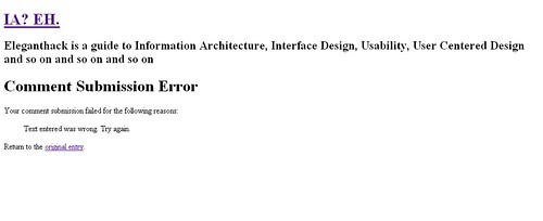