
It struck me that Tufte's description of "administrative debris" and its opposite, which I suppose might be called "proper interface/content integration" or an "information interface," may finally explain my penchant for hypertext as a user interface medium for many types of information display. HTML, and the web's basic architecture in general, is designed in such a way that demands that interface elements related to navigation and moving through content, areas prone to administrative debris, occur in a way that's naturally suited to the content.With hypertext, the information itself is the interface.
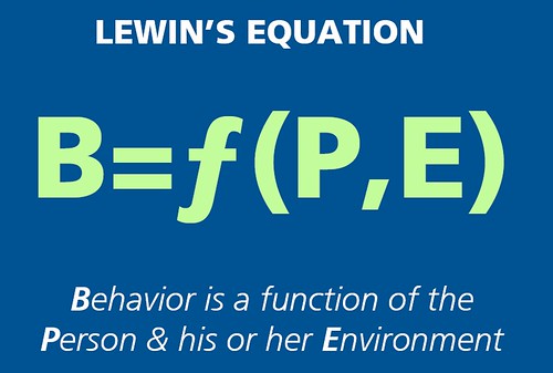
When I saw this slide on Josh Porter's terrific preso on Psychology Of Social Design the clouds parted and the angels sang.
There is a desired behavior that we need to create, we have no control over the person but, via interaction design, information architecture and interface design we control the environment.
Perfect, and succinct. I need to make a T-Shirt.
entire presentation:
Banner Blindness: Old and New Findings (Jakob Nielsen's Alertbox)
"In addition to the three main design elements that occasionally attract fixations in online ads, we discovered a fourth approach that breaks one of publishing's main ethical principles by making the ad look like content:* The more an ad looks like a native site component, the more users will look at it.
* Not only should the ad look like the site's other design elements, it should appear to be part of the specific page section in which it's displayed.This overtly violates publishing's principle of separating "church and state" -- that is, the distinction between editorial content and paid advertisements should always be clear.
I think this has been known for some time, though it's always nice to get a third party with data to support it.
What I find more interesting is how few designers are able to absorb the opposite lesson: i.e. if you make something look different than the rest of the page, it becomes invisible, not noticeable.
Let's say you have a search result, and you want to make the message that the user has misspelled a word visibile. Do you
Those of use who use google/yahoo search know the answer already. Make the message you want people to see look like the thing they are looking for, and they will notice it.
Interface Scalability -- CMS Watch
Interface bottlenecks typically result in creeping inefficiencies in editorial processes. Maybe it takes too long to find content because, while the system response time is fine, thereâs simply too much stuff to wade through. Perhaps some operations you would like to make in bulk can only be conducted one at a time. Or maybe there isnât an easy way to see who is working on what, so sorting out the weekâs responsibilities takes editors several rounds of the kind of off-system emails and face-to-face meetings that the CMS was meant to obviate in the first place.
 Tripped over this little fellow on the british ZDNet. I wonder if he's working as well for them as Linkedin's progress bar works for them.
On the other hand, i can't say I found myself overwhelmed with the desire to email everyone I knew a whitepaper just to see the line change.
Product loyalty: consumers mistake familiarity with superiority
Overall, the results suggest that all the years of arguments over the relative merits of things like the Mac and Windows user interfaces were a waste of time: we're generally convinced that whatever we're familiar with is the best.
We've been using Basecamp as our core collaboration/project management tool for PublicSquare. While it does seem to be true it's the best thing out there, at least if you are like me and want as lightweight tracking as possible; it has some amazing moments of lameness, some small, some really annoying. I've been haunted by them for months, now I must vent.
So here we go, Letterman style:
#6 
What's the difference between uploading in the file section and uploading a file within the context of a message? Not the advantage you might think of, which would be multi-file upload. The difference is you can't comment on files uploaded in the file area. I wanted to upload files in the file area, because that seemed proper, then discuss them. But no.
It took me awhile to learn this (because I am thick), but now I almost never use the file area, except occasionally to drop a song off, or backup a Photoshop file. It's a good place to hide things. Which maybe it was made for after all...
I still want multi-file upload. How many times do you need to upload 20+ images at a time? Every time you run a design project.
#5 
This is not search. Search has an input box, and a submit button. Trust me; I have seen an unbelievable number of hours of user testing. No box, no see. No see, no search.
#4
Um, why not add textile to to-dos, like everywhere else? It allows one to give context to a todo, if you can link to the message or note where everything was decided.
#3 
Writeboard has been integrated into Basecamp-- sort of. Although it looks like a part of Basecamp, with tab access, once you click on the tab, you find it's just kinda been pasted on. Moreover, you cannot email or IM the URL in the browser window. It just plain doesn't work. I'm not sure why, but I can't seem to learn this and continue to IM Lars a URL that doesn't work.
When I used to see this behavior-- users perpetually doing things "the wrong way"-- in usability tests, I'd call it an "unlearnable interface." It so contradicted established conventions that the user couldn't learn the exception. Since I have a samplesize of one (me!), I can't say for certain it's true here, but I suspect...
If 37 Signals didn't want to take on the technical challenge of fixing this, they might at least place the location of the writeboard somewhere where it could easily be seen, and cut and pasted into an IM, instead of forcing people through the email-me form.

This one has me tearing out my hair daily, when you finish creating a new message entry, it takes you to what appears to be the message overview page. But wait! It turns out it's been narrowed by the category you filed the new message. You have no idea how often I've sat, staring at the page, thinking where the heck did that message I was going to reply to next go? One team member has just given up using categories at all.
Also, if you edit the category, and save your changes, you are dropped on the page narrowed by the category the post *used* to be in! So the message essentially disappears. Wha-huh?
The ideal solution would be showing you all the messages once you have finished composing, but since this has been the behavior for some time now, and customers may have grown used to it, stronger feedback would be helpful. Perhaps a paperclip saying "We notice you filed that in design, so perhaps you'd like to look at other design posts."
#1 
This is my biggest annoyance, the one I call "Using Ajax to make your interface worse." One day, instead of the simple easy flat entry interface for writing a new message, they replace it with hidden fields you just open when you need. Sounds peachy? Well, let's say you are going to upload three images with a message, perhaps a thumbs up, a thumbs down and a warning icon, in order to get feedback. Well, lucky you. Instead of having to upload them one at a time, which is already painful (browse, select, upload, browse, select, upload, browse, select, upload) you know have to open up the upload access (open, browse, select, upload, open, browse, select, upload, open, browse, select, upload). Great, with ajax you just made my work harder!
Thank you for listening. I feel much better now.
Basecamp is a lovely application, with many many wonderful moments. I still do not hesitate to recommend it. But gosh, wouldn't it be swell if these moments never happened?
www.dontclick.it mostly inspires a shrug and a so what-- but it is useful to remind people that you don't have to slavishly adhere to standards.
What's your favorite book on designing interfaces, either web or software?
John shares his article tool comparison chart. This is a handy little fellow, and a great companion to the growing collection over at widgetopia.
"Submit Button Guidelines
Place the Submit button at the end of the form, at the bottom. There is a quirky user behavior called button gravity11 that causes users to scroll to the bottom of the form to find the Submit button, like a dropped apple heading toward the ground. Take advantage of this; place submit where people will look for it.
Tell people if they cant back out. If this is the last button they have to push to buy the 1969 copy of Murder and the Married Virgin on Abes Rare Books site, for gosh sakes, warn them. If they are about to delete e-mail from those heady, premarriage dating days that theyve been hiding on a private web mail account, warn them. Submitting a form should never be a horrible surprise. If you cant provide an undo, let people know there is no turning back.
Give people a button. Many sites now use JavaScript to submit the form for you. You select an item from a drop-down list and you are whisked away to a page. This is bad news for a couple of reasons. A percentage of users turn off JavaScript because they consider it a security risk.12 Its not a huge number, but it may be enough to cause trouble if you dont provide a button. Also, as I stated earlier, many users slip on drop-down lists. Using JavaScript to autosubmit means that not only do you have to reselect your choice, you now have to hit the Back button first. Remove the submit button only after careful consideration of your audience.
Call it something other than submit. Submit is what the invading aliens say shortly before Take me to your leader. Label it with the function of the button. If it logs a user in, call it "Log In". If it registers a user, call it "Register". If it submits the credit card for a purchase, call it "Buy Now". Be literal.
11. Jared M. Spool et al., 1999, Web Site Usability: A Designers Guide, Morgan-
Kaufmann Publishers, pp. 7981.
12. Go ask your friendly neighborhood engineer about it. I bet shes got JavaScript
turned off as well. "
I'm a heavy Netflix user. In my opinion, Netflix is why you buy a DVD player, not the other way around. I visited Blockbuster recently, to get a big pile of movies in preparation for tuesday's dental surgery, and I noticed Blockbuster has rolled out a new "Movie freedom pass." It allows you to keep two movies as long as you want, and see as many as you want, two at a time, for a flat fee.
My husband read the offer as we stood at the counter checking out, and snorted "same as Netflix except you have to go to the store and you get crappier films." The endlessly maligned Blockbuster clerk did not respond, merely continued to ring me up. Sometime I think the clerks' apathy provide a challenge to my husband's gallic nature, as he seems to save his most insulting comments about american culture for our arrival at the counter.
So: back to Netflix.com. They've redesigned their site. Because I visit Netflix so often, and typically from clicking an email as often as navigating there, I had the good fortune to have old Netflix and new Netflix open in two windows and was able to capture at a page of each for comparison. And here is my rambling observations...
Below is the redesign explanation page. Most sites undergoing a major redesign now respect this best practice. A few years back, complete redesigns & rearchitectures were sprung on users regularly with hardly a word of explanation. Now there is usually a tour or guidepage explaining what sort of mischief the designers have been getting into and how to adjust to the new design. Even when a design is a great improvement, users of the previous design will often have problems as they relearn the interface.
Unfortunately the vast majority of the users will not turn to the explanation page, except perhaps out of curiosity or if they can't locate a favored feature and want to see if it's still there. Tours tend to get the traffic of a good banner ad... abysmal. Still, it's good to offer help to those who seek it.

In my case I'm thwarted by the move of search (#6) from the left (common not only to the old netflix but to many other of my regularly visited sites such as amazon) to the right. I'm sure someone had a deep and passionate argument about how having the search box on the right was more ergonomic and intuitive, but damn if I don't keep looking for it on the left every time.
(There was a poster at this year's ia summit with typical location of things like shopping cart and search-- anyone have a link?)
Below we have the old netflix queue page and the new one. This is a page I spend a lot of time on, moving movies up and down the queue as my mood swings from serious to playful and my needs from blockbuster-stupid to intellectually challenging. I doubt I'm unusual in this pastime. Netflix's few drawbacks is you can't match film to mood easily.


There are two big changes in this page. One is the aqua-ization of the design. Everything is shiny 3-D macraphics. Why? Page was loading too fast? That fountain pen really enriches my renting experience! Those round tabs makes me feel so futuristic, like I'm in minority report!
I will admit that I have a personal aesthetic preference for the flat interface, and I really don't get what a 3-d tab brings to the experience. But then, OSX leaves me vaguely seasick, and when my XP machine arrived, I spent a hunk of time removing the fisher-price interface and returning to the simple "windows classic". This is my caveat... I like flat. Still, I do suspect this design will look dated pretty fast.
Moving beyond the veneer, let's consider use. This page is a highly utilitarian one. Why add visuals that don't help? The fountain pen neither helps in wayfinding nor explains how to use the page, nor sets the tone for the task. It bespeaks a designer's struggle digging through clip-art seeking an image that represents managing a queue of movies-- maybe the solution was no image?
Is an image necessary on this page at all? Setting the tone of the service's brand seems far more appropriate on the home page, perhaps lightly across the browse pages. But once you get to a page the regular committed user accesses again and again, why not make it lightweight and swift, with no unnecessary elements?
One thing the image does do is tie the tabs into the page. Often tabs are tossed on top of an interface like a hat, and have no visual connection with the page they modify. This undermines their power-- the ability to show state and provide both location and alternatives. The new tabs are far better tied to the pages they modify than the old buttonettes.
Are tabs the right metaphor for Netflix? On the web, you see two uses for tabs. the old software metaphor, which is different views of the same thing, and the new/old folder metaphor, top-level groupings of items. Amazon uses tabs in this way, as do most.
Netflix is using tabs to indicate the three different tasks a user might accomplish on their site, an atypical use for tabs. Tabs are probably the wrong widget, then. But a little rebel within whispers "I bet they tested great in usability."
Another big change you'll notice is the removal of the left-hand navigation. I'm going to assume they looked at the number of clicks this received, and decided that it was not serving any purpose beyond noise. On the other-hand, its removal basically renders this page a dead end. You've tweaked your queue, you are satisfied the right films are lined up to arrive... now what? What does the user want to do next?
My answer is usually
1. Find more movies on netflix
2. Go to IMDB and read up on a movie, or find suggestions for another.
3. Leave to do something else.
You can no longer easily do any of these on this page. Why not offer movie recommendations here? Why not do a deal with IMDB? Why not take overture text-link ads to take advantage of an exit point?
I think Amazon is the master of the "no dead-ends" philosophy. Every click provides you with a thousand other tempting offers, until you enter the check out tunnel. Netflix has got your money, the best thing they can do is make sure you view them as an indispensable part of your existence. Part of that means making sure you have a rich queue of movies so you never sit at home with no red envelope, wondering what you are paying for.
"Are scrollbars located close enough to where users typically work with a Website or list box to encourage the fastest possible use?" is the question du jour. Even though left hand navigation has settled into a web standard, people are asking if a right hand navigation might be better. Bob Baily says yes though Eric Schaffer says we're stuck with it on the left, William Hudson doubts it, James Kalbach thinks right is right on, and iaslash is discussing.
It's Eric's comments that give me the most pause. Just because something is a convention doesn't mean we should keep it. Some conventions are good, some are so deeply ingrained their is nothing we can do about it, and some can be overthrown. James's work on Audi suggests the latter is possible in this case. Moreover Eric suggests making scrolless pages, a Sisyphean task, considering variations in browsers, and perhaps unwise, considering the alternative is clicking links though many short pages, often an undesirable alternative for users.
First, the Paper Clip, now the Happy Mac. Soon we'll be alone in a virtual world without avatars!
I love fonts deeply. But like my wine experiences, I have no memory for names and thus I tend to a sensualist's pleasure rather than a collector's passion. (i can never exclaim, "oh rather! this is just like the 1981 copppola-bondoni -- insouciant, but structured." And perhaps that is for the best.)
Public Lettering tickles me right where I live. This collection of signage throughout London is a delight if you love fonts, architecture, photography, signage or travel. I've been wanting to do the same sort of thing for el camino avenue... the street is lined with amazing leftover fifties structures with classic signage. This inspires me to try to make it reality.
The author of Catalog of Unfindable Web Widgets emailed me, asking "Why can't an average guy find reasonably informative widgets to drop into a design? "
I read his article, full of innovative ideas
"Introducing the idea of preemptive hinting. The most POPular links of the Day, week, month. Some sites construct entire paragraphs made of densely packed but separate links, and there are directories and whatnot. Perhaps there is some need to integrate Web statistics into user navigation widgets so visitors can tell the really hot links from those less traveled"
While a few of the ideas are a case of "right problem, wrong tool" he is 100% on the scent of something good. Why do we choose one widget over another? What is the right widget for the job? How do we use widgets in meaningful groupings, so that the user understands the range of possibilities that exist? And what widgets are missing from our toolsets?
Which reminds me of one of my ongoing widget issues.
Google's tabs make me crazy. I know they shouldn't, but they do. Tabs have proliferated across the web as a navigation device. From Amazon to PCWorld, they behave as the files in our file cabinet would. They classify and contain different stuff.
However, on Google, they act as lenses. Let me explain what I mean by "lenses." Once you have done a search, you can see the information differently by applying a tab/lens to it. "See images", "see groups", "see directory listings". If you click the tabs from the front page, it seems like they are behaving like proper tabs and take you to a whole new place where you can search a theorectically exclusive collection of stuff. But if you search first, it appears they more like night goggles, telescopes and microscopes-- lenses that let you see very different things, yet, still the same matter.
I have had folks tell me that tabs-as-lenses is the proper software widget behavior. Research suggests otherwise: looking through windows, and at About Face (my favorite for best widget practices), I see tabs-as-folders -- they hold mutually exclusive stuff (though typically the tabs are part of a family, the parent being the dialog box.)
In About Face, Alan Cooper writes, "I believe the tabbed dialog box is having such success because it follows the user's mental model of how things are normally stored: in a monocline grouping"
It's a subtle difference, tabs-as-lenses and tabs-as-folders, and looking at software standards is still less relevant than the question: "What is the prevailing experience and expectations of the web surfer? Tabs that behave as they do on Amazon, or as they do on the windows control panel, three levels deep into the TCP/IP settings?"
Then again, like the microscope/telescope analogy using the Google tab/lenses on my search shows me something so completely different that it might as well be classified separately. Too subtle a difference to fuss over? Then again, does a user really expect a tab to modify their existing search? or do they expect to be taken to a completely different collection of stuff, like every other tab on the web will do?
Would it be worth using a completely different widget for separating the concepts "these are different ways of seeing the same idea/item" and "these are different things altogether"? For a short while, Amazon experimented with using tabs within tabs to allow people to look at different aspects of book data: the reviews, the product metadata, the pictures from inside the book. The design is gone now, but it was a perfect example of tabs being used as lenses.
And if it is worth separating lens behavior from tab behavior, what would such a widget look like?
Remember that old Sesame Street song?
"One of these things is not like the others, one of these things just doesn't belong. One of these things is not like the others, can you tell me which one before I finish my song?"
![]()
from internet world magazine
Novus Petroleum's homepage displays a large IA-deliverables style sitemap.
I found Lessons from the London Undeground in my inbox this a.m. and read it with some doubt: yet another metaphor for IA? When do IA's find time to do IA when they apparently spend so much of it explaining what it is.
Then I was sucked in. And utterly charmed and intrigued by the metaphor of the London Underground for the web.
If you've ever emerged from the underground (or the metro, or the subway) dazed and perplexed and disoriented, you know what I mean when I say that is much like coming up from a long stint of surfing to stagger to the kitchen for a soda (and accidently walk into the closet. or maybe that's just me). We learn a new set of navigation rules to the point of almost unlearning our native ones.
It's a whole different world underground, with all our usual wayfinding devices (sky, wind, square walls, windows) removed; to be replaced only by signs. Signs get to be very important.
It's an apt and intriguing metaphor, complete with solutions we have hardly begun to tap into.
Thought-provoking article. Check it out.
Location, Path & Attribute Breadcrumbs was Keith Instone's poster at ASIS&T's IA summit. If you dont' mind holding yoru head sideways, it is a very interesting read.
I like breadcrumbs-- they are both a navigational widget and a way to broaden your search.
Lately I've been trying to understand the appeal of ZUI's... their advantages and disadvantages. on my quest, I was shown this wonderful page on DENIM. Check it out...
![]()
Go look for yourself.
GUIOlympics: The International XP Visual Styles skinning competition!
The standards research continues, with many fine finds
from GUI Guidelines
Examples of Developer Reactions to GUIs"That's a great way to show ..."
"... and what does Cntl-click do?"
"Can I see all eight views at the same time?"
"This will make great screendumps!"
"Can I launch all the other tools from this one?"
"How much of the appearance can I customize?"Examples of User Reactions to GUIs
"Why is it taking so long?"
"Which part am I supposed to be looking at?"
"Why is it showing me this?"
"What do I do next?"
"How can that help me improve my program?"
"How much work does it take?"
Personally I think GUI guidelines/standards/patterns would make a great wiki.
So I'm researching interface standards, and I'm reading AskTog: First Principles and in the middle of the usual "consistency good" and "Fitt's Law" was this gem of a concept...
"Human Interface Objects
Human-interface objects are not necessarily the same as objects found in object-oriented systems. Our objects include folders, documents, and the trashcan. They appear within the user's environment and may or may not map directly to an object-oriented object. In fact, many early gui's were built entirely in non-object-oriented environments.
Human-interface objects can be seen, heard, touched, or otherwise perceived.
Human interface objects that can be seen are quite familiar in graphic user interfaces. Objects that play to another sense such as hearing or touch are less familiar. Good work has been done in developing auditory icons (Gaver).
Human-interface objects have a standard way of interacting.
Human-interface objects have standard resulting behaviors.
Human-interface objects should be understandable, self-consistent, and stable."
I've been thinking a lot about the concept of universal icons (which of course, aren't really universal, but that's my current codename for the idea) such as the magnifying glass for zoom, or an envelope for email. The few icons that actually don't need labels.
What are some examples of human-interface objects? (Beyond Tog's trash can, file folder, etc)
User Interface Design Tips is a solid introduction to some of the concepts of design for applications. This one got me thinking:
"Gray things out, do not remove them. You often find that at certain times it is not applicable to give your users access to all the functionality of an application. You need to select an object before you can delete it, so to reinforce your mental model the application should do something with the Delete button and/or menu item. Should the button be removed or grayed out? Gray it out, never remove it. By graying things out when they shouldnt be used people can start building an accurate mental model as
to how your application works. If you simply remove a widget or menu item instead of graying it out then it is much more difficult for your users to build an accurate mental model because they only know what is currently available to them, and not what is not available. The old adage that out of sight is out of mind is directly applicable here."
While this rings true, I've seen it fail on websites in testing. Users think a grayed out link is simply a gray link, and can't figure out why it doesn't work.
Perhaps this is one of those cases where a weblication is sufficiantly different from an application that users aren't ready for a standard to make the leap across. Of perhaps there are so few standards in link design that users just click everything, hoping that something will eventually work.
Matt Jones, man of the best tagline ever (IMO) points out an excellent post by another Matt on conversation interfaces, then elaborates upon it..
 While in Portland, I had the pleasure of taking public transit.
I wonder how you prove you are honorable if you get stopped?
 Michael B. Moore writes "A thin but very good primer on what makes good interfaces work. Even though they come from the Sun/X/Motif world their advice is platform neutral."
My two cents?
I have found too few good books on Interface Design that neatly combine theory and practice into a seemless learning and reference tool. Designing Visual Interfaces is special. It is often on my desk, the spine hopelessly cracked as it's been forced open to one page or another, post-its peering out along the edges. It belongs in the canon.
Finally, someone steps up to debunk The Myth of "Seven, Plus or Minus 2".
If there is one rule that has been consistently misunderstood and misapplied.....
There are three reasons people visit a website:
Too many sites only remember the last, and they think people have two hours and not five minutes. Too many sites think the visitor is dying to be entertained, even if they are coming to a tax-preparation site, and festoon the place with animated gifs and zooming navigation.
Lets say thats not you. You arent here to entertain. You know what your site is: its a site with tons of information. Or tons of stuff. And people have come on a quest. And you want to help them.
 So lets look at an example of a quest. Lets say Im looking for a scarf for my scarf-losing husband. (looks cold, doesn't he?)
I decide to try Nordstroms.com, because I like the stores customer service. I always feel taken care of there.
 When I arrive I see they have divided the store into departments, though they dont label it as such.
Nor do they have to. Most websites offer navigation across the top of left side, and that is all that matters to me, the user. I really dont care if they are called departments, sections or clothing bins, as long as they hold scarves.
 So I try the mens department, look in accessories, look in outwear, look under gifts under 50 dollars, look under best sellers, look in... waitaminute, did I look in accessories??? The category list all is the same color, and nothing has changed as I dug through the categories....
When hypertext was created, some one came up with three ways to display a link: an unvisited link, a visited link, and an active link each had its own unique color.
Designers have taken active links to the next level, by introducing fancy rollovers that change the background color when the user passes his mouse across it. At the same time they have almost completely demolished the visited link. Almost all commercial sites now define the visited link to be the same color as the unvisited link.
When you are searching for something, and methodically going through the categories, you need a way to know where youve looked as well as a way to determine where you might look next. I nearly gave up on Nordstroms, thinking that I had looked everywhere, because I thought Id already looked in accessories.
And I would have missed this lovely scarf. Only 15 bucks! A bargin! I can buy three so he can keep losing them....
So you, you smart site designer who knows that people go to shockwave.com when want to play a a holiday game before their meeting with finace, but don't want to mess around when they are trying to get something bought by December 17th, the last shipping day to get it there by xmas, and still haven't gotten the chance to run to the deli for a sandwich before the team get together... you'll help us out and bring back the visited link, right?
37signals > Design Not Found takes a look at what is a depressingly common error-- a form field has a required attribute that the user is not told about, until they've made their error.
it's back to the heuristics, kids-- here we've got a violation of "error prevention"
If more designers used heuristics to design with, usability specialists would get less use out of them in evaluation-- and users would have an easier time.
Usability and HTML Forms is one of the best articles I've seen on the subject. Lots of "aha" moments here.
These three examples demonstrate three different relationships between users and forms. The tax form is obligatory. It's a pain but has to be filled in. An e-commerce form is filled in by choice in a shopping environment where there are alternatives. In most cases the user can abandon the form and try a different company. A registration form at an early stage on a site creates the most fragile relationship. There are lots of alternatives and the reward is unclear - who knows what's inside?
The newly redesigned Snapfish gives us another best practice: a sensible rotate tool.
 Rather than ask you to try to remember which way is clockwise, or decode some arrows, it simply asks you to chose which side is up.
 One you've clicked that, you can ask yourself, "is that right" before applying it.
 Once it's been done, you are taken to a page where you can make your next move...
Clear, simple, friendly. (and yes, that's the Carbon IQ dog, Beau, posing ... he's hardly a puppy anymore!)

So here I am, needing an online calendar for myself, my company and my husband. I'm staring at this page, thinking: what am I supposed to do? If I click those links, will I sign up? I don't know what one I want. How do I compare these plans... or are they products? I see a big log in... where is the link to register? Maybe I could just try it. I don't see a way to register. I have a palm... but I'm not a "my palm user"
I still haven't decided what to click.
(you can click the thumbnail to see a bigger image, or go stare at Schedule Online yourself.)
part two

So upon sign up (honestly, I'm still not quite sure what I'm signing up for, except it's the cheapest) I'm asked to fill in this form. Apart from the amusing alignment problems (which, btw, are normally a problem that keeps people from trusting a company and therefore will cause them to not hand over their cash... Cheskin/Archetype study on trust, sadly no longer available online) I was puzzled by time zone.
Why was timezone a requirement for becoming a customer? They don't serve midwesterners? it only took me a second to realize they were signing me up and setting me up.... This leads me to a key principal of interface design: relevance.
Group all like items in an interface together. users can gain understanding through the groupings. That's why address, email and phone number are typically grouped together... they are all personal information. timezone is a tool for setting up the tool, and as such should be grouped with other like elements-- perhaps adding contacts, deciding on the page view, entering/uploading appointments, etc.
It just makes for a more elegant user experience.
part three
So here I am, I've filled in my credit card data, and clicked finish.

They ask for feedback, I give it and voila, I'm unceremoniously dropped here.

What the hell just happened.
How about a little "welcome and here's how it works"? How about a little "getting started" info? All I know for certain is that I have no appointments. Whew, that's a relief. now I have plenty of time to spend trying to figure out what to click to get this thing to work.
What's funny is that when I circled back to get the screenshots, I discovered that I hadn't even read the text of the button I clicked-- I just filled out the form and hit the first button-looking button I saw. Even so, I'm still puzzling over how to get started. I suppose I'll start clicking, like every other user I've ever observed using an interface. <grin>
one more thing...
 On the actual interface of the scheduler, this appears if you happen to notice the horizontal scroll. Luckily it's pretty non-essential information.
I'm a huge fan of allowing people to make their font size bigger on the page... the new EH was recoded using "em" in hopes of allowing people to do that (next step, designing and implementing the widget for it).
I've just come across the Sac Bee's solution.
The Sacramento Bee -- sacbee.com -- Low fare guide
It would be great except hte tools are sooo teensy someone visually challenged probably wouldn't even notice them, much less use them.
IAWiki's been slowing down lately (other than folks filling in their bios) but a new addition makes it worth a visit...
The Amazon.com: buying info removes it's tabs within tabs... and why oh why didn't I take a screenshot?
Nooface: In Search of the Post-PC Interface is an interesting new blog that tracks the developemnt of the non-WIMPy interfaces.
One of my favorite sites, flazoom has a great new article
"I am convinced that Flash designers have vision that is far superior to ordinary people. Vision so powerful that 8 pixel tall bitmap typefaces on a low contrast background do not present a problem for reading. "
 After donating to the Red Cross through Amazon, I noticed this in the corner of the confirmaiton page. My reaction was "No duh." But then it reminded me of one of the cardinal rules of page design-- never assume that the customer knows what you do. I don't know how many home pages I've visited where I'm looking around trying to figure out if I'm at a useful place. New people visit your site everyday. And much as it may bore you to say "Gromits Inc, We sell grommits online" on the homepage month after month, it may just the thing to turn a visitor into a buyer.
Another best practice from Amazon.
from the wonderful Web Page Design for Designers - Symbolism
"One of the most important aspects of navigation, and interface design generally, lies in an understanding of graphic symbolism.
If you have had a good art college training, you will probably have been introduced to the theoretical concepts behind symbols and logotype design.
Capturing the literal or abstract essence of a company identity and making a visual representation of it in the form of a symbol or trade mark is something a graphic designer has to do all the time.
Designing icons and navigational devices for computer programs requires exactly the same skills and, for those readers who have not had the advantage of such a background, I will give a brief introduction."
Italics mine. I had not made this connection before, but it rings very true and provides a clue to why so many icons fail....
Chad's collecting interface guildlines. Some of his discoveries
I feel extremely happy to see the term "information architecture" used in a publication aimed most at marketeers.
Broken Links and Poor Information Architecture Design
freshfroot motion web mind food offers an innovative way to flip through a series of heart-shaking photographs. Very impressive collection selected by very impressive heather.
My husband and I were looking at attws.com, trying to find a plan for his new leash-- er, cellphone. Clicking on nationwide covereage you get this dialog box...
MORE...
From: Gleanings
To: thinkers
Subject: Gleanings: a buzzing bee....
OPENING THANG
been busy. very busy.
recent projects:
keeping http://www.carboniq.com/log entertaining (along with clever noel)
getting http://www.carboniq.com/events/cocktailhour/april live
making http://www.tracystroder.com for a friend's upcoming art show
Oh, and that billable work thing....
but I haven't forgotten you, dear gleanees. here is a nibble to keep you
going until I can emerge again...
IA MATTERS
Don Norman points to this as a potential innovation in navigation. Worth playing with, for sure.
http://www.primavera2001.org
~~~
Researching web sites - paul nattress
Describes a technique on researching your competitors web sites to help you design your own.
researching_web_sites_pn
~~~
Scents and sensibility (via giantant.com/antenna/)
IF WEBSITES are built without bricks or mortar, why does navigating around them so often feel like bashing your head against a wall?
and the original xerox parc scent study
~~~
big hairy pile of cog-psi papers, (via peterme.com). yum-o.
DESIGN MATTERS
Have you had your superbad today?
~~~
reboot
.threeoh.
USABILITY MATTERS
Internet World: Is Usability Really Worth Anything? (via tomalak.org)
Jakob Nielsen. Is usability really that bad for business? Basically, all
usability does is generate more sales, more traffic, and more loyal users. If
you lose money on every order you ship or every page view you serve, then
increasing the volume will indeed result in a flood of red ink.
~~~
IBM developerWorks: The usability world according to Tog.
"Effective interfaces are visually apparent and forgiving, instilling in their users a sense of control. Users quickly see the breadth of their options, grasp how to achieve their goals, and do their work."
"Effective interfaces do not concern the user with the inner workings of the system. Work is carefully and continuously saved, with full option for the user to undo any activity at any time."
"Effective applications and services perform a maximum of work, while requiring a minimum of information from users."
read article
~~~
New AskTog!
Is the Internet Really Collapsing?
"Fear is in the air. A lot of us have lost a lot of money in the past year. It seems like the downward spiral will never end, but it will, and then things are going to get a whole lot better. "
read article
NEWS & COMMENTARY
The Web Grows Up
A dip in Net surfing last December raises the question of whether the Web, like other media, is showing signs of seasonality.
read article
~~~
Napster Tones Down the Downloads
The number of songs traded on the service dips by more than a third during its first month of blocking copyrighted music, a report says.
http://www.thestandard.com/article/1,1902,24127,00.html?nl=met
I think it's true-- despite attempts at misspelling, I couldn't find a single live soul coughing song (I've bought all the albums, and I need more!!!)
APROPOS OF NOTHING
H4x0r Economist
(via captaincursor.com)
read article
~~~
Okay you have to be a web geek *and* a car geek *and* read a little french:
click several times on the car.
read article
developerWorks : Usability : The usability world according to Tog
"Effective interfaces are visually apparent and forgiving, instilling in their users a sense of control. Users quickly see the breadth of their options, grasp how to achieve their goals, and do their work."
"Effective interfaces do not concern the user with the inner workings of the system. Work is carefully and continuously saved, with full option for the user to undo any activity at any time."
"Effective applications and services perform a maximum of work, while requiring a minimum of information from users."
Been thinking a lot about rules put forth by gurus. A woman recently put forth a post on the SIGIA list about how some higher-ups came back from a conference with a bag full of rules she was now expected to live by. They included:
1. "3 goals of a site have to be identified to determine the direction and voice for the site"
2. "There should only be a maximum of seven links on each page, more than that and we lose the user. It's just too many choices."
3. "Users won't click on items they believe are advertisements. Banner ads only work if they appear on the right side of the page."
4. "Users are trained to respond to "blue" or underlined items on a site to get somewhere else.
5. "There is no need for a button and a text click through (to the same page) on the same page."
Each of these "rules" is derived from a larger, smarter principal that someone has apparently determined is too complex for the idiots building websites.
Let's take a look:
1. "3 goals of a site have to be identified to determine the direction and voice for the site"
Let's translate this one: determine the goals of the site before you start building it. Goals need to come form multiple sources:
What are the business goals? (customer loyalty? investor excitement?)
What are the engineering goals? (easy to maintain? extensible?)
What are the sales goals? (more banner space? Customized pages for cobranding opportunities?)
What are the marketing goals? (reinforced branding?)
What are the user's goals?(I want to learn? find? buy? I need it to load fast? Work on my 3.0 browser?)
It's called requirements gathering, and no site should be built without it.
New rule: Do requirements gathering before you start designing a site
2. "There should only be a maximum of seven links on each page, more than that and we lose the user. It's just too many choices."
A better way to look at this would be "not everything can be the most important thing on a page" A page has to have a visual hierarchy and organization to make sense. Which means somebody gets to have their stuff in the top left corner of the homepage, and someone gets be below the fold. It is important to understand user tolerance of information but people can take a lot more than one might suppose if it is designed well. And sites with only seven links often look empty (I've seen this in user testing) belying the wealth of content that lies below.
New rule: Prioritize your page elements. Design a clear page hiearchy.
3. "Users won't click on items they believe are advertisements. Banner ads only work if they appear on the right side of the page."
It doesn't matter where you put the ads, if people think they are worthless they won't click it. I found the eyetracking study very interesting-- it showed people's eyes were looking at banners. yet Neilsen's banner blindness study showed people have no memory of seeing ads. To me that suggests that some lovely tiny bit of people's brains is quickly taking everything in, deciding what is valuable and trashing what isn't.
What is quite more valuable is designing ads that show the value of whatever is being offered and place them where they have meaning. So ads for a credit card don't make much sense on a greeting card site, but ads for flowers, chocolate, etc do. especially when placed at that important "susceptible moment"-- you've just sent a card.. don't you want to send a present too?
People don't want to be offered stuff they don't want. it's as simple as that.
New rule: Make ads contextual and meaningful whenever possible
4. "Users are trained to respond to "blue" or underlined items on a site to get somewhere else."
They were. and then every site on the web changed the rules (except maybe Jakob).
They key principal here is "make a link look clickable" make it a different color, make it a button, underline it-- do something to say "click me."
I've been in a lot of tests recently where people used "Braille" to find links-- they ran their mouse across the page and watched for the hand to show up. Kinda of a cruel thing to force users to do, no?
see earlier post on links
New rule: make links look clickable. Don't make non-links look like links
5. "There is no need for a button and a text click through (to the same page) on the same page."
I'm going with a flat "no" on this one: I think the real issue is "Should you have multiple ways to get to the same page on the same page." In a recent usability test of a large entertainment site, you could get to each piece of content by clicking on the thumbnail, the headline or the "click here" link that appeared after a short description. Some users used the image, some the title and some the "click here" link. None of them hesitated or were confused as to where to link-- I believe because each found a link they recognized would work for them.
I recently was shopping for a cd, and couldn't figure out how to purchase it. There was no "buy now" button. However the price was linked to the shopping cart. I didn't know that, and I started clicking randomly on things until I managed to hit the price link. Bah.
Why did I put up with this frustration? Honestly, it was the cheapest price on this particular cd. If it wasn't, I would have just bought it from Amazon.
New rule: support different people's ways of doing things (support different mental models)
Got an expert's pronouncement you need debunked or re-interpreted? write me
Hungry for more? IBM has a terrific article that goes after "the rules" of software design: Debunking the myths of UI design.
The experts state links should be blue and underlined. However, they don't realize they are too late to try to enforce this: more websites have flaunted the convention of blue underlines than have respected it, and now users basically are in a constant state of not knowing what is a link and what is not. The situationis not hopeless, though.
Because almost all major commercial sites flaunt the blue underlined rule, anything underlined or in a different color in a body of black text will be suspected to be a link. There are other conventions that have slowly arisen, mostly due to website designers tendency to copy anything successful (before you write me to tell me I'm a jerk for saying this: a. yes, I know it's your boss who makes you do it and b. good artists borrow, great artists steal.)
Some of these successful new conventions include:
(based on observations made during usability testing of a number of different sites)

Links Want To Be Links is an article that is both insightful and bizarre. It pushes the idea that links should be typically blue and always underlined, and image borders must be left on
(I've never seen anyone who used the web post-lynx who cared if images had borders or not. In fact, a typical surfer clicks all images, so you might as well link them all).
The article gets truely weird when the author suggests that different kinds of links should be in different typefaces. I started to consider buying the The Non-Designer's Design Book for the author of the article, Jukka Korpela. He uses so many colors, font sizes and font faces throughout the article, I found it extremely difficult to read, and even though I knew his philosophy was underlines=links, I couldn't help but run my mouse over the green and blue words he colored for emphasis. (Is the bold tag broken? or if he's that old school, how about the em tag...)
I felt like I was reading a 5th grade girl's letter, full of i's topped with hearts, items underlined three times and six exclaimation points at the end of each sentence. Really!!!!!
I can't believe no one calls RealPlayer on what has got to be the worst user experience in registration ever. Do you want mail? do you? are you sure? you must want some mail. are you sure?
Of course their lowest trick is this one:
looking at this, you'd hit next, wouldn't you? Better scroll first...

Jesse and I have chattted about immoral IA before and couldn't come up with an obvious example-- until now.
it ain't right.
addendum: Marc writes Living in Seattle, I had a brief vision of printing out your 'blog and physically standing in front of their headquarters downtown, shoving copies of your example in front of their employees as they walked into the building.
"Are you SURE you don't want this informative flyer? Are you SURE? Well, too bad, you have to take it, because I didn't GIVE YOU THE OPTION not to!"
Consider it a guerrilla strike for good IA. :)
 About Face: The Essentials of User Interface Design Alan Cooper explains the basics of user interaction design. It was written for software, but the core is completely applicable.
found another great resource; a blog on all sorts of useful stuff: Mersault*Thinking - Information Architecture, Usability, UI, Better Design
FEED: Tomorrow's Desktop is a cool article on the future of interfaces from Stephen Johnson, including quotes from various folks on the front, such as Harlan Hugh, developer of The Brain, and Dan Ancona, evangelist for the vizbang project. Good meat here.
JJG sends an article on web conventions here on peterme's site.
he also questions the location of the search box (but agrees it lives as a box and reminds me of tabs and shopping carts... Taylor points out "skip intro" before flash opeings. keep 'em coming! Maybe I'll write an article...
no I'm not talking thurderlizards.
the opening paragraph of this issue of A List Apart made me wonder...other than the left hand nav, how many established web interface conventions are there?
UI guidelines for the palm pilot.
thanks Kayla Black for pointing these out.offtopic...anyone else love Kawabata's palm of hand stories? Are they available for the palm?
OneCenterPlaza gets my vote for worst splash screen ever... a logo, and two buttons which, if you rollover them, say "walk the path" and "know the path" Why would I bother?
And honestly I would recommend that you not bother either, since the rest of the website is just as cryptic. The only thing I could learn from "walking the path" is they are not launched yet, and they are hiring a UI person (good!). No sign of what they do, or even in what field. I can understand a stealthy launch, but why put up a site, then?
"Know the path" is no better: all you get is a form that allows you sign up to be notified why they are launch. Again, why bother... because I don't get enough email? Some inducement should be offered.
Is this the best way to intrigue users to sign up to find out when the site is launched, lure in prospective hires (such as myself) and venture capitol? I doubt it...