
early draft of a section from 2nd edition of blueprints
We all would like to think there was an abstract, perfect design that we could find and then never change. But different sizes demand different design approaches, and as our websites grow we have to change the wise choices we made earlier that are now liabilities. This is true of both information spaces and social spaces.

For example, everyone has seen the almost psychic spellchecker most search engines sport, but do you know how it works? It parses the millions and millions of queries and correlates when a query is made, then no click on results is made, then a second query with a large number of similar characters is made, then a click on a result. To do this and end up with a comprehensive dictionary of potential misspellings and corrections, you need millions of searches so you can identify the millions of ways people get things wrong and the millions of ways they get it right. Adding spellcheck to a website may seem easy, but if you don't get high traffic, you can't get the same range of suggestions and you'll have to rely on what is likely to be a less effective approach (a discussion for elsewhere). There are many other types of websites that are changed and shaped depending on how much data they have and how many people are using it. Wikipedia is one.
Wikipedia is only interesting because of the huge numbers of people who use it. Exerts on every topic on earth join in in writing, editing, contributing citations... collectively creating the most complete entries on any topic. Because they have so much traffic, and because most people are nice, if the occasional idiot defaces a page it is repaired in under five minutes. And so goes the marketing speil, and many of the entries do indeed realize this promise. But some on each end of the spectrum of usage show their own set of problems.

The extremely popular entries or extremely controversial entries (often the same) can't be left open to be edited by everyone, no matter what the Wikipedia philosophy is, because the number of people vandalizing it is too high to guarantee a useful entry at any given time. Wikipedia is forced to lock this entries against open editing.


Here we see a typical Wikipedia article, illustrating the power of collaboration. Ciphergoth, mlcome, OliAtlanson, Aastrup and many others are discussing how to make the article more accurate, and complete.

And here we see a page that gets almost no traffic. In fact, it didn't exist until one day I started to wonder where the name (and the food) Jalapeno poppers came from. I searched everywhere, including Wikipedia, but all Icould find was a Chowhound discussion board article that thought they might be related to Chili Reneos. I posted what little she knew on Wikipedia in hopes that the miracles of five-minute-corrections would bring me the answer, and wandered off to ask the question on another discussion board.

People are so used to Wikipedia being extensive, complete and expert no one questioned this entry. Over the next ten months, a couple people did add to the entry, one restoring the tilde to jalapeno, another contributing a photo, and someone adding suspiciously marketing-esque information about John Neutizling's invention of the Chile Relleno (unless he's Mayan, I really really doubt it). That has been removed since this screenshot, but in the stub world updates are slow, and vandalism - especially subtle vandalism--remains up and the truth is arrived at with fewer miracles if it arrives at all.
Moreover, in the ten months since its creation, it is now the 4th result (5th if you could video best bets) in Google. 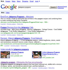
The LATimes tried to leverage the power of wikis with their wikitorial. On June 17th 2005 they launched it, and on June 19th they took it down. Users were posting obscene photos and comments at a pace that no one could manage. LATimes had the large numbers needed to create interesting content, but hadn't learned the lessons of Wikipedia's controversial entries. After all, if Wikipedia with its vibrant and committed community couldn't keep George Bush under control, how could a brand new newspaper section? It still hasn't returned, and maybe it represents a problem that can't be solved.
When you look at examples on the web to learn from, make sure you are dealing with similar problems of scale.
see also earlier size matters post
It's a recursive old world we live in these days, in which ideas are put up on one blog only to be refined and realized by the next several blogs. I've been giving a building community talk that is starting to do what I want it to, i.e. connect theory and practice, and Josh Porter's slides on slideshare had influenced my thinking. Now he reports on my talk, moving the ideas forward further still.
Different views of self We expose different views of self. Our home self, our work self, and services each represent a different view into our lives, different relationships, different interests. Our Facebook profile, for example, shows a different window on us than our LinkedIn profile does.Interesting question: if all of our online profiles were added together, would it be representative of the *real* us?
(this is a very pertinent question given the recent claims that Facebook is trying to map *the* social graph…it’s not clear at all that anybody but a single individual knows the extent of their own social network....)
This reminds me I have not been a good girl and reported on one of the two things I found more revelatory at Graphing Social. Facebook is the next Google (unless they mess up.) When I saw them speak, I was really surprised at their point of view. They are obsessively driven to map the social graph. Your goal very much defines you as a company. Corporate missions are often doublespeak, but if you can take a mission and boil it down a sentence, like "making the world's information findable and useful" then you can create a collective mindset that will move the needle. It must be big enough to be aspirational, small enough to make progress toward.
If Facebook's mission is to map the social graph, they will have a data asset that they can monetize. They do not need to worry about missed opportunities enjoyed by the application makers, they don't have to worry about an unclear ad business. Or at least, they shouldn't (and their valuation certain suggests it's a non-issue.) They will own a core piece of data that is so useful and more important, so novel that their business model should make itself visible as the Social Graph gets built. They are waiting for their adsense. Maybe, like Google, they'll spot a company doing it half-right and because they understand the social graph they can connect the dots. Or maybe once they understand how people connect, a new model will become obvious.
Perhaps there is a very obvious 1:1 relationship between Facebook and Google simply in they are both mappers. What's left then, to map out? It would be a good thing for a start-up to know.
I said one of two things... the second is not so big, but still very interesting. This new generation of developers are radically more user centered than any of those before. Slide, RockYou, and others hammered home over and over in their talks the value of both user testing and A/B testing. I know many larger corporations that can't manage to do qualitative and quantitative research affectively, and here are these tiny companies launching products in a handful of days, and they manage to squeeze it in. As Porter (Michael, not Josh) says, "What gets measured, gets managed." These kids have their eyes clearly on the end goal, and know how to get there: through the good auspices of their users.
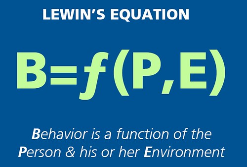
When I saw this slide on Josh Porter's terrific preso on Psychology Of Social Design the clouds parted and the angels sang.
There is a desired behavior that we need to create, we have no control over the person but, via interaction design, information architecture and interface design we control the environment.
Perfect, and succinct. I need to make a T-Shirt.
entire presentation:
Rosenfeld Media recently did an analysis of user experience mentions in prominent Business Magazines. What they discovered is quite fascinating.
- The Harvard Business Review dramatically differs from its peers in its information focus. Knowledge management (26.7%) and information management (61.7%) combined to account for 88.4% of its results, while the average for all of our business publications is 28.2% (8.5% + 19.7%). Of course, HBR is the most academic publication on our list. If this is the explanation, does that suggest that the research and academic side of the business community is more focused on information management issues? If so, why?
- The Economist is quite focused—at the expense of all other UX topics—on branding: 96.7% of its results, versus a 42.4% average among all analysts. Of all the terms on our list, branding has been in use perhaps the longest. Does The Economist see newer topics as flighty and not worth deeper coverage?
- Conversely, Business Week seems to have the most balanced coverage, with six terms accounting for at least 5% of the results each (branding, content management, industrial design, information management, knowledge management, and user experience).

though I suspect the overhead of running Yahoo Photos isn't that back-breaking to recently beleaguered Yahoo, I understand the wisdom of not supporting two competing photo sites. What I'm impressed by is this fine deal they made with their rivals, allowing folks who aren't quite ready for a 2.0 world to retire their personal works to the secluded safety of a private family photo sharing site. Bravo, Yahoo. You could have dumped us all in Flickr, but ya did the right thing.
I tried moving my photos too ALL the services, out fo curiosity,a nd found that I was able to, with a little back-buttoning.
Flickr did the right thing by respecting that not everyone is ready to make their entire life public
This is just a little note to say hi, and to confirm that you've decided to move all your photos from Yahoo! Photos to Flickr. This is fabulous!It could take a little while for the import process to
finish, so when it's finished we'll send you another email
to let you know.We've marked all your photos from Yahoo! as private,
because we didn't want to assume that you're comfortable
with making everything public until you've had a chance to
look things over. If you're happy to make things public,
we've written a one-time batch tool you can use to set your
photos public (or for friends or family) all at once.We'll be in touch again soon to let you know it's all done.
In the mean time, why not explore Flickr?
http://www.flickr.com/Regards, The Flickreenos
Compare this note to the Shutterfly note
Thanks for selecting ShutterflyWe are now transferring your pictures from Yahoo! Photos to Shutterfly and will send you another email when all of your pictures have been uploaded.
Bleah. Brand, much?
Snapfish provided a server error, Kodak couldn't find my old account (I suspect they closed it, and I didn't want to sign up again because I seem to remember they spam you every five seconds.
Photo bucket insulted me:

Gender? Required? BITE ME. Worse, a full birthday was required as well, not just proof I was over 13. And after that, my photos were not moved over, even when I tried a second time. Buh-Bye photobucket. Buh-bye, chance to get a ton of users from curious Yahoos.
Anyhow, irrespective of expected confusion between multiple service sign-ins, which all photo sites except Flickr had to suffer from (sign up/sign in, etc), Flickr still provided the most pleasant, the most positive experience. Yahoo was twice a mensch today. They did the right thing AND they did it well.

On the long now blog adsense not only fails to be relevant, it cheapens the entire effort. Stewart, this is just not worth the $2.39 a month of revenue it's bringing in....
From ASIS&T 2006 Information Architecture Summit: Key Topics Survey Results, the topics attendees most want to heara about are
facinating... I never expected number three to pop up, but I am extremely pleased to see it. It's a definate sign the community is realizing they much reach higher, deeper to make a real difference.
Is a dumb strategy: More on Walgreens
 In DC, I stayed at the Hotel Monaco. The stodgy exterior belies a hip interior. It's another of the new style of boutique hotels, complete with quirky offerings such as a goldfish brought to your room upon request and leopard-spotted terry-cloth robes.
It was this quirkiness that got them into trouble-- I was happy to see they offered a complimentary yoga basket, with mat, strap and block, since I'd forgotten to pack my mat. But when they were out all three days, I was more upset than if they had never offered it. I suspect if they had simply pulled the yoga table-tents when they ran out of baskets, they might have had fewer cranky guests. After all, if you don't expect it, you can't feel badly not to have it.
on the plus side
 on the negative side
 it's funny-- I'm not sure it was a particularly worse experience than the Hotel Lucia: jazz on the radio, comfy bed, good TV, cool old building. Yet I left not-delighted. I guess it's the old saw-- always underpromise and overdeliver.
In Full Disclosure, a review of The Jewish Museum Berlin, the reviewer asks,
What role does design play in the illumination of a history many might prefer to ignore? To what extent can or should it deliver painful or damning information without making the experience glamorous? How might it render such a break with civilization, making it both believable and memorable?"
When I first read those questions, I thought, Design can do that!. But then, as the review progresses, I wonder if design is up to it:
"How to explain the myriad oddities of the JMB exhibitionthe digital pomegranates, kosher gummy bears, synagogue building blocks, and nap corners; two hundred young hosts deployed to usher visitors through the building and the insistent labeling that explains the architects intentions to the presumed confused (the voids are, for example, Architect Libeskinds way of recognizing that the destruction of European Jews in the Holocaust has caused an absence, or void, in German and European society); the unseemly detours into irrelevant political correctness, like the tree to which you are meant to attach your answer to the question What do equal rights mean to you?
And in this moment, I can see the designers sitting around excited yet daunted by their chore: how do you get people to feel the way you want them too, how do you get them to actively participate in a space devoted to one of the worst crimes in history? Maybe the designers should have asked if visitors would be up to actively participating in such a creation (I have a feeling a tree on equal rights wasnt the way .)
I can remember a moment where the world spit into two for me; the created world and the born world. I was 18 and on a tour of the Kansas City Art Institute, and we entered the design building. In the hall was an exhibit of student work-- the usual, toasters, silverware, books, etc. Upon seeing these mundane objects I suddenly realized that everything around me had a human being behind it. Not just the student-built toaster, but the case that held it, the wall that held the case, the linoleum under my feet the shoes on my feet my jeans, the cat-eye glasses on the woman explaining why the school was a good investment, the brochure in her hands, everything. Everything until my eyes fell on the trees outside the window.
And even though I choose fine art (perhaps partially because of the strange repulsion of that moment where my world felt horribly wrongly artificial) I never lost that consciousness. I never lost the awareness that not only was everything man made, but that someone sat down and puzzled over how it was made. Some designers talked to users, some did not, some sketched, some imagined, some copied, some innovated but there was always a human just like me deciding.
And now, after some years as a designer, I feel vaguely embarrassed when I see something and feel the designer's struggle. A good design feels much like a tree. You forget that a designer was there, and you don't consider it any more or less than a landscape-- it's beautiful or it's ugly-- but not "What were they thinking?" Its much easier to be in the world when you don't feel reminded about someone's sweat, worries, late night and struggles. Better to enjoy the apparent effortlessness of Google without knowing there are five people on the first result team.
So as design and designers take on work that touches our humanity, be it museums to the holocaust or designing the ground zero site, I think perhaps we need to shake off the feeling that we are doing important work because that makes us self-conscious and awkward. All acts of designing the world are important, and need to be approached with the same attention. Having gained awareness of the designed world, we have to protect others from that upsetting sensation. We should remember the real design work is done internally by the visitor to the museum, or the user of a website, and our job is simply to give them a decent place to have that experience. Our designs are enabling, not dictating.
If you put a fork in your mouth and you are conscious of it rather than the food it carries, it is a bad design.
I watched SuperSize Me last night, which I highly recommend to anyone who has ever eaten fastfood or plans to again. This explains my current state of mind.
Now I'm eating a celery stalk with peanut butter on it. I bought the peanut butter from Trader Joes, and when I opened it, it had a layer of oil on top, which the jar instructed me to stir back in. I have never seen this before, but I don't think I've eaten peanut butter since my Jiff days either. I wondered about this creepy oil, so I looked at the ingredients list. It listed Dry Roasted Peanuts and Salt. So the oil was just peanut oil that had seperated from the "butter".
I love it when the ingrediants list is shorter than war and peace and full of things I've actually heard of: peanuts. salt. And as I stirred in the (naturally occuring) peanut oil, I thought of focus groups.
I can just imagine peanut butter focus groups talking about the oil, and stirring and how they didn't like the extra work ...
well, I picture it like this:
Moderator (thinking of a new technology they have discovered): and the oil on top, that you stir in-- do you like that?
User: It's okay
Moderator: But what if you didn't have to stir?
User: That'd be cool
Moderator (thinking): Fantastic! A user in favor for pentasodiathol 20!
... and then they put chemicals in the peanut-butter to keep it from separating. They don't say, would you rather stir or would you rather have lab created extracts in your food. Oh no. They've got DATA!
Anyhow, Philippe and I have happily removed processed food from our diets (or as he likes to point out, I've removed process foods. He's been organic for some time, though that does seem to include fattened duck liver. hmm)
And remember kids: don't listen to the users.
David Greenberger gave one of the most intriguing talks at GEL. Accompanied by a piano, he acted out dialog form conversations with folks form a nursing home. Rather than being a classic oral history, these were people living in the present, though with views uniquely shaped by having a long past.
Check out The Duplex Planet
"The Duplex Planet is an ongoing work designed to portray a wide variety of real characters who are old or in decline. In our culture, exposure to people at this point in their lives is generally limited to seeing family members age and, since that points directly to one's own mortality, it's hard to glean much in the way of an objective example."
In Joi: Opting out of Plaxo Jay explains why he'll never use Plaxo, and Stacy of Plaxo explains why he's maligning the service incorrectly.
The platform issue remains.
Which brings up the question, if you want influencers to join and write about your service, maybe that 3% of the user base should be catered to (i'm speaking of the not-so-silent minority of mac users). Usually it's not a financially sensible thing to do, code a unique base to 3% of users, at least not until your numbers hit millions, but if that 3% is noisy bloggers...
I have a little list of websites I dream about fixing. The top two are:
1. Netflix: Everything that is wrong with them is stuff I love and understand: their IA is horrible, and the interaction desing for the queue is a really attractive problem of scaling design.
2. Via Michelin: A wonderful print product that hasn't quite figured out the web. It could be the single resource for European travel.
Both are sites whose product I love, and whose problems seem more than skin deep: from a glance I'd say both are free from interface politics and have excellent visual desingers, and are missing the IA/ID understanding.
Wells Fargo just came off the list (it's gotten way better in the last few years), Travelocity is on the maybe pile (it does show signs of interface politics), almost all wine sites are definates ('cause the are both cute and broken and sell stuff I like), and as temptingly broken as the Sprint website is, I fear it. The interface politics look like chasms as big as the grand canyon.
What broken experience would you love to fix?
Why the heck is it so hard to archive mail. it's in everyone's interest-- since doing so encourages you to upgrade the computer or the software... why is it so hard?
gray tuesday is a good cool thing to do. I feel myself already there.
A while back, Peter Merholz, Noel Franus and I hosted/organized a User Experience Cocktail hour. It began as an IA cocktail hour, but became inclusive of User Experiences, as inclusiveness made for better discussions, including better discussions about IA.
However, the list was hosted on some quite buggy software, and Noel has just managed to extract the original list. I've requested folks resign up here:
Bayue Info Page. This is stable technology, and Boxes and Arrows is not going anywhere soon, and we're unaffliated wiht any company, so it should be a happy home for anyone to post and receive messages about either Peter Merholz's beginning of an UE Salon, Brad Lauster's reviving of the Cocktail hour, John Zapolski's exciting UX gathering, my UE Manger's gathering or any other related IA/UE event.
So if you are in the bay area (i.e. near San Francisco), go ahead and sign up. Hopefully we'll see each other soon!
TC 510 Course Website David Farkas has an amazing collection of web-based articles supplementing his course that would make fine reading over the holidays-- the breadth and diversity of the reading would help round out any IA or ID thinking.
Had dinner last night to celebrate the B&A nomination with staff memebers George Olsen, Erin Malone and Brenda Janish (and special friends John Z and Lou R). We didn't think we'd win-- we're up against the onion after all-- and so we toasted each other and ignored the 9 p.m. announcement time blithely. But after dinner, we all got struck with curiosity (and perhaps a tiny bit of hope) and trotted over to a local Internet cafe. The Webby Awards: 2003 Winners announcement told us what we already expected... and we all felt the slight let down of seeing we didn't win. But it's hard to feel too bad when you are competing against professional magazines and formal nonprofits.
Then Brenda once more said what we had all said at various points during dinner... "How did we get nominated?"
And none of us could figure it out.
Everyone says, "It's an honor just to be nominated" but for us it really was... our tiny zine, the equivalent of a garage band, was up against the equivalent of a bunch of studio produced records... and that alone was startling and satisfying -- and a bit perplexing.
I mean, B&A is a magazine for specialized geeks... designers who aren't into pretty pictures as much as they are into the underlying structure of design. Thus our site is waaaaay less accessible to the general public than any other design site that is replete with gorgeous layouts and colors. Our site is kinda text heavy. and the articles are things like The Sociobiology of Information Architecture and Six Tips for Improving Your Design Documentation.
Then again, if anyone has the foolish notion designers are idiot savants who take a product plan and say "ugh, i go photoshop now" Boxes and Arrows quickly shows that design is a cerebral process. And somehow, miraculously, the editorial team at B&A keep finding and refining articles from some of the brightest minds in interactive design today.
When it started, I said I'd be happy if we managed to keep it going for six months (as my team likes to tease me about continually). Now it's been a year and a half, the webbys noticed us, and who knows, maybe a few folks clicking through the nominees got a new insight into what it means to design.
I'm honored just to be nominated.
India: Hole-in-the-Wall is amazing--
"An Indian physicist puts a PC with a high speed internet connection in a wall in the slums and watches what happens. Based on the results, he talks about issues of digital divide, computer education and kids, the dynamics of the third world getting online."
I have been working late the last few night, as we approach a launch. I drive home in our miata. It's "new to me" and even though I only drive a few miles home, it brings me a great deal of joy.
Part of it is the engine and handling-- I enjoy slushing around the speed bumps in the near-empty Yahoo parking lot. I like accelerating in the curve onto the highway. I love to pass. I love when I accelerate, I am pushed back into the bucket seat as if by a gentle invisible hand-- it's like a miniature version of an airplane takeoff.
I enjoy having a decent stereo for the first time in my life. I was blasting French-arab music and suddenly realize both that I was stunningly out of sync with my country (it's odd I don't know who coolplay is, I discovered in conversation last night with a product manager) and also that I really love that music's complexity, which I could never hear before.
But most of all, I love top up/top down. I've had the cabriolet for a while, and I don't really have to sing the praises of top down. Sun on your face, hair tangling, blue emptiness above you-- it kinda sells itself. But top up in the miata is a very different experience. The cabriolet has a high roof. Top up is very like having a hard top car, quite comfortable and respectable. The miata has a very low roof, and top up the interior is a cave, especially at night. Driving home last night, I couldn't understand why I was suffused with a sensation of comfort. I felt warm, protected, taken care off. Then I remembered Bachelard's Poetics of Space and realized that the interior of the miata was poetically a nest.
Picture a nest with a bunch of baby birds and a mother sitting on them. Being sat upon doesn't sound nice most of the time, but in the cup of the nest, with warm feathers of a living duvet tucking you in and providing parental "hugs" at the same time-- it is a sensation I long for, especially after a brutal day. Better than a martini or a rough workout, to be nestled is what I dream of.
So I climb in the miata, top up, heat kicks on, the dashboard softly glows, the music comforts (news in the morning commute, music at night), the space is just the size of me and I am carried home.
In fact, even top down in the sun it is a nest-- the mother bird has flown off and the nest is exposed to the sky, a hand cupping me as the sun falls on my face. I drive to work with the top down and slow traffic is no worry; the sky is nearly cloudless and I'm in no hurry to dive into the stresspot that awaits.
I wondered if having such a car for a commute made sense (though the mileage is fantastic). It seemed to me that it was a weekend car. But I've found that it is the salve to the wounds that work's latest bout of intensity has been giving. I fought with Philippe over it-- he leaned toward a practical vehicle. But I fought back-- if one drives, which is (in my mind) a bit morally reprehensible (though my back requires it for awhile longer-- the bike is still triggering spasms), then one should get pleasure out of the act of driving.
it may not be a VW, but it is still farfenugen.
From a great article: How to get the most out of conferences - UIWEB.COM
"Posters: Some conferences have poster areas, where professionals or students put together summaries of their work for people to look at. This can often be a lot of fun. ... Sometimes there are scheduled times where the posters are manned, so you can ask questions of the people that did the work. This can be great fun. Don't be shy: usually they're thrilled that anyone is looking at their stuff, much less asking questions. "
My husband is a research scientist, and things begin what they are, I've wandered around a few of his conferences. Science conferences pretty much always have poster sessions, and I saw what a really terrific icebreaker they were for strangers to start conversations.
We did it last year at the IA summit, and we're doing it this year. If you are attending, take advantage of this to both meet folks and learn what they are doing....
 Anyhow, I'll be around. This is what I look like, feel free to come introduce yourself. If we meet saturday night at the bar, make me drink water... I don't know how I'll make those 8:30 sessions.
Potential conversation starters --
"Is food really that much better in France?"
"Have you ever eaten tongue?"
"Don't you think you are a bit silly in differentiating rules and guidelines"
"Do you secretly hate Jakob?"
"Are you double jointed/Explain your scars"
"What's your favorite greek island"
"Why is Wurman relevant?"
Potential conversation enders
"Why did you choose the name Asilomar?"
"What's up with Yahoo mail?"
"What's up with this Bush guy" (for non-americans)
"What's going on with Yahoo! Search?" (I'll have to just look coy, due to NDA)
"I like your book" (I'll blush and not know what to say-- better to insult or question it. ;-)
Mention Google.
Looking forward to seeing/meeting you all!!!!
 Persuasive Technology is in turns fascinating and sinister.
This book is a must for any designer working in the technology field. B.J. Fogg is clearly a upright fellow, yet the techniques he offers to persuade desired behavior are so clearly articulated that it is easy to see how they will be used for unethical ends.
Stanford professor Fogg lists many positive uses for these techniques, such as educating teens about domestic violence, or teaching diabetics to monitor their blood sugar levels, or getting RSI sufferers to stretch-- yet it's no effort to image the dark side. A later chapter on ethics does just that, showing his student's experiments in designing unethical tools, such a Pokémon game that coaxes personal information out of children and persuades them to bug their parents for toys.
That said, ignorance is not an option. We need to understand these methods, as designers and as users. I had never seen Amazon' Gold Box as more than a very silly bit of foolishness.. now I understand it for the highly crafted and effective sales tool it is.
Even if persuasion turns you off, you need this book for chapter 7, on web credibility. Check out the website for a taste. Design and information architecture are critical pieces in the struggle to differentiate a site from the vast number of personal sites and imitators sites... an increasingly difficult task for users.
When you finish this book, the hackles on your neck will rise, you'll feel lightly slimey-- but you will be a better designer and a smarter consumer.
from terremoto.net
"Kansei is a japanese term where the syllable kan means sensitivity and sei means sensibility. It is used to express the quality of an object for producing pleasure through its use. "
Actually, my husband did. I rode. We're talking about buying a car. And for fun, I suggested we test drive the new beetle convertible. It is unquestionably a triumph of design-- ergonomic, quiet (even Whit the top down, it's remarkable windless) efficient, elegant and even beautifully quirky. But no fun to drive. Smooth and silky, 60 feel like 30 as we flew down the highway. But is that a good thing?
After my husband and I drove home in my ancient cabriolet (also not much fun to drive) we talked about the cars that gave us the most joy behind the wheel. He loves his '58 bugeye sprite. Even when driving 45 you feel like you are flying. It's old and small and basic, so the road feel is really intense. When he and I get out of it, it's like seeing clowns come out of their car-- yet when you are in it, it's pretty roomy.
I miss my old fiat. Driving winding roads in the marin headlands, getting a bit of slide in the corners, top down, shifting down to grab more power-- that's joy.
We've driven friends' Z3, friends' porches and these cars can do 90 before you start to feel any speed. It's terrifying to realize you've broken the speedlimit without noticing, and you are driving a dangerous speed without feeling it.
Comparing it to Philippe driving the back-roads in the bugeye and I'm holding on for my life at 30 mph and shouting for joy at the tall trees overhead, I have to wonder if the new car's emphasis on comfort is entirely a good development?
Maybe a bit of discomfort is part of the sport car experience. A driver has to feel some challenge, some sense of control and of power-- but the bugeye's 43 horses can feel just as powerful as the Porsche's 360. A bit of road feel, a bit of slip in a turn, a bit growl in a downshift-- it's feedback and it's fun.
VW says in their ads "Drivers wanted" but honestly, I doubt real drivers will want them.
Anyhow, this was all set off by reading dancing mango's thoughts on pleasure. See what he has to say on the matter.
After reading Consumer WebWatch: How Consumers and Experts Rate Credibility on the Web, it seems if you you want to be trusted, get design and IA right.
Okay, here's today's question: who are the practicing "experience designers"? What are their job duties? What are their methods? This skill sets?
The passionate conversation on information architecture and information design, as well as a discussion on sigia about how you can design for information (and experiences) but you can't design them because they are help in the recipient, has got me thinking about experience design.
I've never participated in one of the ED summits (usually too broke or busy or sometimes both) so I've only been exposed to ED via the mailing list's sporadic discussions and nathan's book which is long on concepts and short on explanations (a book I very much like, in the way I like poems and books of paintings).
The AIGA experience design site offers a short explaination:
Reading through the longer paper, it seems ED is more design and product strategy.
So-- business strategy, organization phych/dev, HCI and design. These folks gotten be triple phd's all... or have amazing hubis.... or be part of crack teams of experts... or am I missing something still? I feel like I am, because most of the smartest favoritest people I know are involved in ED and I still don't really get exactly what it is and why it matters (and this post will probably invite some of them to come over and kick my rear-- or at least debate me over too many bottles of cheap wine).
Jesse's book also provides an "experience design" approach, but he seems if not opposed, tangential to the AIGA efforts-- it is about their last bullet point primarily. Which would lead me to another question; just what is hate relationship of these two developing--- er-- efforts. How are user experience design and experience design different. Are they?
And I get how Jesse's user experience design plays out in the world, but I have trouble seeing how ED does. Or am I trying to make a practice out of a philosophy?
Digging deeper, I discover "The AIGA Experience Design Community brings together all types of experience design practitioners to focus on larger issues of business value and collaborative practice and methods .... AIGA uses the term "experience design" to describe a community of practice - not a single profession. Designing effective experiences requires many different types of professionals with a broad range of knowledge. The community currently consists of design strategists and planners; brand strategists; user and usability researchers; information architects; information and graphic designers; and interface, interaction, and software designers." which makes it sound very much like it might be a management/management consulting kind of thing.
And finally, reading "What has the AIGA Experience Design Community accomplished so far? ", it seems like it is a place for different related professions to talk to each other, mostly. Maybe they could solve the problem of what the aspects of ED are, and how they can be named, so we have a standard for communication. And the what is IA conversations will finally end.
Ha!
In O'Reilly Network: Dial-Up Revelations [Dec. 20, 2002] Meg writes
"Lately I've grown lazy around the issue of page size and images. When designing something for a client or posting a picture to my own web site, I'd often think to myself, "everyone I know has a high-speed connection now-a-days" and with little more than a cursory glance at the file size, I'd post or design in happy, dial-upless oblivion.
Oh what a spoiled fool I'd become."
our world is not the world....
If I was wondering, I'd know just where to ask
 I've been reading about patterns again. I've been asked to explain Pattern Languages for Design to a group of designers and interaction designers. And reading through Christopher Alexander's fine book I suddenly thought about the stairs in the Vatican museum. And ran to dig up a photograph.
To exit the Vatican museum you have to walk down this incredibly beautiful long spiral staircase made of many many shallow steps. You cannot run down this staircase. The handrail is an intricately carved wonder of craftsmanship-- polished by thousands of hands and people, dazed by the wonders they saw barely able to stand upright, neck still craned from gazing at the Sistine chapel.
Some might consider the stairs inefficient, even unusable. There is a partially hidden elevator for those who cannot use stairs at all-- but the stairs are so low-rising, so shallow that the oldest granny who has not yet resorted to a walker can totter down them. And only young kids would grow impatient-- the stairs permit the art to settle in your mind. The circle down is a mediatative labarinth.
 The art in the Vatican is vast and mind blowing-- even mind numbing. it's like the Louvre: far more than a person can absorb in a visit, and most visitors travel so far to see it that they attempt it anyway. This staircase was made to allow you to make a full transition from the pope's century of treasures back into the waking world.
I think of how many times I've exited a museum only to run into the back of someone who is come to a full halt, unable to cope with the bright sunlight and screaming traffic. The Vatican has not such issue.
I name it a pattern; transitioning between view space and life.
Joel on Software tracks down some causes of bad service. it's pretty impress, a "Why things bite back"moment in which management's inability to think in systems or understand humans (or both) leads to trouble.
Experience design starts at the "c" level in a company. Executives set the tone and reap the results.
from Losing (inter)face: Customer experience and its discontents
"This comes at a moment when the quality of American products, in both their design and construction, has never been higher, which only makes the deterioration in the quality of service that much more starkly apparent. "
How often is a good product ruined by poor service? I bought a clie, a lovely though tempermental bit of technology which drove me to phone up Sony where I was berated. hmmm. Will I buy sony again?
From a scenario in Modeling Access Control
"After some browsing, she tries to use the Search link but is told shell need to register to use the search. This costs only time, so she decides to do so."
The problem with writing scenarios is keeping true to a persona, and not influencing it with what you think or would do-- or what you wish people would do. The "she" of the scenario is a research scientist. I read "costs only time" and thought to myself, "is there anything more precious than time?" And wondered if the entire structure could be flawed if the scenario-- which, after all, is driving the entire thing-- is flawed.
However, the persona names (Dr. Amoxycxillian, Dr Beta-blocker) suggest only partially considered personas, and so this might be part of the problem. Without understanding the situation, the goals, and the motivations of the personas, behavior cannot be extrapolated.
Still, damn good looking poster. And a clear visualization of level of access, which ishard to get your head around.
Today Amazon introduced the soon-to-be standard dancing tab with hairy feet. Yes, another exciting innovation that will spread across websites like wildfire. 

 I should have smelled trouble when the gold box showed up. I think I remember the gold box from digging through my publisher's clearing house packet. I've finally learned to stop clicking it. All it ever offers me is blenders. Oh, Amazon, I thought you knew me better than that.
 The final insult is the message center. I thought, "hey they've been managing my friends. Perhaps they have decided to create a special email for Amazonia, the community that has sprung up around people who like the same stuff." But no, it's just spam! and does this mean they don't still send me spam in my regular email box? Nope, it means I get spam everywhere. It's like getting a big brown box from Amazon, opening it all excited-like, and discovering it's full of direct mail. bah.
 So I'm reading Helping Businesses Evaluate Their Internet Presence when I should be writing and I'm shouting (in my head) yes! No! Yes! No! as I read when suddenly a sweet scented breeze blows through my open window and I look up and see the oleander and am overcome with the desire to rip off my clothes and run through the backyard yelling wheeee!
I've got to finish this damn book before the neighbors sic the cops on me.
Here I am again, lurking around Amazon's favorite people area, reading descriptions and upgrading humans. (I love that Amazon allows me to "upgrade" someone from a favorite to a friend. That's just twisted enough) The Amazon "About me" blurb is an art form. I'm now officially embarrassed by mine and am off to rewrite.
Some favorites:
Lance "I am never content but always at rest. I am never happy but always satisfied. I am never lonely but always alone. I am Stinky Butter Tarts."
Adam: "I used to like NWA. I used to like cheeseburgers. I used to like Frank Lloyd Wright. I used to like Philadelphia. I used to like skateboards. I used to like blondes. I used to like Deleuze and Guattari - without even understanding them. I used to like Sandra Bernhard. I used to like being in the Army. I used to like the color blue. I used to like ACT UP. I used to like staying up all night long. I used to like Armani."
Anil: "I'm a plain brown rapper. "
David: "I enjoy long walks and heated swimming pools. Lighting fires and watching the grass grow. What am I? Is that your final answer? "
Derek: "Has anyone else noticed that Amazon brought the tabs back? Sigh. "
Erika: "snork!"
Lane: "After everything I've done for you, THIS is how you repay me? "
Todd: "I make stuff easy for people to use. I live in San Francisco. My favorite color is #ff6600. My hair defies gravity. I am the greatest lover the world has ever known. "
Mike "Uh uh, not on MY sofa you don't. "
Michael: "I wear blue shirts. I drink orange juice. I drive a Volkswagen. I'm married. I live in a major metropolitan area. I'm in 'management.' And since 1996 I've purchased something from Amazon every 11.6 days, on average. "
I'm also puzzling over how I got on Jef Raskin's favorite people list (if it is that Jef? How many people are so efficiant they go to using only on "f"). Yes, yes, I admit it-- I look at other's favorite people list to look for my name.
You love me, you really love me!
p.s. I'm taking this friday off from freaking out over anything. Book? What book? Job hunt? What job hunt? Dirty clothes? What dirty argghhhh help me help me I'm buried!!!!
![]()
from Virtuosos of the Experience Domain (pdf)
"There is no such thing as experience design. You cant design experience because experiencing is in people. You can design for experiencing, however."
This is one of experinece design's hotbuttons, one of the points most often debated. This paper points out that experinece design is co-owned by the designer and the people using the products and services. That any experinece is essentially a collabortive process.
Did I mention Design Has Consequences?
There are multiple other interesting points in this paper that deserve some debate:
Users and customers and audiences
Ms. Sanders proposes the user of the term "people" rather than "users" or "Customers." This is a debate that comes up again and again on CHI-WEB but really, it seems semantic to me-- every term we use becomes dulled with reuse. It's up to the individual designer to remember some poor human is someday going to experience your design. That's why I'm such a fan of personas... you can change the name of the faceless "user" as many times as you want, but you can't beat giving that user a face.
It's easy to say "users are morons" or "people are morons" but can you say that this persona, James McCain, who went to havard is a moron because he is fifty and tends to mis-select on dropdowns because of a slight tremor in his hand? It's harder to call a specific person, even if they are make-believe, a moron.
creativity as owned by design
While the paper acknowledges that all people can be creative, it states
"Most people, however, are not in the habit of using or expressing their creativity."
I'm not sure this is true. I suspect that all people who sove problems in their jobs, be it the lowly data entry person who writes excel macros to the material scientist who designs a new type of rover to get at the good rocks on mars is creative. Anyone who solves a problem is creative. I think there is a bit of elitism in many designers that they own creativity. And why shouldn't they feel that way -- companies refer to them as "creatives" and allow them leeway to play that is often frowned upon in other departments.
All departments engaged in solving problems are creative. All should play. And all playspaces should be respected, be it business developement or QA.
Most people may not be used to creating visual interactive design solutions, but I think most people flex their creative muscle more often than they think. And I think the most we respect and listen to the creative problem solving that exists in other disciplines, the better solutions we'll be able to craft in ours.
experience design as a term
Apart from the question of "Can an experience be designed" I have to wonder if experience design is too vague and far reaching for most of us to ever become good at it. I'm going to feel pretty good about myself as a craftsperson if I can simply design a usable pleasent and effective website -- without smellovision and 3-D glasses. I don't want to go out and design roller coasters. I am somewhat attracted to experience design and an overarching field, a parent to all the flavors of interactive design, but I suspect an experience design would be a jack of all trades with almost no mastery.
These are just the half-formed thoughts floating through my head as I contemplate the things I've heard and read since joinging AIGA's experience design list some months ago. I'd love to hear other's thoughts about this newly coined discipline.
if discipline it is....
In Online Community Technologies and Concepts Cam looks at the technology behind a successful community. A community is such a fragile thing, and hard to build. Each peice has to be carefully selected, from the software that supports it to the charter members that provide the welcoming noise....
Challis's model of experience design suddenly gave me the image of every project manager I've ever known, running around, desperately trying to keep the various people they are working with from slipping away like jello in a fist...
Lou points to The IA of IKEA Stores, in which an IA looks are the fine art of experience design (though she calls it IA). The is an IKEA near us, and I've always been amazed at the Disney-level care given to the user's experience as one wanders through the store. Perhaps it's time for another field trip. Or maybe I just need a lamp.
Interesting article on user experience from Vertebrae, who has quite a few interesting articles
I've never before visited the Nathan: Me section of nathan.com, but I'm glad I finally did.
"The development of all experiences must create solutions to problems of information creation, interaction, and, of course, sensorial media (the visual, audible, tactile, and other sensory displays that form the solution that people experience. Issues of understanding and meaning (information) and usability and appropriateness (interaction) are cerebral solutions that are only expressible with very sensory components. However, the real problems--and the most interesting solutions--lie in these cognitive processes and not in the beauty of the finished experience. This isn't so say that beautiful experiences aren't important, but beauty without purpose is, ultimately, meaningless."
Been thinking a lot about rules put forth by gurus. A woman recently put forth a post on the SIGIA list about how some higher-ups came back from a conference with a bag full of rules she was now expected to live by. They included:
1. "3 goals of a site have to be identified to determine the direction and voice for the site"
2. "There should only be a maximum of seven links on each page, more than that and we lose the user. It's just too many choices."
3. "Users won't click on items they believe are advertisements. Banner ads only work if they appear on the right side of the page."
4. "Users are trained to respond to "blue" or underlined items on a site to get somewhere else.
5. "There is no need for a button and a text click through (to the same page) on the same page."
Each of these "rules" is derived from a larger, smarter principal that someone has apparently determined is too complex for the idiots building websites.
Let's take a look:
1. "3 goals of a site have to be identified to determine the direction and voice for the site"
Let's translate this one: determine the goals of the site before you start building it. Goals need to come form multiple sources:
What are the business goals? (customer loyalty? investor excitement?)
What are the engineering goals? (easy to maintain? extensible?)
What are the sales goals? (more banner space? Customized pages for cobranding opportunities?)
What are the marketing goals? (reinforced branding?)
What are the user's goals?(I want to learn? find? buy? I need it to load fast? Work on my 3.0 browser?)
It's called requirements gathering, and no site should be built without it.
New rule: Do requirements gathering before you start designing a site
2. "There should only be a maximum of seven links on each page, more than that and we lose the user. It's just too many choices."
A better way to look at this would be "not everything can be the most important thing on a page" A page has to have a visual hierarchy and organization to make sense. Which means somebody gets to have their stuff in the top left corner of the homepage, and someone gets be below the fold. It is important to understand user tolerance of information but people can take a lot more than one might suppose if it is designed well. And sites with only seven links often look empty (I've seen this in user testing) belying the wealth of content that lies below.
New rule: Prioritize your page elements. Design a clear page hiearchy.
3. "Users won't click on items they believe are advertisements. Banner ads only work if they appear on the right side of the page."
It doesn't matter where you put the ads, if people think they are worthless they won't click it. I found the eyetracking study very interesting-- it showed people's eyes were looking at banners. yet Neilsen's banner blindness study showed people have no memory of seeing ads. To me that suggests that some lovely tiny bit of people's brains is quickly taking everything in, deciding what is valuable and trashing what isn't.
What is quite more valuable is designing ads that show the value of whatever is being offered and place them where they have meaning. So ads for a credit card don't make much sense on a greeting card site, but ads for flowers, chocolate, etc do. especially when placed at that important "susceptible moment"-- you've just sent a card.. don't you want to send a present too?
People don't want to be offered stuff they don't want. it's as simple as that.
New rule: Make ads contextual and meaningful whenever possible
4. "Users are trained to respond to "blue" or underlined items on a site to get somewhere else."
They were. and then every site on the web changed the rules (except maybe Jakob).
They key principal here is "make a link look clickable" make it a different color, make it a button, underline it-- do something to say "click me."
I've been in a lot of tests recently where people used "Braille" to find links-- they ran their mouse across the page and watched for the hand to show up. Kinda of a cruel thing to force users to do, no?
see earlier post on links
New rule: make links look clickable. Don't make non-links look like links
5. "There is no need for a button and a text click through (to the same page) on the same page."
I'm going with a flat "no" on this one: I think the real issue is "Should you have multiple ways to get to the same page on the same page." In a recent usability test of a large entertainment site, you could get to each piece of content by clicking on the thumbnail, the headline or the "click here" link that appeared after a short description. Some users used the image, some the title and some the "click here" link. None of them hesitated or were confused as to where to link-- I believe because each found a link they recognized would work for them.
I recently was shopping for a cd, and couldn't figure out how to purchase it. There was no "buy now" button. However the price was linked to the shopping cart. I didn't know that, and I started clicking randomly on things until I managed to hit the price link. Bah.
Why did I put up with this frustration? Honestly, it was the cheapest price on this particular cd. If it wasn't, I would have just bought it from Amazon.
New rule: support different people's ways of doing things (support different mental models)
Got an expert's pronouncement you need debunked or re-interpreted? write me
Hungry for more? IBM has a terrific article that goes after "the rules" of software design: Debunking the myths of UI design.

From: Gleanings
To: gleanettes
Subject: Gleanings: Experience Design and glow-in-the-dark rabbits
IA & DESIGN MATTERS
User Experience and Interface Design Resources
from SIGIA
"For those of you interested in paper prototyping and evaluating with prototypes in general, you might find some useful tips in the following paper. Showing it's age a little bit (it came out a bit before the web hit town), but I've had good feedback on it's practical use as a how-to piece.
(zipped .pdf, 4.3 meg)
NEWS
from NUA
Harris Interactive: Online kids now spend up to USD164 billion
A new study has revealed that online US kids, teenagers, and young
adults aged 8 to 24 are now spending at a projected rate of USD164
billion per year.
more articles about the changing face of the web.
from tomalak:
ZDNN: AOL quietly linking AIM, ICQ.A person familiar with AOL's situation says the company is taking some steps
internally to make AIM and ICQ interoperable, but that it faces challenges
meshing the cultures of the two companies and also with the kind of users
signed onto each system.
NewMedia: Is Rich Media Worth It's Weight in Gold?
Software designers and Webmasters keep pushing forward like scouts in the wilderness, claiming new audio and visual landscapes as their own. As a result, the Web now is a swirl of color and movement, games, three-
dimensionality, and virtual worlds--it's a bastion of rich media. But there's a rub.
APROPOS OF NOTHING
Mutant Rabbit Raises Controversy Over Genetic Manipulation
Because I'm interested in collaborative filtering and progressive profiling and suchnot, I was drawn to this site
m o v i e l e n s
however, 155 ratings later, it still can't predict what movies I like. I suspect part fo the problem is they ask you to say whether or not you think it was a good movie, rather than "did you like it"... two different things. I'm sure we can all think of movies we saw, had to admit that it was a good movie but a toruous 2 hours. i've been avoiding "Boys Don't Cry" for just that reason. I also suspect they are missing the important option"would not see it if you paid me" as opposed to merely "not seen".
I also managed to thwart emode.com... The What Breed of Dog Are You? test said I was a happy go lucky pug (?!?!) Maybe i'm just difficult, or maybe the fine art of predicting what people like has a long way to go. (or maybe I'm a pug? Argh!)